Pop-up forms – you’re probably familiar with them. They’re the forms that show up on a website, usually darkening the page behind them and requiring you to either submit your details or close out of the form.
This is no doubt what drives many people to claim that they hate pop-ups. But the fact is that they work. They’ve been proven to convert more than other, less-annoying types of forms. And marketers are showing no signs of abandoning this growth tool.
But, as with most things in life, there’s a wrong and a right way to do it. So in this article, we’re going to look at the right way to use pop-up forms, with best practices and tips on how to design a form that has the best chance of converting.
However, before we get into that, if you need convincing that pop-up forms are a good way to grow your subscriber count, let’s see what the stats say.
Page Contents
How effective pop-up forms can be
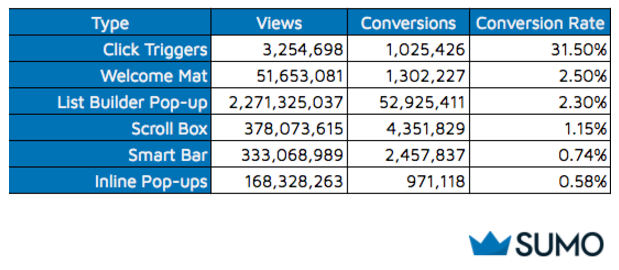
A few years ago Sumo analysed 1.7 billion pop-ups and discovered the average conversion rate to be 3.09%. Compare that to the 0.58% average email opt-in rate for a static inline form and you increase your conversion rate by 5x with a pop-up form.
To put that into perspective, if you get 100 website visitors per day, you’d end up with an extra 92 subscribers on your mailing list by the end of the month using a pop-up form. Compared to just 17 new subscribers via an inline form.
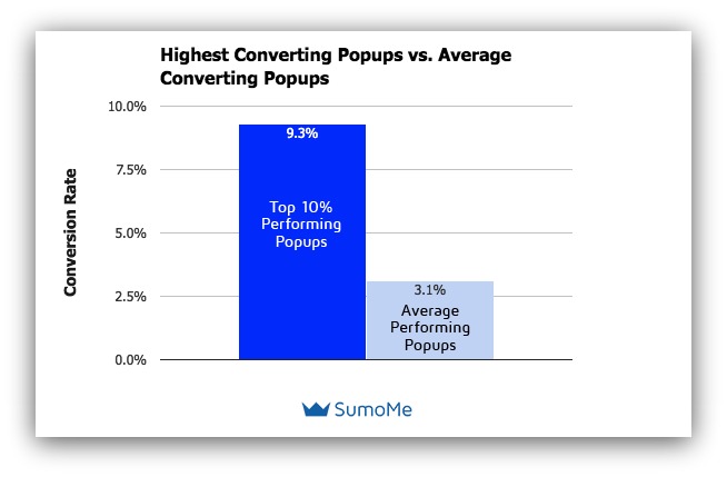
Even more impressive was the finding that the top 10% of the highest-performing pop-ups averaged a 9.28% conversion rate. Going back to our example and this conversion rate would give you an additional 278 subscribers each month.
These studies show just how effective pop-up forms can be. And they’re effective because by putting the CTA right in front of a visitor’s face, you make it crystal clear what you want that visitor to do. Plus, you make it easy for them to do it – there’s no need to scroll around your page looking for the sign-up form. Instead, it magically appears in front of them.
But because of their attention-grabbing, distracting nature, pop-up forms have developed something of a bad rep in recent years. Many people – website visitors and designers alike – consider them to be intrusive and annoying. But that’s only because pop-up forms aren’t always used well.
When pop-up forms are used considerately, they are surprisingly effective in converting website visitors into subscribers and growing your email list – as we’ve seen.
So what can you do to make sure your pop-ups forms are high-converting rather than highly irritating?
Let’s take a look.
Best practices for using pop-up forms to grow your email list
The goal with a pop-up form is to persuade website visitors to share their contact details without annoying them. Follow these five tips and you’ll be fine.
1. Show your pop-up forms when visitors are ready to see them
It can be tempting to throw your pop-up form in a visitor’s face the moment they land on your website. After all, you don’t want to miss the chance to grab their email address before they leave, right?
But think about it from a visitor’s perspective – they’ve just clicked through to your website and they want to read the content that drew them to the page in the first place. Interrupting them straight away is likely to annoy them and they’ll simply close the form in frustration.
Instead, give your visitors a chance to engage with your content. Wait an appropriate time to show your message and ask for your desired action.
What’s an appropriate time?
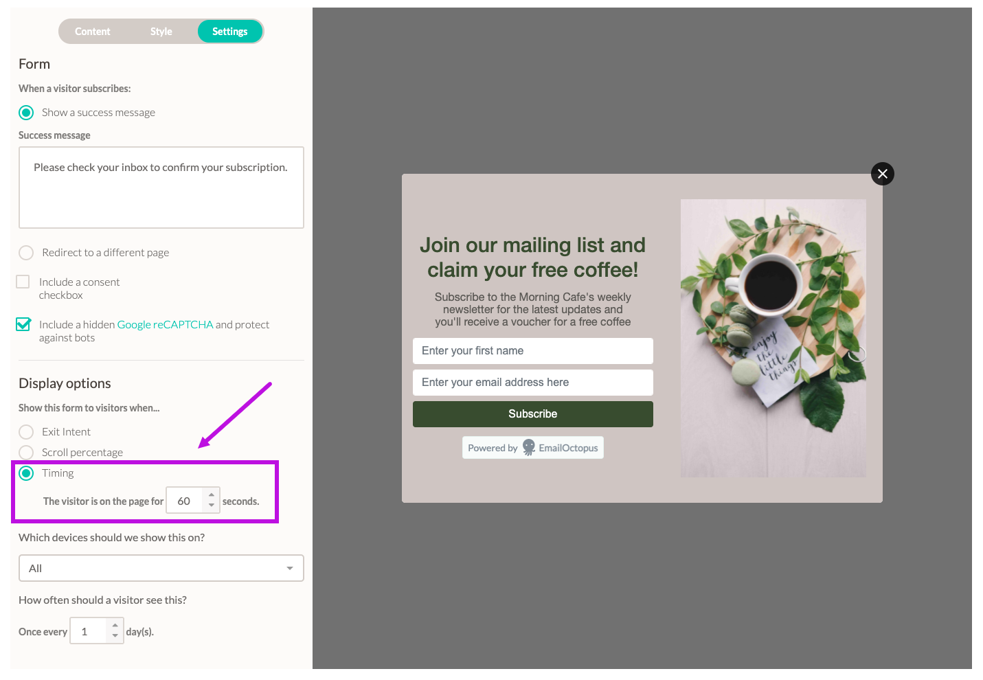
A good rule of thumb is around 50% of your average time on page. For example, if on average, visitors spend 2 minutes viewing your page, show your pop-up form after 60 seconds. This means you’ll get your CTA in front of your most engaged visitors and those most likely to sign-up. And conversely, it also means you won’t annoy visitors who are likely to bounce quickly anyway.
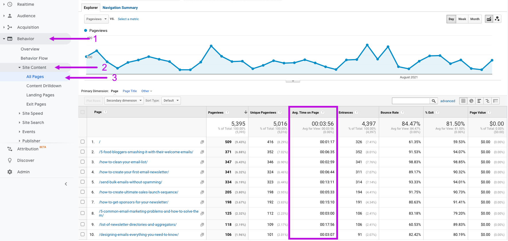
You can view your average time on page stats in Google Analytics. Go to the Behaviour report, select Site Content and then All Pages to view stats for each page on your site.
Then, when setting up your pop-up form in your email marketing tool or form builder, choose to display the form based on timing, using 50% of the page’s average view time.
At the very least, allow breathing room between when a visitor first lands on your page and when you show your pop-up form. Avoid displaying the form immediately after a visitor hits your page.
2. Offer something of value to visitors
If you’re interrupting a visitor from browsing your website page, you better have a damn good reason to do so.
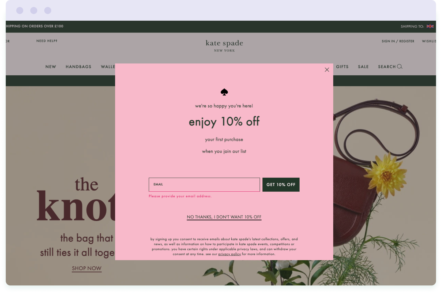
For ecommerce brands, this is usually the offer of a discount for a visitor’s first purchase. For example, designer brand Kate Spade offers visitors 10% off their first purchase in exchange for an email address.
You can also provide value with free and exclusive content offerings, or early access to events. This is especially relevant to publishers, bloggers and consultants.
Take this example from blogger Adam Enfoy – he offers readers a whole host of free content offers to persuade them to join his list. This includes free eBooks, checklists and exclusive access to a private Facebook group.

These sorts of offers are often referred to as a “lead magnet”, in that it attracts people to your list who are likely to be interested in your product or service, and therefore a potential customer. So by offering something of value, not only do you grow your email list, but you also expand your pool of potential customers.
It’s why an optimised lead capture strategy is so important to list growth.
However, how you present your offer is equally as important as the offer itself. You need to be clear on how visitors will benefit by joining your mailing list or what they will get in exchange for their email address.
Adam Enfoy (in the example above) does this well by formatting the list of benefits into three offers, starting each paragraph with the word ‘free’, and using bold to make these standout.
He also uses social proof by mentioning the number of people already signed up to his list. This makes visitors feel as though they might be missing out on something if they don’t join themselves.
3. Align your pop-up form message with the content on the page
The more contextually relevant and appealing you can make your mailing list to the content on your website, the higher your sign-up rate is likely to be.
For example, on our guide to email design, we display a pop-up form inviting readers to download a free Email Design Lookbook in exchange for their email address. It’s the only page on our blog where we use this pop-up form.
Why?
Because it’s the only article where this offer is relevant. The article is all about email design and the free eBook we’re offering is a collection of expertly-designed emails with takeaway tips to help readers design their own emails.
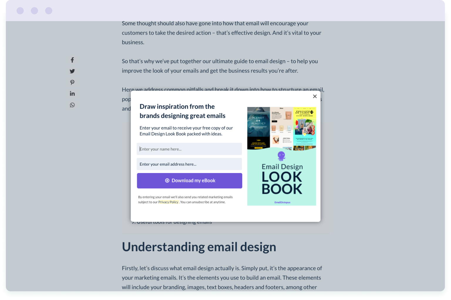
Our reasoning is that if people are reading the article, they’re interested in designing better-looking emails. And if they want to design better-looking emails, then they’ll be interested in our lookbook.
We could promote this Email Design Lookbook on other articles to maximise sign-ups, but is someone reading an article on how to increase email opt-ins from your blog necessarily going to be interested in this content? And is it worth interrupting them to find out?
Apply this same reasoning to your own website and, wherever possible, align the message or content offering in your pop-up form with what’s on the page. This increases the chances of website visitors being interested in signing up for your mailing list, as they have already expressed an interest in that particular topic.
This might mean you have multiple different pop-up forms on your website. But that’s a good thing. It means you’re really targeting your audience with what’s most relevant to them.
4. Make it easy for visitors to close the pop-up form
The fastest way to annoy your website visitors is to obscure the content they were reading with a pop-up form that cannot be easily closed.
Moving your mouse around a form to see what works and repeatedly clicking on different areas of the form is downright frustrating.
So make it as easy as possible for visitors to exit your pop-up form.
Let’s take a look at a few pop-up forms to demonstrate.
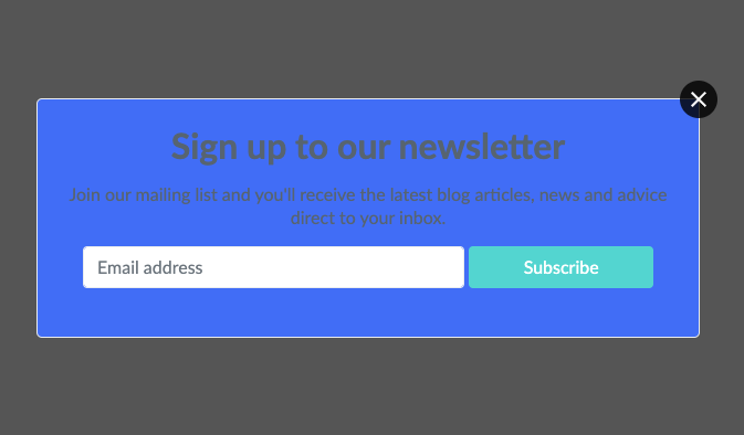
Here’s an example of how not to do it:
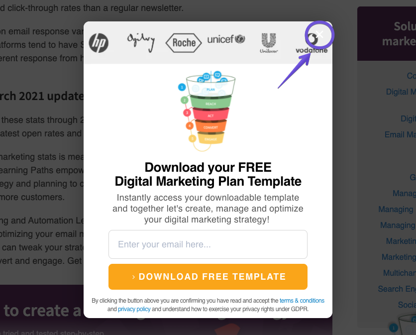
The white cross is barely visible over the pale grey background. And this lack of contrast makes the cross difficult to locate. The more difficult you make it for visitors to close the form, the more irritated they are likely to be.
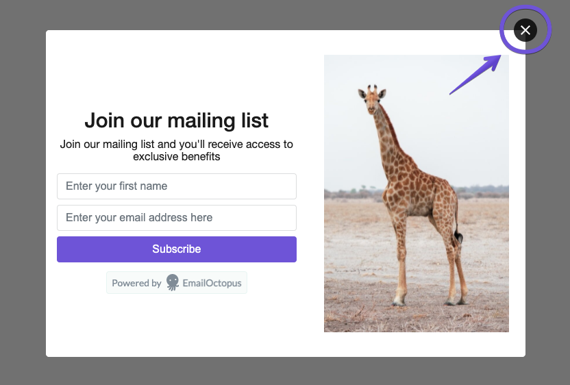
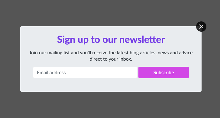
Compare that to this pop-up form:
The close button sits in a box that floats on top of the form – you can’t miss it. Which means visitors who aren’t interested in signing up can quickly get back to browsing the website without wasting time figuring out how to get rid of the pop-up message.
To make it easy for your website visitors to return to what they were reading, all of the pop-up form templates in EmailOctopus come with a high-contrast close button.
5. Make sure your pop-up form is mobile-friendly
Depending on which study you consult, mobile traffic accounts for anywhere between 55% and 68% of annual global website traffic. So it’s safe to say that a good chunk of your audience is using a mobile phone to visit your website.
Which makes it all the more important to check how your mobile visitors experience your pop-up form. And to ensure your form is mobile-friendly.
A mobile-friendly pop-up form should:
- Be easy to exit – the close button should be large and clear so that mobile browsers can quickly get back to the website
- Keep form fields to a minimum – the fewer fields there are, the less space the pop-up form occupies on a mobile screen, which ensures the most important bits are visible
- Include a large CTA button – this makes it easy for potential subscribers to submit their contact details and join your mailing list
Here’s a great example of a mobile-friendly pop-up form on the Allplants’ website:
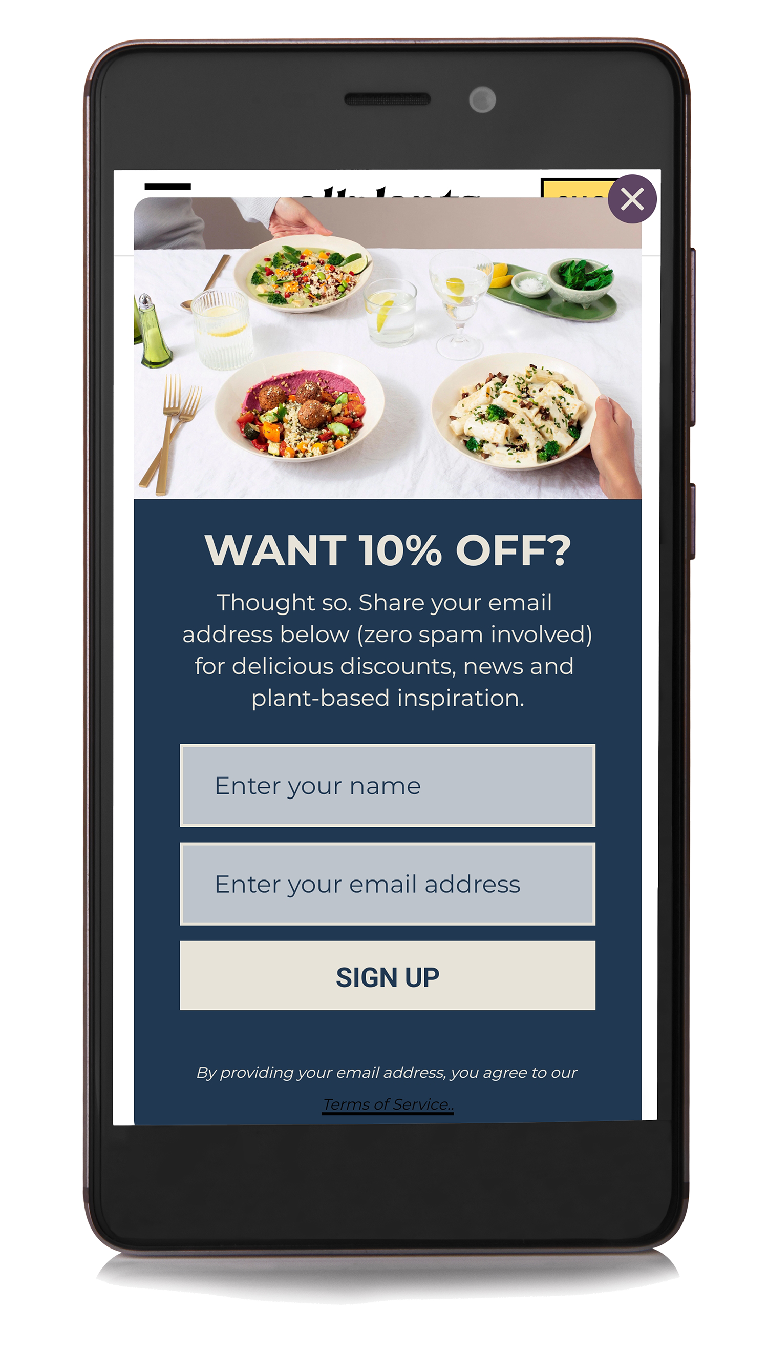
The close button is clearly visible, which makes it easy for visitors to return back to the page. There is space between the form and the page in the background, rather than the form occupying the full screen. And the form fits within the screen – there’s no need to scroll down to fill out the form or read the copy included on the form.
By default, pop-up forms created in EmailOctopus are mobile-friendly in terms of the space they occupy on a phone screen and the visibility of the exit button.
But regardless of the tool you use, check what your final pop-up form looks like on a mobile phone once it’s live. Visit your website as a potential subscriber might and go through the sign-up process yourself to ensure that it all looks good and runs smoothly.
Design tips for high-converting pop-up forms
Now that we’ve seen how to use pop-up forms effectively, let’s look at the design, and what it takes to put together a high-converting form.
1. Limit the number of fields in your form
Common wisdom tells us that when it comes to sign-up forms, more fields = more friction + fewer conversions.
And after analysing one million pop-up forms, Sleeknote found that including more fields in your form does indeed result in a drop in conversion rate.
Forms with five fields had the lowest conversion rate, while forms with just one field had the highest conversion rate. Most interestingly, forms with one field only converted by a marginal 3.32 percent improvement compared to two-field forms.
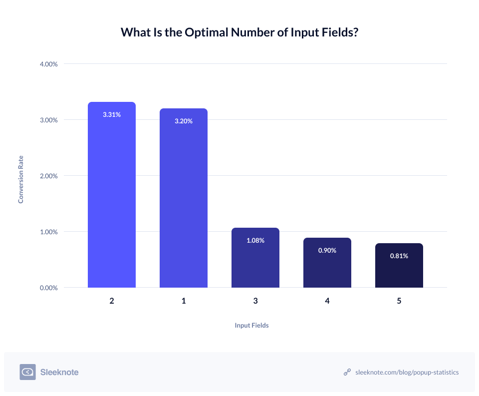
Obviously, an email address is the bare minimum of information you need to request. But these stats show that if you want to ask for additional information, you can, and not damage your conversion rate too badly.
Asking for a name is often a good idea as having that information will enable you to personalise your future emails to subscribers.
So when it comes to designing your pop-up form, consider what is the most essential information you need and ask for nothing more. You can always ask people for more information once they’ve become a subscriber, for example, via a survey.
But when it comes to winning over subscribers in the first place, the fewer fields to fill out, the easier the form is to complete and the more likely website visitors are to share their data.
2. Include images in your form
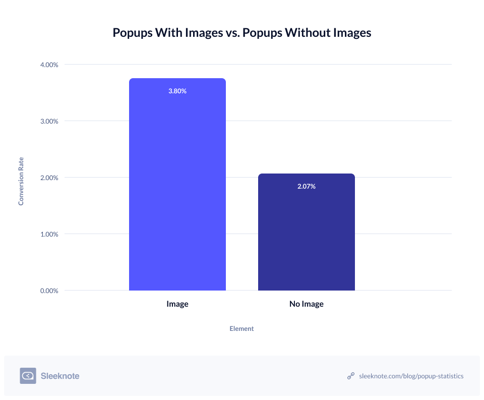
Returning to Sleeknote’s study of pop-up forms, they also found that forms with images convert almost 84% better than forms without images.
Let’s look at two sports retailers and their pop-up forms as an example.
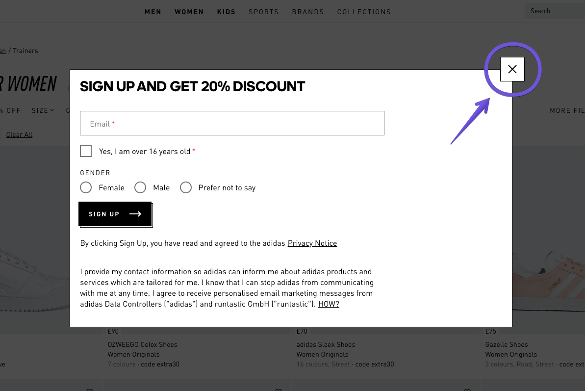
On the left (below) we have the pop-up form displayed on the Adidas website. There are no images in the form – just the copy, form fields and CTA button, plus a lot of white space.
Compare that to the pop-up form on the right, which is displayed on Reebok’s website. This form includes an image of two models wearing Reebok clothing. The form fields and layout are very similar to the Adidas form, but which one grabs your attention first?
And how does the image in the Reebok pop-up form help you navigate the rest of the form?
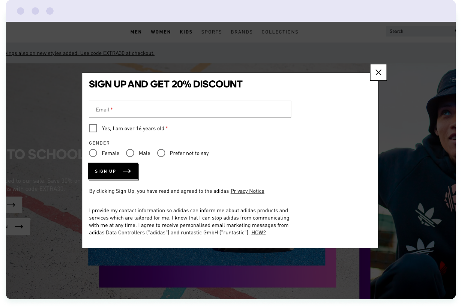
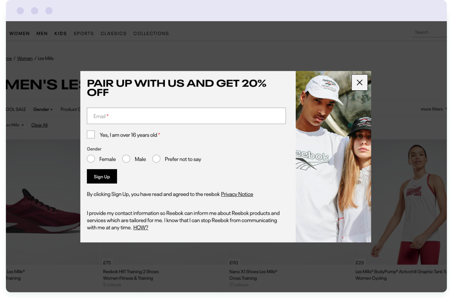
If your attention is anything like mine, your eyes will be drawn immediately to the picture of the models wearing Reebok. And from this image, your eyes naturally drift towards the form and the 20% discount offer.
Which just goes to show that images are more appealing and attention-grabbing.
So if possible, include an image in your pop-up form. If you’re an ecommerce brand, this could be an image of your products. If you’re offering a free piece of content, the image could be a picture or illustration of that content – whatever best fits the message.
3. Stay on brand
This might sound obvious, but when designing your pop-up form, keep it on brand. This means using colours from your brand’s colour palette and the same fonts* you use on your website.
(* Your pop-up form builder might only offer a limited selection of web-friendly fonts. So if you can’t use your exact brand fonts, use the closest available font instead, ideally from the same font family).
Another element to consider for keeping your pop-up form on brand is the use of images. If your website uses photographs rather than illustrations, for example, continue that theme in your pop-up form. Conversely, if your website is filled with bold graphics and illustrations, use these in your form instead.
Here’s a great example of an on-brand pop-up form from makeup brand Nars:
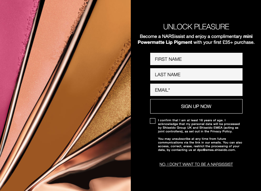
As well as the colourful, abstract image of makeup, the form sticks to a monotone palette, just like every other page on the Nars website.
The fonts across the web pages and the pop-up form are the same too, so once you’re familiar with the Nars branding, it’s clear that this pop-up form belongs to their brand.
Whether or not your website has a strong, recognisable brand, always aim to design your pop-up forms so that they reflect the appearance of your website. That way they’ll look more organic and in-keeping with your brand’s overall style.
4. Keep the colour palette limited
The Nars pop-up form above leads us nicely to this fourth tip – limit the number of colours in your pop-up form.
It can be tempting to go crazy with the colour palette on a pop-up form. Ever seen those ones that mix too many bright colours or use shades that are far too close together on the colour wheel?
Well, that’s what you need to avoid.
It’s true that in web design, colours are used to grab attention. But the fact that a pop-up form “pops up” in front of a visitor means it’s hard to ignore. So you don’t have to worry about using outrageous colour combos to make it even harder to ignore – you’ll have their attention already.
Instead, stick to a small number of colours (three or four is perfect) that work together to direct attention to the most important areas of your pop-up form. These are going to be the headline (where you spell out your value proposition) and the CTA button (where visitors submit their contact details).
The background, form fields and paragraph text should be in muted colours, while the headline and CTA button should standout with a bright, bold colour. Otherwise you risk visually overwhelming your website visitors and confusing what’s actually important.
To demonstrate, let’s look at two pop-up forms. First, we have an example of what not to do:
- using a font colour that does not provide enough contrast against the background colour
- using a bold background colour that distracts attention away from the headline and CTA button
- using a combination of colours that means the form field stands out the most, rather than the most important parts of the form
Now let’s look at what you should do instead:
- use a font colour that provides plenty of contrast against the background (either dark font on light background or light font on dark background)
- use a muted background colour so that the eye is drawn to the most important elements on the pop-up form – the headline and the CTA button
- use colours for the headline and CTA button that complement each other to help them standout (you can use Adobe’s colour palette creator tool to help select suitable groups of colour)
What you end up with is a form that doesn’t assault the eyes and drive visitors to the exit button. Instead, following these design tips, you have a form that captures attention in just the right areas while being easy on the eye.
5. Include an eye-catching CTA button
In order to be noticeable and attract clicks, the CTA button on your pop-up form needs to be eye-catching.
But what makes a CTA button eye-catching?
Well, as we’ve already discussed, bold colours are one way to make your CTA button standout. In fact, the CTA button should be the most colourful part of your pop-up form. So use the brightest colour in your brand’s palette.
If your brand’s colour palette is pretty muted, rely on contrasting colours instead, so dark against light or light against dark. Whatever works to make the CTA button “pop” against the background of the form.
And apply that rule to the text in your CTA button too – use high contrast colours so people can easily read the text. Though before going nuts with purple text on a green button (yes, it’s high contrast but it’s also an eyesore), stick to either a white, grey or black font. Which font colour you choose will ultimately depend on the colour of the CTA button.
Here are a few examples for inspiration:
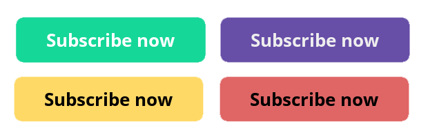
Notice what they all have in common? The text stands out clearly from the button, which makes them all easy to read.
Wrapping up
So there we have it – a complete guide to using pop-up forms on your website.
When used correctly, these types of forms convert better than static inline forms, which makes them an excellent choice for growing your email list.
But you need to put your website visitors first and think about their experience. Whether that’s delaying when your pop-up form appears on the page to give visitors time to engage with your content. Or making it as easy as possible for them to exit the form.
By following these best practices, you can cause minimal annoyance and simultaneously double, triple, or even quadruple your conversions, turning more website visitors into subscribers.
Need a free pop-up form tool?
Pop-up forms in EmailOctopus are customisable, mobile-friendly and completely free for your first 2,500 subscribers.
Our pop-up forms don’t require any coding on your part – simply create your form using the drag-and-drop editor and then paste the code into your website.
Best of all, these pop-up forms connect directly to your mailing list in EmailOctopus, where you can set up automated welcome emails and schedule regular email campaigns to stay connected with your news subscribers.
Grow your list for free with EmailOctopus
Convert more visitors into subscribers with pop-up forms that connect directly to your mailing list.
Free for your first 2,500 subscribers with up to 10,000 emails per month.


No Comments
Leave a comment Cancel