“Good design is good business”, said Thomas Watson Jr. back in the 1950s. Granted, he was talking about computers. Specifically IBM machines. But it’s a concept that applies to any industry where design is used.
And email marketing is no different. Every email you send to your customers has been designed. Thought has gone into how that email will look – that’s design.
Some thought should also have gone into how that email will encourage your customers to take the desired action – that’s effective design. And it’s vital to your business.
So that’s why we’ve put together our ultimate guide to email design – to help you improve the look of your emails and get the business results you’re after.
Here we address common pitfalls and break it down into how to structure an email, popular design principles and maximising your reach with mobile optimisation tips and accessibility considerations.
Page Contents
Understanding email design
Firstly, let’s discuss what email design actually is. Simply put, it’s the appearance of your marketing emails. It’s the elements you use to build an email. These elements will include your branding, images, text boxes, headers and footers, among other things.
Emails come in one of two formats – plain text or HTML.
Plain text emails
Plain text emails are simply that – plain text. There are no formatting options – not even the choice of bold or italic – and you’re not able to use additional graphics. Fonts are basic, colours are limited to black and white, and URLs are typed out (no neat hyperlinks allowed here).
They can be useful in some instances – transactional emails, for example. But as creative and highly visual emails can often mean better conversion rates, many marketers opt for HTML emails instead.
HTML emails
HTML (HyperText Markup Language) is a way of coding a document – in this case, an email – that tells an HTML reader, such as Gmail or Outlook in our scenario, how to render the information. Or put another, it’s a language that tells your email client how to display the information.
With HTML, you have full control over your email design. Which is why it’s the preferred option for the majority of email marketers. And it’s what we’ll be covering in this guide.
Most ESPs automatically generate and attach a plain text version to your HTML emails. This ensures that if a recipient isn’t able to view HTML in their email client, the plain text version will be displayed instead. Which means you’re still able to deliver your message.
It’s a feature you’ll find in EmailOctopus. Our software essentially strips out the text from your HTML email and structures it as best it can with the information available in the HTML. This is all done automatically so you don’t have to worry.
HTML emails without so much HTML
When people think of HTML emails, they’ll often imagine heavily designed emails with lots of images and graphics. However, HTML emails don’t have to mean lots of code. You can opt for emails that contain more text and less imagery.
If you do ever opt for a plainer looking email, you can optimise your email signature as part of your marketing campaign. This gives you an opportunity to include CTAs and work especially well for B2B brands.
Why good email design matters
The look of your emails is just as important as the content that’s in your email. You could have the most entertaining or interesting message in the world. But if your emails look like a dog’s dinner, people aren’t going to want to read that message.
Well designed emails should hold your reader’s attention and stop them from hitting the ‘delete’ button. A well designed email can make all the difference to your click-through rates and increase engagement. Which ultimately improves your deliverability.
And that’s why good email design is so important. After all, email marketing only works if customers engage with your content.
Getting started with email templates
When first designing your marketing emails, it’s good practice to build a template for each of the different types of emails you will use. This could include transactional emails, promotional emails and news updates.
Creating these templates will save you time in the long run. And will also mean you can design a set of emails for better consistency of appearance. Every time you need to create an email, you’ll have a template ready to go, safe in the knowledge it’s on-brand and themed correctly.
When building your own library of email templates, there are a few options available to you.
Create your own
First off, you can design your own. If your emails are likely to follow a standard layout and you’re using an email editor, there’s nothing to stop you from doing it yourself. Check out the email design collections of Really Good Emails, Milled and Beetle for inspiration and examples of good email design.
Pinterest is another good place to pick up ideas.
If you’re a one-man or woman band with limited design skills, it’s a good idea to outsource. Hire a freelance designer or employ an agency to create your initial templates. This will ensure your emails look professional and modern.
Use pre-designed templates
The second option is to use existing pre-designed templates. There’s plenty of resources out there that provide free email templates that can be edited to suit individual needs. This is a great option if budgets are tight and you don’t feel confident starting from scratch yourself.
If you’re using an email service provider, like EmailOctopus, you should have access to a library of templates that you can tailor to your brand. We also offer a selection of free templates to use with your preferred ESP.
How to design the perfect email – best practices and considerations
Now that we know what email design is and why it matters, let’s get stuck into the nitty gritty. Here we’re going to explain the key components that make up an email and how you can use these to design the perfect email.
Subject line
It might come as something of a surprise but good email design starts before the reader has even opened the email. The subject line can make the difference between an email that’s opened and one relegated to the trash bin without so much as a click.
The copy usually makes all the difference but it’s also worth considering how the subject line looks in a reader’s inbox.
If the subject line is too long, your message may be lost or the meaning altered.
If the subject line is too short, you may not get enough of a message across to interest your readers into opening the email.
You want to find the sweet spot between what gets seen and what drives your open rate. Aim for at least four to five words that convey what your email is all about. And if you are using longer subject lines, put the most important info at the start so it’s viewable across all devices – especially mobile where the smaller width truncates most subject lines.
⚠ Avoid using all CAPS and excessive punctuation in your email subject lines. These can trigger spam filters and stop your emails from reaching your recipient’s inbox.
Using emojis in subject lines
You can make your subject lines stand out by using emojis. The extra colour and the fun nature of emojis can help lift your email out of a dreary inbox.
Emojis tend to be more impactful when used at the very beginning of the subject line – here they’re more quickly noticed and help your subject line stand out against other emails competing in the inbox. They also help lead your reader’s eye across the subject line from left to right, reading it in full.
When emojis are used at the end of the subject line, the eye is forced to trace backwards across the copy from right to left. Which can be jarring and unnatural for native English speakers.
Try it yourself – compare the subject lines below:
How did your eye move across the different subject lines? Where did you pay most attention? Is that the best place for readers to focus first?
As recent research suggests web users spend 80% of their time viewing the left half of the page, use this to your advantage. Put the emoji first and lead the eye from left to right.
If you’re after more tips on optimising subject lines, check out our article on how to make your campaign standout in a crowded inbox.
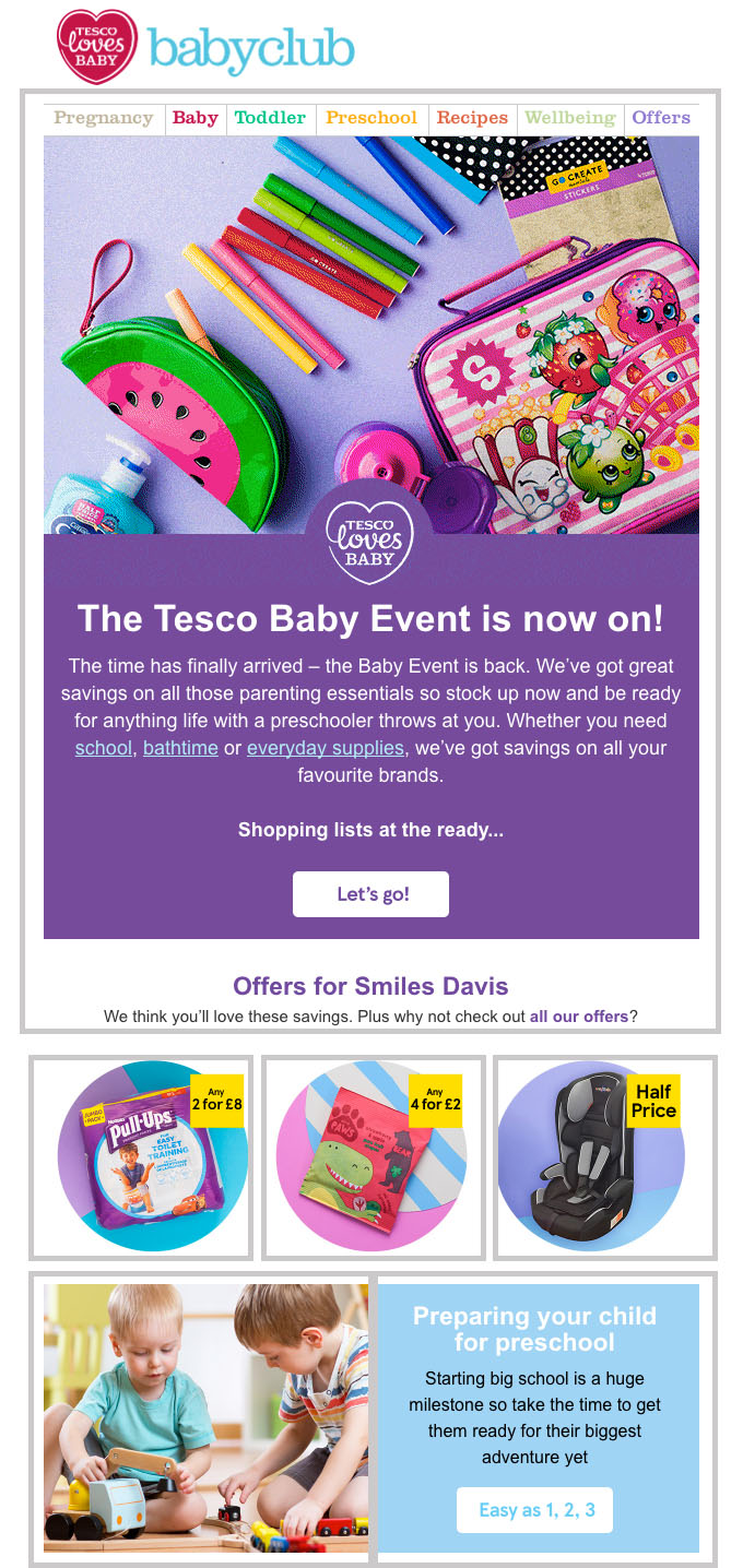
Pre-header
This is another feature of email that may not immediately make you think of ’email design’. Yet the pre-header is another great opportunity to grab your readers’ attention.
It works as an extension of the subject line. Which means more prime email real estate in which to give your readers an overview of what’s inside. And get them opening your email.
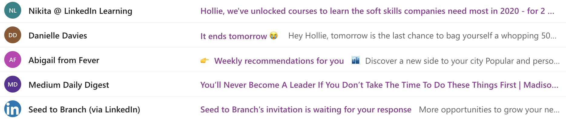
Let’s look at some examples below.
The three emails highlighted with the green border are good examples of pre-header text. It works in tandem with the subject line, providing more information to encourage readers to open the email.
Whereas the three emails further below are not using the pre-header text to its full potential. It either repeats what’s already in the subject line or mentions the uninspiring technical feature of viewing the email in a browser. But as that’s not an option until you open the email, it’s totally redundant mentioning it here and a wasted opportunity to include more inspiring copy.
When writing pre-header text, keep it short and sweet (between 40-70 characters). And make sure it works in tandem with your subject line. You could also use emojis here instead of the subject line.
Layout
Now let’s move on to the email itself and what readers find once they’ve opened your email. We’ll start with the layout and how the content is displayed within the email.
The email layout is essentially the structure that helps determine how the reader’s eye scans the content. And the goal here is to make your email as easy to read as possible while capturing their attention immediately.
Email layouts generally fall into three groups: single-column, multiple-column, or a hybrid.
Single-column layout
As the name suggests, with this layout, images and text are stacked on top of each other in one column. Each element fits within the width of the email, which should ideally be 600 pixels.
The single-column layout is one of the easiest for reading as the content follows a clear hierarchy – usually image, heading, text and CTA. It allows readers to scroll to the section of the email that is most relevant to them.
Arranging content in this way will help your readers arrive at one clear call-to-action. Especially if you adopt the inverted pyramid model by centre-aligning your images, copy and CTA buttons.
This framework for structuring your email draws the eye to where you want it to arrive and pay attention – the call-to-action.
Let’s take a look at how this works:
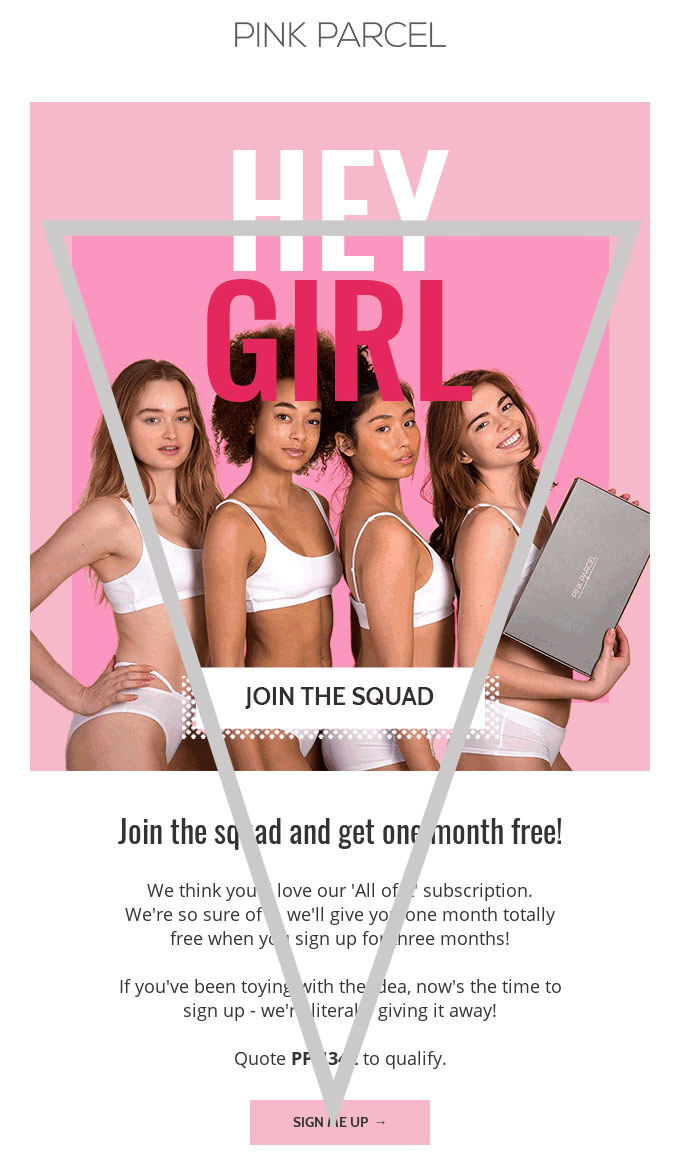
In this example, the grey triangle shows how the alignment of the hero image, headings and text bring you to the end goal – clicking that ‘sign me up’ CTA.
Another huge benefit of this layout is that it’s already optimised for mobile – with a single-column email you’ll see little difference between desktop and mobile.
More tips on how to optimise emails for mobile can be found further on in this guide.
Multiple-column layout
This layout uses two or more columns to display content. Though it’s best to avoid using any more than three columns – remember the ideal width is 600 pixels, which doesn’t give you loads of room to play with.
When multiple rows consisting of two or three columns are used, it creates a grid format that’s perfect for displaying a number of different products in one email.
Below is a great example of the multiple-column layout in action. The grey rectangles highlight the use of columns, starting with two, switching it up with three and then reverting back to two:
What’s interesting about this example is that the columns aren’t all equal – the alignment changes in each row to break any visual consistency yet keep your eye moving around the email.
It’s a layout that works better on desktop – the grid will fill the full width of the email and look really neat. On mobile, if it’s a responsive design then it should switch to a single-column layout, with each of the highlighted boxes stacked on top of one another.
If not, then the content will look really small on mobile and may even almost illegible, especially with the three columns. So make sure it’s responsive.
The ‘Z’ Pattern
If you’re using two columns, you could adopt the Z-pattern or zig-zag layout, as it’s also known. This layout follows the shape of the letter ‘Z’, taking the reader’s eye from left to right, then down diagonally to follow from left to right again.
Here’s an example:
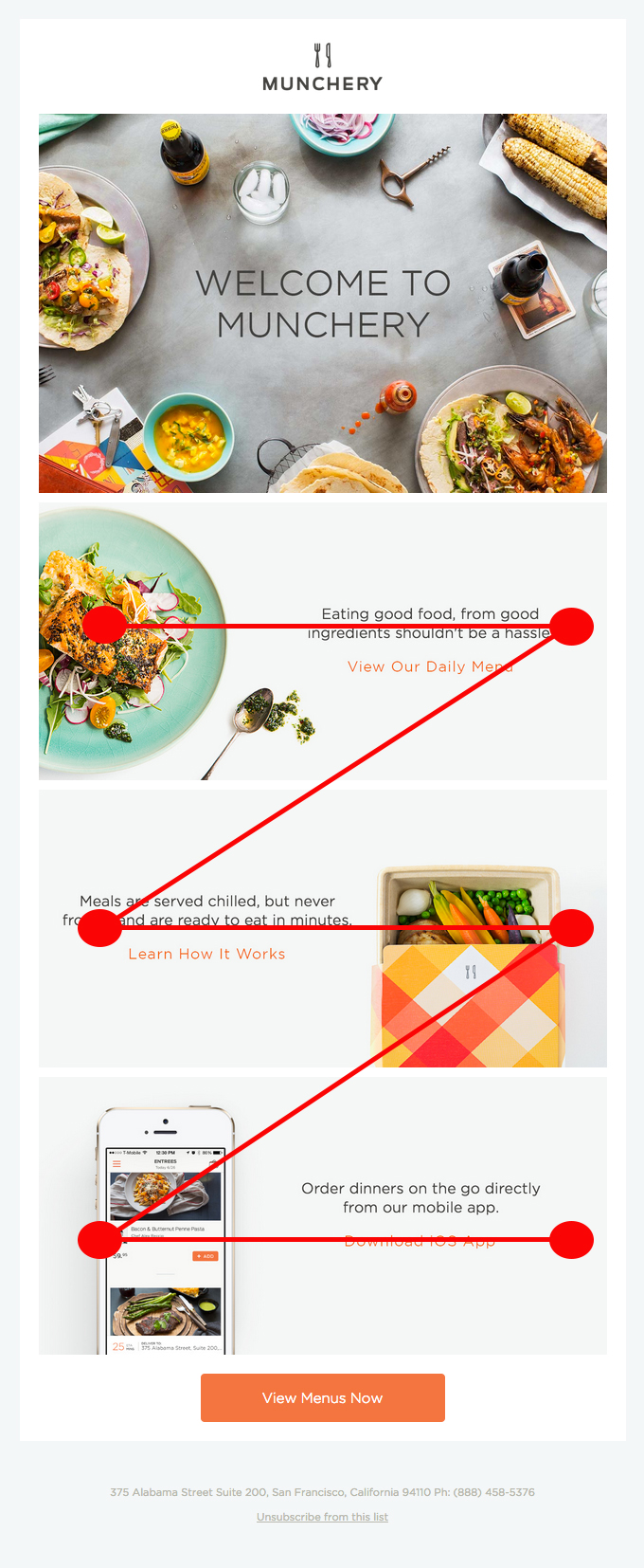
In this example, images and text are used to take advantage of the Z pattern.
It’s a popular layout with ecommerce as it allows you to place multiple product images alongside short descriptions.
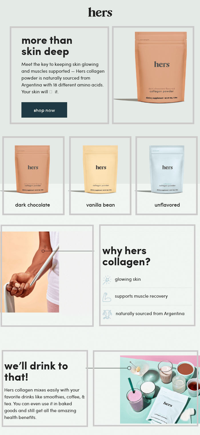
Hybrid layout
This is simply a combination of single-columns and multiple-columns used in the one email. It’s often used with a hero image, followed by sections of two or three columns to highlight additional messages or products.
And here it is in action:
The grey boxes show how the email layout switches from single-column to three columns, followed by two columns.
It’s a great layout if you’re packing a lot into the one email as it maintains a strong hierarchy with that first hero image. It also enables you to use multiple CTAs without confusing the main message.
💡 Whichever email layout you use, position the most important content above the fold – the area that your subscribers see first after opening. This should include your primary CTA.
Header
The header is the first thing people will see when they open your email. Which is why it’s the best place to include your logo and company branding. That way, readers know exactly who the email is from and what to expect.
This is also where you should include an option to view the email in a browser, in case the email doesn’t load properly in the reader’s email client.
It’s also a good spot to include a navigation menu with links to important or popular pages on your website.
Here’s an example from fashion brand Reiss:
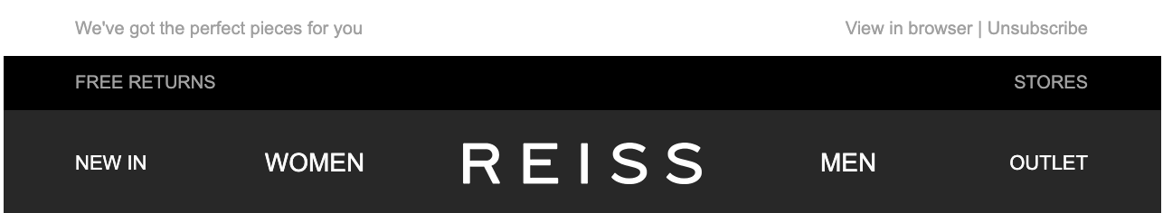
It’s clean and simple. Which is what you want. Think of your email as a sandwich with the header and footer the two pieces of bread and the main content of your email the sandwich filler. Make sure it’s all about the filler!
Footer
The footer sits at the bottom of an email. It should contain links to your privacy policy and provide the option to unsubscribe from future emails. It’s also a good place to put social media icons with links to your business pages.
Depending on your industry, you may also want to include legal fine print in your footer. For example, if the newsletter contains a promotion, the footer should include the terms and conditions of that promotion.
You should also include a valid postal address for your business to ensure you’re abiding by international email regulations.
When considering the look of your footer, opt for a lighter colour font so that the footer is clearly separate from the main body of the email and doesn’t distract readers.
In the example below, Holland & Barrett use a pale grey background and smaller font to distinguish the footer from the rest of the email:
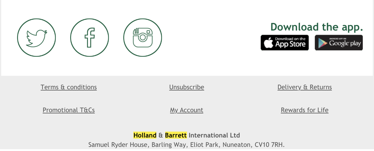
For consistency, use the same header and footer across all of your email campaigns. Save these in a template to save you time crafting each new email.
Images
We’ve all heard that a picture is worth a thousand words. No surprise then that images are an essential part of good email design.
What may surprise you is that images are processed up to 60,000 times faster than text. So with images, you have a better opportunity to more quickly entice, delight and persuade customers than you do with a paragraph of text.
That’s why many emails will lead with a hero image – a photo or graphic that sits at the top of the email and is usually the first thing readers see. According to the principles of visual hierarchy, design elements should be organised according to their importance. This dictates the order in which we notice things.
So if you’re using a hero image, it should contain the most important information within the email. Pick an image that encapsulates the message of your email. And don’t be afraid to include text on your hero image.
Here’s an example of an effective hero image from Australian charity CARE:

This hero image works well for a number of reasons:
- It’s engaging – your eye is immediately drawn to the smiling face that’s looking straight at you. It’s helped even more by the blurred background that keeps you focused on the face.
- It compliments the copy – the image matches the message, ties in nicely with the brand and provides context to the email.
- It’s compact – text is included in the image to tell readers what the email is (January’s newsletter) and what it’s about (they’re celebrating an amazing year).
When choosing images to use in your emails, opt for your own creative whenever you can. Stock imagery may be cheaper and easier to obtain but using photos that you own helps strengthen your brand identity. And it ensures no one else is using the same picture.
More tips on how to strengthen your brand identity in your emails can be found further on in this guide.
💡 If you’re an ecommerce brand, add a Pinterest ‘pin it’ button to your product images. This allows readers to save products they’re interested in and helps promote your brand across Pinterest.
Image size and formats
To ensure faster loading times in your recipients’ inbox, save images at 72 dpi to keep the file size down. Aim for a width of 1200 pixels to keep your images nice and crisp. But make sure each image in your email is less than 500kb in file size as large images can harm your deliverability. They also take longer to load, which affects the user experience.
It’s best to use the widely recognised file formats of JPG and PNG. Both formats offer good image quality with the option to save as smaller files for faster load times.
Whenever you include images in your emails, always add alt text so that readers can read what the images are about if they don’t load correctly. Alt text also makes your emails more accessible to visually impaired readers as the text will be read out loud by screen-reading tools.
More tips on how to make your emails more accessible can be found further on in this guide.
Using GIFs and videos
Photographs are just one option when it comes to hero images. You could also use illustrations, graphics or even GIFs and videos.
Animation and movement can help elevate your email and pack more content in too. You’re able to showcase different products or even demonstrate how something works.
Here’s an example from Bonobos:
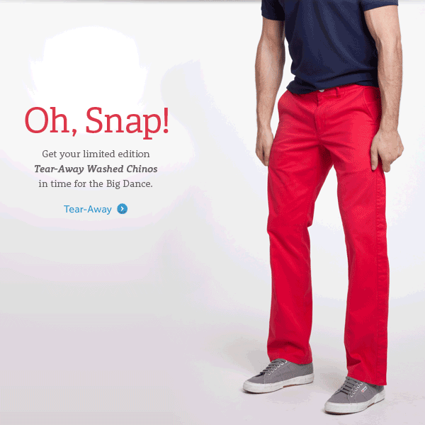
The animated GIF demonstrates how easy it use to remove their tear-away washed chinos. And you couldn’t help but pay attention to this when it lands in your inbox.
Read Litmus’s Guide to Animated GIFs in Email for more advice.
⚠ Be mindful that not every email client supports animated GIFs. Outlook is one of them. Where GIFs are not supported, the first frame is displayed as a static image instead. So treat the first frame like a hero image and you’ll be fine.
Using one big image
There’s no doubt that images are essential to good email design. But if you’re tempted to make your emails one big image – don’t. There are very good reasons why you shouldn’t send image-only emails.
Not only does this create a higher risk of being blocked by spam filters, there’s also a strong chance a percentage of your mailing list will receive a blank email if the image is blocked.
Text
Now that we’ve established how to use images in a well-designed email, it’s time to look at how best to use copy. The fonts you use, the size of text you opt for and the alignment all goes towards your overall design.
And speaking of overall design, you want a balance between text and images. Around 60% text and 40% images works nicely.
When you start writing your email, keep paragraphs short. Aim for no more than three sentences per paragraph and keep those sentences short too. This makes your copy easier to read and scan, which makes for a better reader experience.
Remember, your readers have limited time and attention. So you want your messaging to be as clear and concise as possible.
Consider using bullet points to list features or benefits and make your email even more readable. The example below shows how you might do this:
Fonts
Before we go any further – let’s clarify one thing. Font refers to the combination of typeface, style and size. Typeface is the particular design.
It’s advisable to use no more than three different typefaces in your email. You could use one typeface for your headings and another for body text. And perhaps a third for extra flair.
You can be creative here and combine serif fonts with sans serif fonts. Sans serif fonts are considered marginally easier to read on screen so best used for body text.
With text, size matters. For optimal readability, use font-size 14 or 16 for body text and 22 or 24 for headings.
⚠ Avoid using custom fonts if you can. These will not render correctly on the majority of email clients and you’ll need to specify a web-safe fallback font anyway, making the custom font largely redundant.
Headings
Headings help organise your email into easy-to-scan chunks. A good heading should be concise and tell readers exactly what the following copy is about.
You can add hyperlinks to headings if you have a relevant landing page on your website to direct readers to. But only if this doesn’t compete with the CTA.
CTAs
Calls-to-action (or CTAs as they are often referred to) tell readers what it is you want them to do. They should be clear, concise and include a verb to denote an action.
Having said that, it can be worth experimenting with more creative CTAs – “read more” may be concise but it’s not all that inspiring. See what works best for you.
Put your CTAs in coloured boxes to help make them more prominent. It should be a colour that matches the rest of your email but stands out from the background colour.
CTA buttons should be large enough not to miss but not so large that they overshadow other elements of your email. Allow plenty of empty space around the button to make it easier to click and give it more attention.
Your most important CTA should be above the fold – readers should see it in their inbox without needing to scroll. And it’s a good idea to limit CTAs to a maximum of three or four to avoid confusing your message. Focus on driving your readers to one particular action.
If you’re using multiple CTAs, consider using different colour combinations. For example, use your brand colour with white text for the primary CTA and a grey background for the secondary CTAs. Here’s an example to show you what we mean:
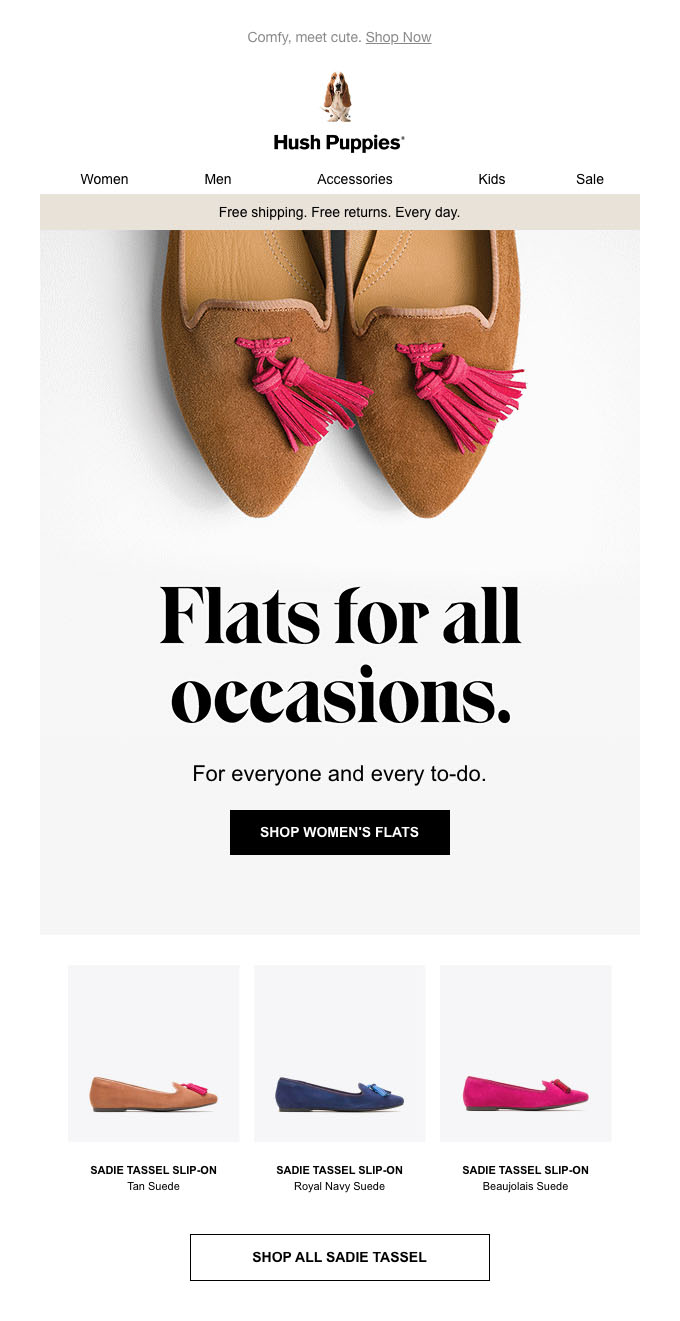
Hush Puppies have made their primary CTA more prominent with a dark background and light text while the secondary CTA uses the same colour as the email background.
You can also use different sizes for your CTA buttons to help distinguish which is most important.
Creating a strong brand identity in your emails
Every email you send should be a positive reflection of your brand. Readers should be able to quickly look over your email and know who it’s from.
To build a strong brand identity across your email campaigns, it’s important to have a set of design guidelines that can be applied to every email. Whether that’s a transactional email or a promotional email.
To start creating that design guideline, consider how you display your logo, what fonts you use, your colour palette and the style of images you use.
Branding
Featuring your logo at the very top of your emails is one way to do this. Another is by using the same fonts you use on your website.
In fact, one of the best ways to maintain a strong brand identity is to ensure your emails visually match the landing page on your website. If a reader clicks a link in an email, they expect to find a similar visual experience when they land on your site.
Colours
Colour is said to improve brand recognition by 80%. It’s why so many brands stick to one colour – think of EasyJet’s shade of orange or Cadbury’s particular purple hue.
Use your brand colours in your emails – everywhere from the header to the CTA boxes. Although many brands prefer a white background with accents of colour in their emails, don’t be afraid to use paler versions of your brand colours as a background instead.
Your text may be another feature where you utilise brand colours. If you use a certain tone of grey for the text on your website, then use the same colour in the text of your emails. You can also use your brand colours to highlight hyperlinks.
Here’s an example of how EasyJet uses its brand colours in email:
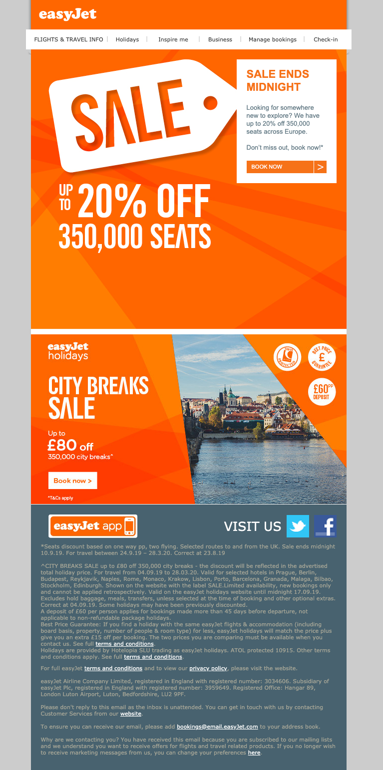
The company’s distinctive orange is used prominently throughout the email with a secondary brand colour in the footer to separate the legal copy from the main body of the email.
If your brand only consists of a limited number of colours, create a wider palette using Adobe Colour. This free online tool suggests palettes based on colour theory principles. You can choose from complementary, monochromatic and analogous colour combinations.
Simply add a primary colour or upload a screenshot of your website and Adobe will do the rest. You’ll now have a choice of harmonious colours to use in your email campaigns to broaden your palette.
Imagery
If you use illustrations on your website instead of photographs, continue this trend in your emails. Stick to the same illustrative style for consistency.
If you have the budget, shoot your own photographs. This ensures no other brand is using the same images and helps strengthen your brand identity.
Stock imagery is great if you’re on a budget but there’s always the risk that the picture you’re using has been used by multiple other brands too.
Optimising your emails for mobile
According to various reports, almost half of all emails are read on mobile devices. Which is why it’s essential your emails are optimised for mobile.
When you craft an email campaign, you’re most likely doing so on your desktop computer and checking the test sends on the same device. That means you’re designing your emails for desktop but it’s wise to design for mobile-first instead.
Here’s how you do it.
Use a responsive template
Responsive email templates are designed to automatically fit the screen on which they’re being viewed. Whether that’s a mobile phone, a tablet or a desktop computer.
If you’re using templates provided by your ESP, make sure they’re fully responsive. The same goes if you’re employing a professional to design your templates for you.
Make sure you’re testing on mobile before you hit that send button. You may find the way your email renders on mobile isn’t the best layout for that device, even though it’s responsive. Keep iterating your design until it looks great and works perfectly on mobile.
Break up text
One of the rules of good copywriting for emails is less is more. Be as concise as possible. This is especially true for mobile where large chunks of text appear even more dense as the restricted width crams copy into a smaller space.
The result? More scrolling required to read the full paragraph.
Keep it short and sweet, and don’t include more than one hyperlink per paragraph. If any. It saves the reader accidentally clicking on the wrong link as they’re too close together.
CTA buttons are more mobile-friendly than text links so use these instead where you can.
Use plenty of empty space
To make your emails as click-friendly as possible on mobile devices, include lots of space around CTA buttons and links.
It’s also a good idea to include empty space throughout the email – around images, headings and text. This helps break it up and makes it easier to read.
If you follow these extra tips and all the other guidelines presented here, you’ll have beautiful emails that look great on all devices.
Making your emails accessible
We’ve already spoken about the importance of using alt text in your email images but there are other ways in which you can make your emails more accessible.
Colour blindness
Colour blindness affects 1 in 12 men and 1 in 200 women around the world. A subscriber with colour blindness may not be able to differentiate between some colours in your email or may have a harder time distinguishing text on a background if the contrast between the two is low.
Use an online colour blindness simulator to check how your images appear to people with the condition and adjust your creative where necessary.
Readability
Make your text as easy to read as possible by using a minimum font size of 14 pixels and using left-alignment in paragraphs. This has been proven to be easier to read than justified text where letter and word spacing is adjusted to align with with left and right margins.
All-capital headings are harder to read than normal caps so opt for the latter to make your emails more accessible. Using sans serif fonts, such as Arial and Verdana, also improves readability of your text.
To help inform readers of where a link might take them, feature meaningful link text. Generic link text like “click here” doesn’t provide much information on its own so, as an example, try “click here to view our shoe collection” instead.
What to do once you’ve designed your email
Test, test and test again!
Before you send your email to your database, it’s vital that you check for typos, incorrect links and alignment. It’s also important that you check how your email renders across different devices.
Paid tools like Litmus and Email on Acid enable you to preview what your email will look like on pretty much every technological device known to man. These tools can also confirm content is accessible by subscribers of all abilities to maximise reach and test campaigns against spam filters for improved deliverability.
Useful tools for designing emails
We’ve referenced a few handy tools to use when creating your emails. Here they all are for quick reference, along with a few extra:
- Really Good Emails – curated collection of emails showing off design and code
- Milled – search engine for email newsletters
- Beetle – online catalogue of emails
- Adobe Colour – use this free online tool to generate colour palettes
- Litmus – paid software to test, optimise and analyse your emails
- Email on Acid – paid pre-deployment email checklist
- Pixabay – high quality stock images available for free
- Canva – create beautiful images for your email campaigns and free for individual users
- Hemingway – online app to make your writing clear and readable
- GIFmaker.me – free online tool that creates GIFs from your uploaded images and video
- Coblis Color Blindness Simulator – useful tool to check how your images appear to people with colour blindness
- AppyPie Emoji Maker – free tool for creating custom emojis to add to your emails

No Comments
Leave a comment Cancel