There probably are more people talking about good design for websites than email, for obvious reasons, but there are still plenty of people who think that good email design is important.
In fact, a lot of the same principles that apply to designing good websites also apply to designing good email templates. The key is to keep things simple and easy to read, while still making sure that the email looks good
Why does email design matter?
A good and creative email design has a significant impact on how effective your email campaign will be. The goal of an email is to grab the reader’s attention and motivate them to do what you’re asking them to do, whether that be to buy or read your blog post.
Poorly designed emails with no focus on the end goal are not able to do that.
A good and engaging email also creates a sense of lasting brand awareness and is useful if you want to build a long-term relationship with the reader.
Things a good email design helps with:
- Better return from your email campaigns
- Improve brand identity and sense of trust in reader’s minds
- Makes the email easier to navigate
- Improves accessibility
Tips that will help you make well-designed email
Well, there are several things to keep in mind, but here are the most crucial ones that you should always keep in mind.
1. Optimise your images: You must have heard this for your website, but that stands true with emails too. Using a tool like TinyPNG or any other image optimiser tool will help you reduce the image size and will guarantee that your images load without making your reader wait.
2. Double-check in light and dark mode: We are in an era where many people are switching to dark mode. This is why you should always test your email design in light and dark modes. You can do this by sending a test email to your own email and try enabling and disabling dark mode in your email app (like Gmail or Zoho) to see if the email looks good. This process is especially important if your target audience are devs and tech people as they have the highest dark mode adoption rate.
3. Clear CTA: Many times marketers send emails with their target link attached to an image which is part of the email design. Well, that’s the wrong way, the reader might click the image mistakenly and this affects the UX. What you want is to have a clear actionable CTA that the reader will click.
4. Add ALT text: There would be emails which you would send with multiple images, but chances are that the reader’s email clients (Gmail, Hotmail, etc.) have images disabled. Your image ALT text helps here in improving accessibility for those who may be using screen readers or who are loading emails without images.
Email design inspiration
Now that you know the basics, let’s jump directly to some email design inspiration so you can get practical insight into creating a good email.
1/ Newsletter onboarding email: Marketing Examples
Most of you should already have a newsletter for your brand or publication. That’s a great way to keep your contacts warm and engaged, but have you seen what your welcome email looks like?
It’s the first impression and better be good.
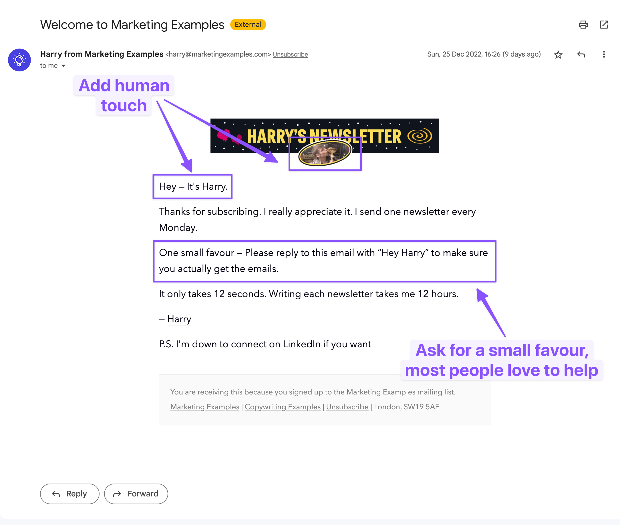
Harry from Marketing Examples has one of the best newsletter onboarding emails which everyone should take notes from. Have a quick look before we proceed to the explanation.
So here are the things Harry is doing right:
1. Making it personal: By adding a photo of his own face, the email gives a quick psychological idea that this email was written and sent by Harry even though it is completely automated.
2. Short and concise: Harry clearly understands that the user has just subscribed, and it is better to keep the email crisp, short and concise so that the reader stays while he builds his connection with the upcoming emails.
3. Ask for help: Harry also cleverly asked the user to do a small action which is replying to the email he sent. It does 2 things. First, gives an idea to Gmail and others that the email is important; and second, this small action may lead to a conversation which is useful for conversion at later states.
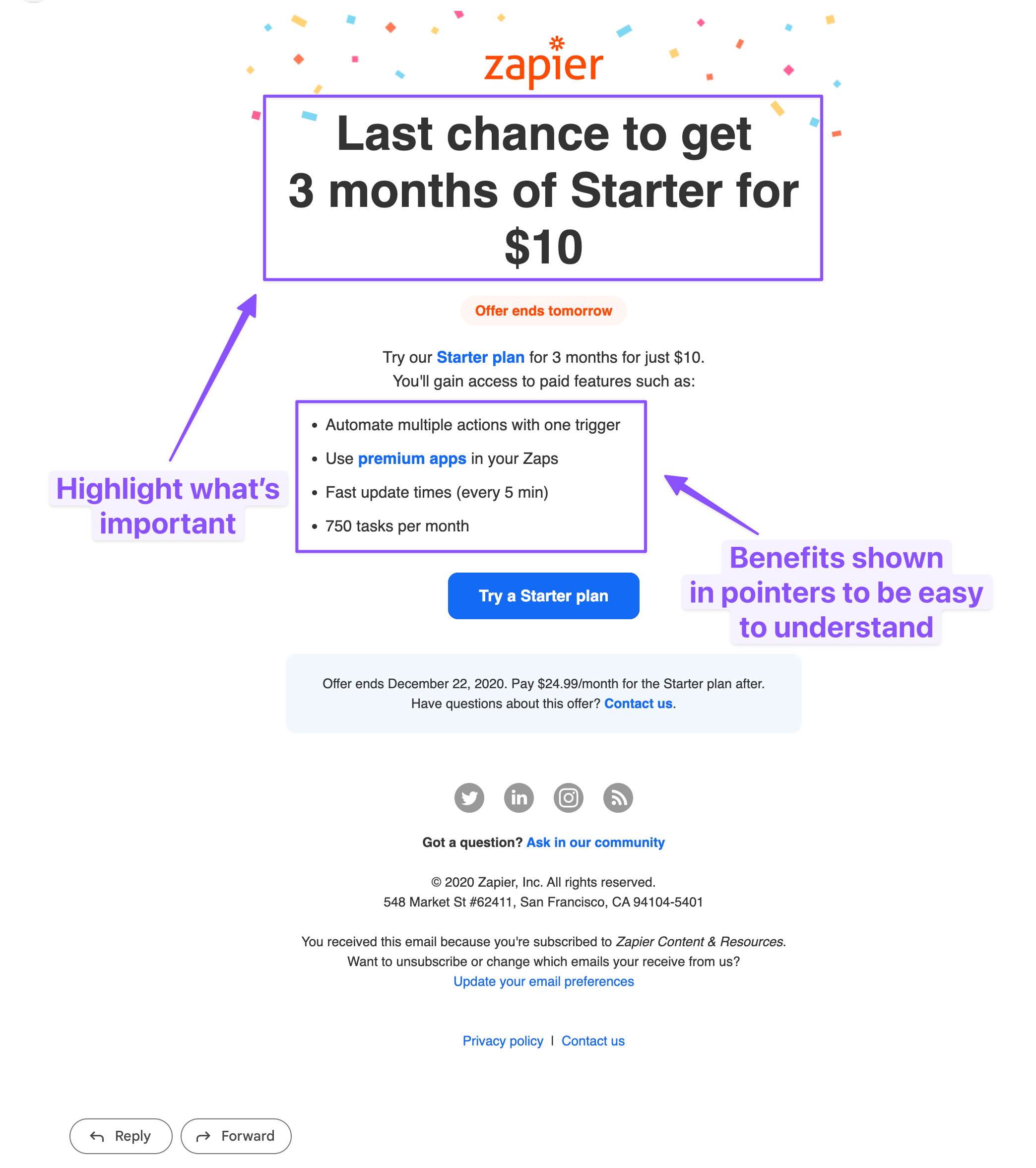
2/ Discount email: Zapier
Most discount and sale emails these days are cluttered and feel spammy with too many images.
Marketers try to cramp in as much info as possible, but they probably forget to consider whether the reader will read the whole email or not.
Moreover, too many images makes the email load slowly, especially when the user is on a slow cellular internet.
So here are the things Zapier has done right:
1. Clear offering: One of the many things that Zapier has done correctly here is by making the value proposition of the email clear by adding a discount message at the top in large fonts. This makes the user take quick action as they get the context in a single glimpse.
2. Well structured: The overall structure of the email is pretty straightforward with clear messaging at the top and well-structured everything else in short lines, and pointers.
3/ Cart abandonment email: Headspace
Most e-commerce sites have cart abandonment enabled, but yet again all of them feel cramped and cluttered.
Let’s see how to create a clean yet effective cart abandonment email for your business with help of an example.
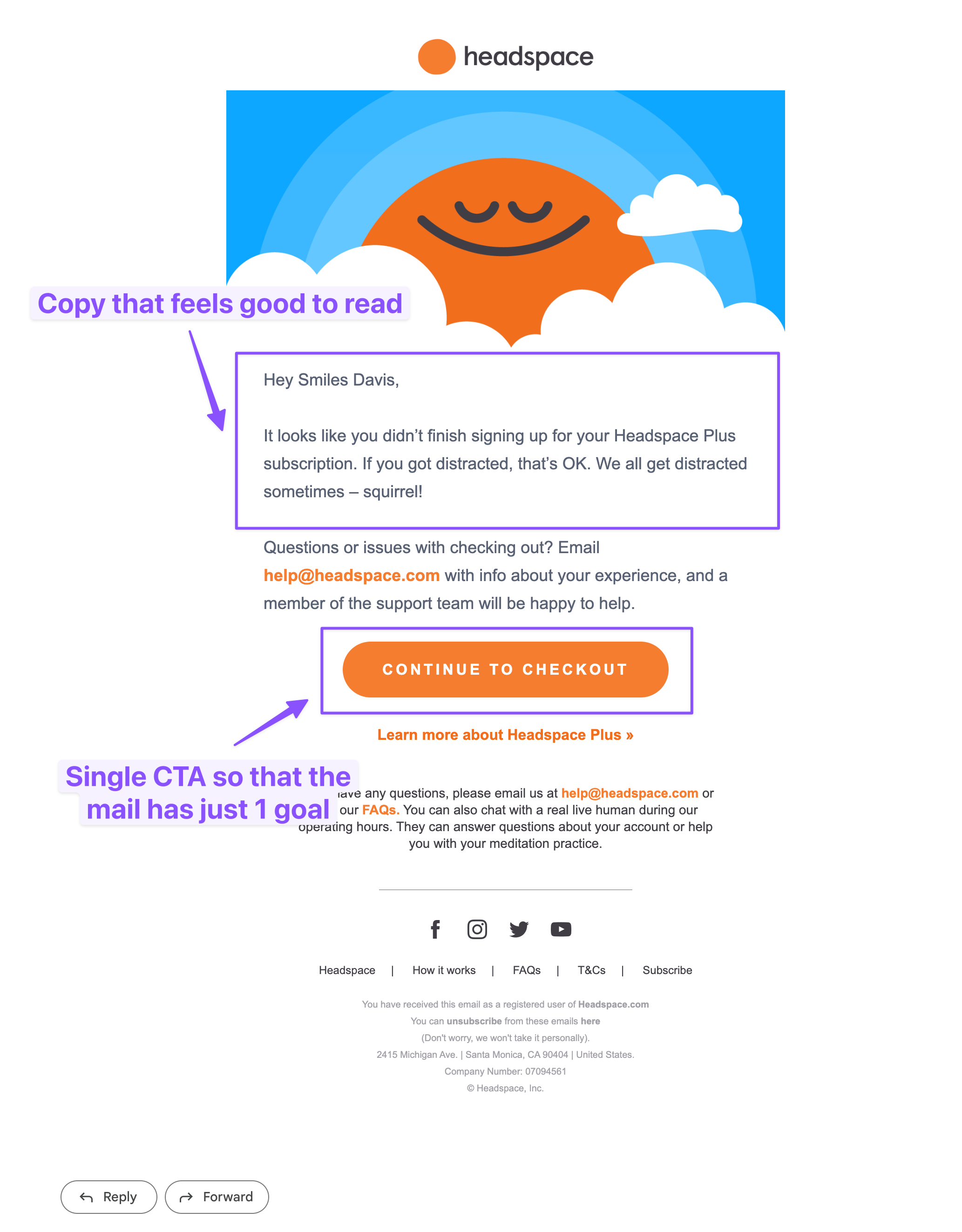
Headspace has a pretty minimalistic, goal-oriented cart abandonment email. Let’s see why it’s a great example.
1. Feels humane: A well-structured text in email always looks good, which the folks at Headspace have understood this very well and the same can be seen in their copy.
2. Minimum options: The more choices you give your reader, the more confused they get which in turn affects the conversion, it’s recommended to provide fewer options (3-4 max) to achieve a higher conversion.
Also, if you need an e-commerce specific email then have a look at this email by Massdrop.
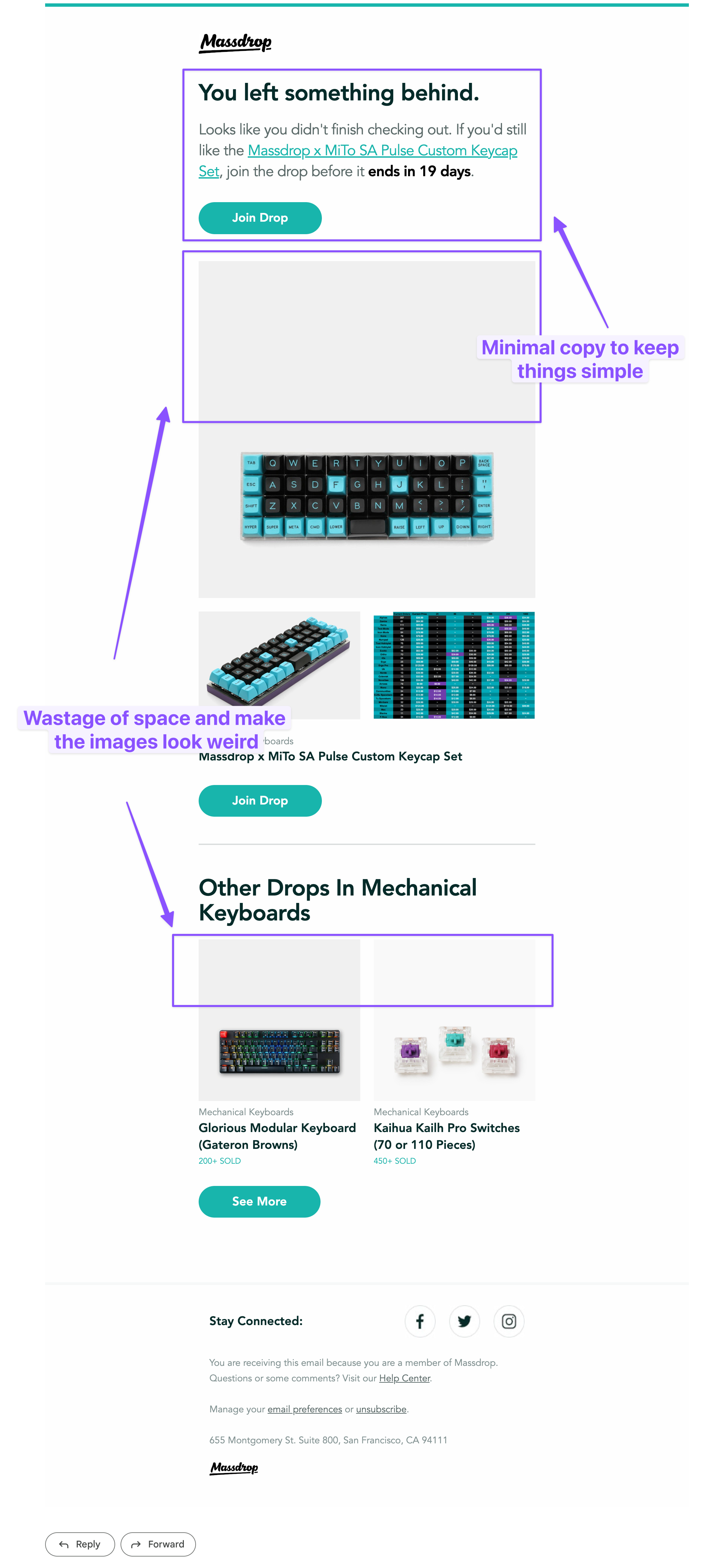
Only comment on the above email; would have preferred if if the images had less padding at the top, the rest looks good.
Conclusion
Now that you know what a good email design looks like, it’s time for you to make one for yourself.
Simply log in to EmailOctopus and use our no-code email editor or existing email templates to build an email marketing campaign that converts well. Feel free to share this article with your friends if you find this useful.


No Comments
Leave a comment Cancel