You’ve got your food blog filled with delicious recipes. And you’ve been busy building your mailing list, successfully converting your website visitors into subscribers.
Now it’s time to start developing your relationship with your new subscribers the second they sign up – when they’re most engaged and receptive to your message.
It’s time you set up a welcome email.
And we’ve got all the info you need to create one that your subscribers will love. Here we take a look at the welcome emails from some of the best-known food bloggers out there. And pick apart what makes these welcome emails ‘smashing’.
We’ve even provided takeaway tips you can use and take a look at how these blogs get website visitors to sign up to their mailing lists in the first place. In case you could use a little help there too.
So let’s jump straight in!
Page Contents
1. Pinch of Yum
Former fourth grade teacher Lindsay Ostrom is the woman behind Pinch of Yum, a blog that delivers millions of readers with flavoured-packed, healthy recipes that you’d actually try and make yourself.
There’s hundreds of recipes to search through on the website. But for those who want new recipes delivered straight to their inbox, there’s also a Pinch of Yum newsletter.
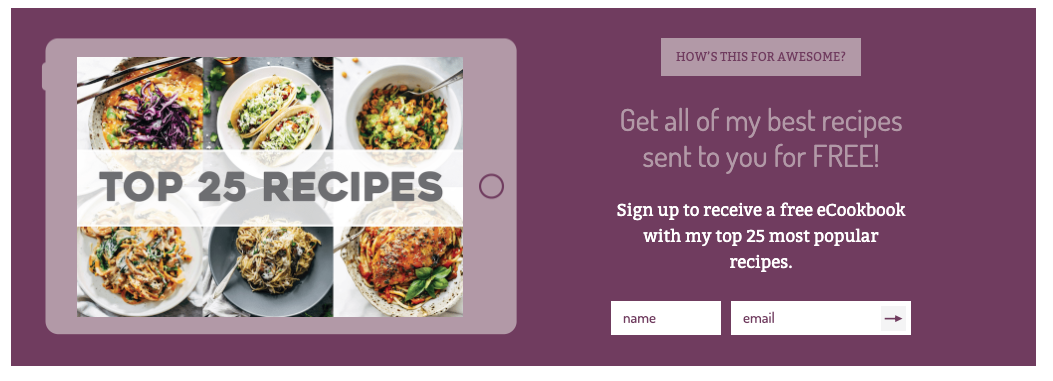
The website cleverly entices new subscribers to the mailing list with the offer of a free e-book with 25 of Lindsay’s top recipes. Here’s what the sign up form looks like:
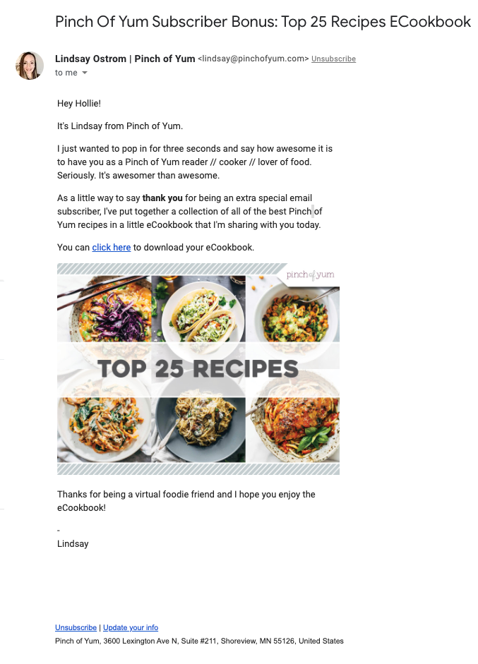
Once you’ve signed up, you’re immediately greeted with a warm welcome from Lindsay herself. After confirming your subscription, that is. This newsletter requires an email confirmation from new subscribers. Known as double opt-in, it’s a good way of ensuring real people are signing up to your list.
But back to the welcome email…
The Pinch of Yum welcome email – what makes it a winner?
Despite this being an automated email, it has plenty of the human touch. Lindsay’s name features four times in this email – in the subject line, the sender address, the intro copy and the sign off. That coupled with the profile pic makes it easy for readers to relate to the woman behind this blog as a real person.
And it’s helped even more by the use of the subscriber’s name. With “Hey Hollie!”, the reader is being addressed as an individual. This form of personalisation is so easy to use in email marketing yet powerfully effective. According to Statista, click rates for personalised emails average 2.1% compared to 1.9% without personalisation. That’s 10.52% higher.
There’s also plenty of language that makes the subscriber feel valued. Like “thank you for being an extra special email subscriber”. The whole tone of the email is warm and friendly. And it’s the copy that does the heavy lifting.
It’s easy to get carried away with designing a killer email created with fancy HTML. But this welcome email is pretty minimal. It’s mostly text with one link and an image (one link if you ignore the ‘unsubscribe’ and ‘update your info’ links in the footer).
What’s the benefit of this?
Well, studies by HubSpot concluded that plain text emails had a 25% higher open rate than HTML emails. And 23% higher click rates. That’s a staggering difference that has major implications for your own campaigns.
Although this email isn’t strictly plain text, it’s certainly low on HTML.
The final winning element of this welcome email is that it delivers on its promise. New subscribers were offered a free recipe e-book. And that’s exactly what they get with this email. There are no distracting secondary messages. No other CTAs. Just a ‘thanks for joining’ and ‘here’s your freebie’.
The result?
A happy subscriber that engages with the email and helps improve email deliverability for Pinch of Yum. WIN.
Takeaway tips
- Use personalisation – ask new subscribers for their name at time of sign up so you can address them by their name in your emails.
- Opt for a plainer email for better deliverability – a welcome email might be the best time to use a plainer email. The less HTML, the better the chances of delivery success.
- Offer something for free – build goodwill with your subscribers and give them something valuable that will whet their appetite for more of your content.
2. Minimalist Baker
Wife-and-husband team Dana and John Shultz founded the Minimalist Baker blog back in 2012. This popular blog celebrates simple cooking with recipes that you can rustle up in less than half an hour with no more than 10 ingredients.
It’s this simplicity – and no doubt the mouthwatering photography of indulgent desserts – that have gained Minimalist Baker a devoted following of millions worldwide. And like other food bloggers, email is a key way in which they grow their brand.
Since the beginning of 2019, Minimalist Baker have been using EmailOctopus to send out their newsletters and recipe round-ups. So yes, we may be a little biased!
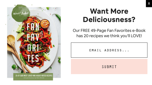
A sign up form pops up within seconds of loading the homepage. This tactic is a good way of getting your message in front of website visitors straight away. And if you’re offering a freebie (in this case, a free recipe e-book), you’re more likely for that message to work.
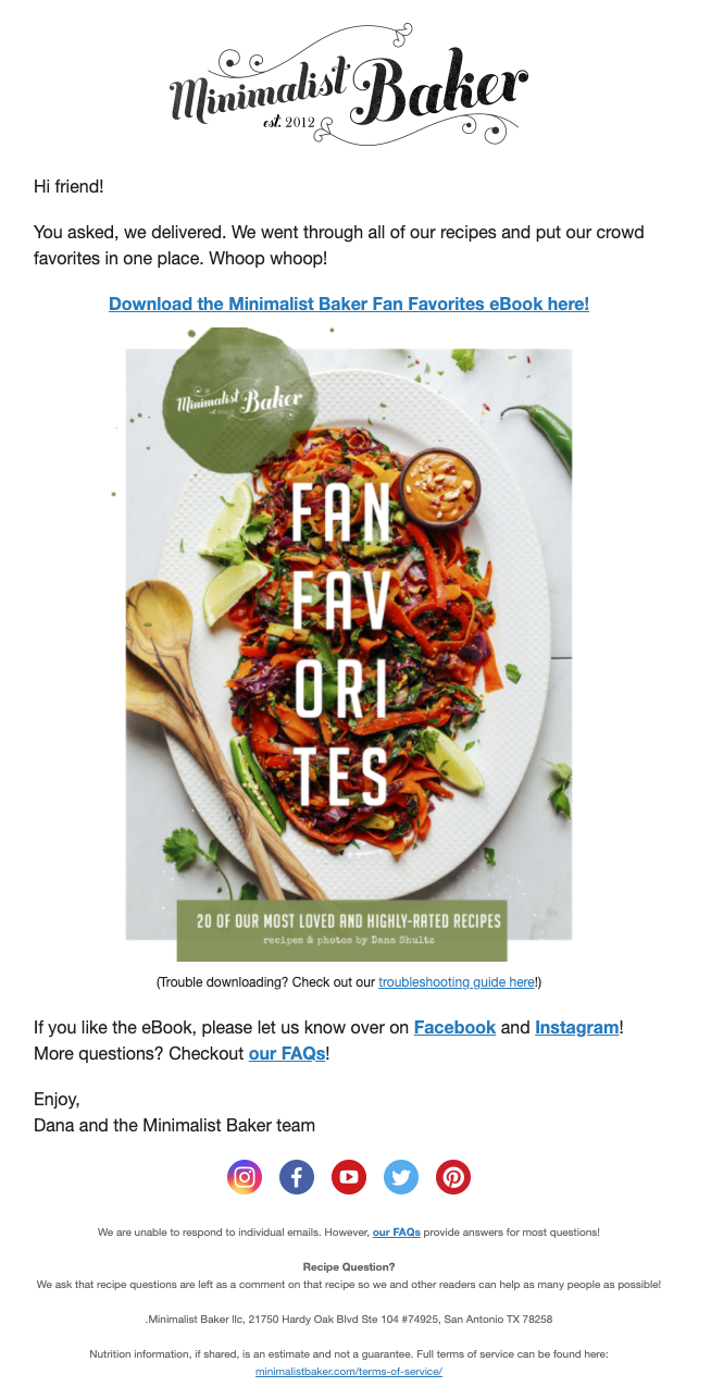
Moments after subscribing, an email arrives in your inbox with that free e-book. Like the majority of food bloggers we’ve looked at so far, Minimalist Baker use a single opt-in process. Which is the more popular option when growing your mailing list is the main goal.
The Minimalist Baker welcome email – what makes it a winner?
The first thing that should strike you about this welcome email is how low it is on text. There’s just a few short sentences. It’s also low on images too – there’s just the one image of the e-book and the brand’s logo.
This has its advantages.
By keeping text and HTML code to a minimum, you achieve two things:
- You keep the focus on the main message of your email – and when there’s less to focus on, you’re more likely to hold the reader’s attention
- You increase the likelihood of subscriber engagement – as we discovered earlier, plain text emails have, on average, 10% greater click rates.
Speaking of engagement, Minimalist Baker actively seek a response from new subscribers. They ask anyone who likes the free e-book to let them know on their Facebook or Instagram channels. This is a great example of using the principles of reciprocity – give something for nothing, and then ask for a small favour in return.
It’s also a tactic that is likely to increase their social following. And possibly even garner some free promotion as subscribers share the e-book with others.
Despite the limited use of copy, there’s still just the right amount of intimacy created with a smattering of the pronouns ‘you’ and ‘we’. Minimalist Baker don’t ask for your name when signing up. So they’re limited in how much they can personalise their emails. But rather than not addressing the reader at all, they’ve used the greeting “Hi friend!”. Which is more personable than simply “hi” or “hi there”.
Takeaway tips
- Reduce HTML to a minimum – you can create a smart-looking email without going overboard on HTML. Keep it clean and simple, and you increase your chances of getting more emails delivered, opened and clicked.
- Keep your copy short and sweet – welcome emails don’t need to be lengthy. A short greeting and delivery of what readers signed up for can be just as effective as a longer email with more information.
- Encourage engagement – if you’re giving away something for free, it’s ok to ask for a little something in return. Encourage readers to post on social media to promote your freebie to a wider audience. And perhaps gain new followers in the process.

3. Simply Recipes
This wholesome, family-run food blog is all about great tasting dishes made from scratch with healthy ingredients. What started as a personal record of recipes has grown into a website that receives millions of website visits each month.
And a fair portion of those visits to Simply Recipes are converted to email subscribers with a non-intrusive opt-in form. It asks for the bare minimum of data (only an email address), which reduces friction and makes it easier for visitors to subscribe.
The form also gives a good idea of what subscribers can expect from this newsletter – recipes, meal plans and exclusive content.
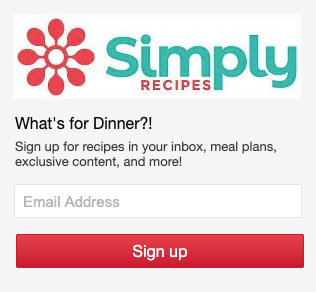
Within seconds of signing up, you’re welcomed to the family. And as another tactic to reduce friction, there’s no double opt-in or email confirmation required.
The Simply Recipes welcome email – what makes it a winner?
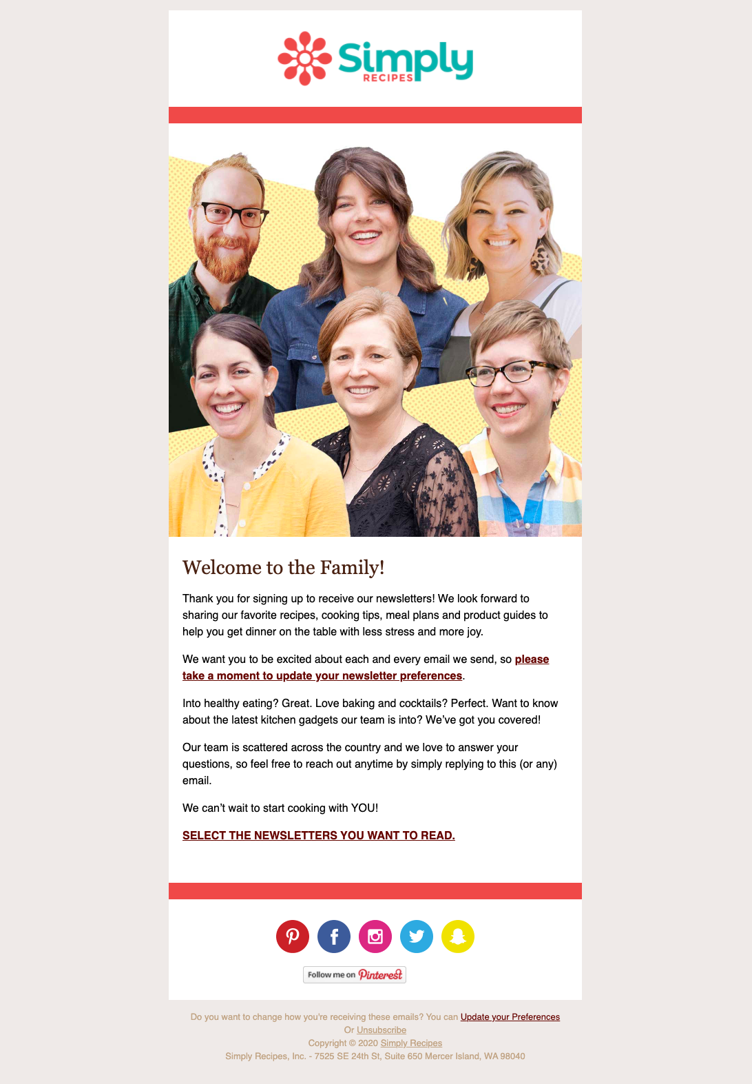
As soon as you open this email you’re hit with smiling faces against a sunny yellow background. It creates a cheery disposition that perfectly reflects the brand’s wholesome family image. And in the email, branding is consistent with the website to strengthen brand identity and recognition.
The inclusion of smiling faces also helps humanise what is an automated message. New subscribers are being welcomed to a ‘family’. So the images of people reinforce that message and invite readers to relate to the brand on a human level.
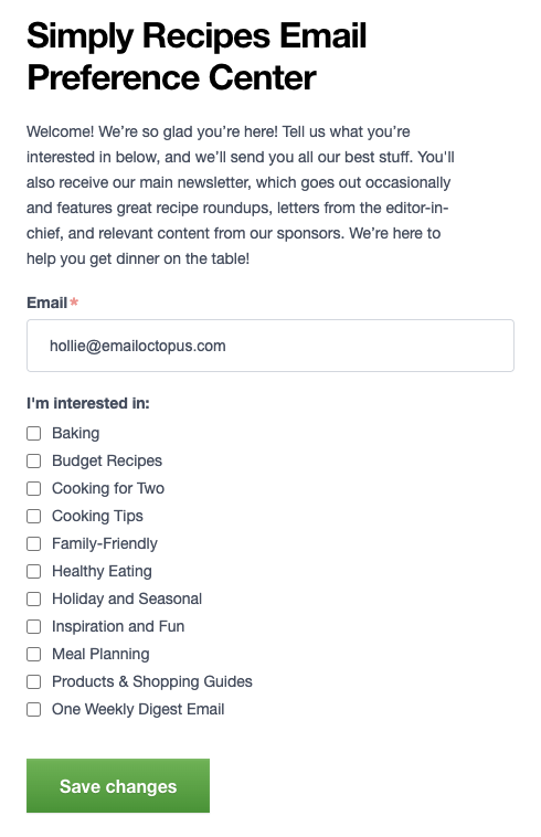
To further develop this new relationship, Simply Recipes wants to know what it is that new subscribers want. It’s why they ask new subscribers to update their preferences. The two links in this email lead to the same place – a preference centre. This is where subscribers choose the topics that most interest them.
Why give subscribers a choice?
Well, the better you understand your subscribers’ interests, the more effectively you can segment your mailing list. And better tailor your content to suit the person reading it.
According to data from MailChimp, segmented emails achieve 14.31% higher open rates than non-segmented emails. And earn 100.95% higher click-through rates too. Asking new subscribers to update their preferences pretty much guarantees better campaign performance in the future. So it’s well worth doing.
And your welcome email is the perfect time to ask. After all, it’s when your subscribers are most engaged – they’ve visited your website and told you they want to hear more from you!
Which also makes it a good time to encourage subscribers to follow your social media channels too. In this welcome email, there are links to all of the Simply Recipes social channels. But there’s a CTA that specifically highlights Pinterest where they receive 10 million monthly unique viewers.
Takeaway tips
- Design your welcome email to be consistent with your brand – if you’re going to use images and graphics, make sure your welcome email mirrors your website design so new subscribers better recognise and recall your brand.
- Include a preference centre – now’s the perfect time to get more information from your subscribers so you can tailor your content to suit them.
- Invite follows on your social media channels – while subscribers are most engaged, encourage them to follow your brand on social media to increase your reach across different channels.
4. Food52
Founded in 2009 by two veteran food writers, Food52 began life as an online source of recipes. Over the course of the past decade, the site has become something much bigger. The blend of content, community and commerce, with a thriving marketplace and reader submissions, has seen Food52 recently valued in the multi-million range.
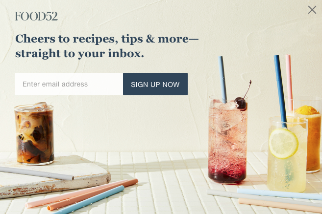
As well as recipes, the site stocks a wide range of cookware, kitchen utensils, pantry staples and home accessories. It even has its own wedding registry. So to convert more website browsers into shoppers, Food52 are quick to ask for an email address.
After landing on the homepage, you’re greeted with a pop-up form. The CTA is clear and concise. And the size of the image makes it pretty hard to ignore.
When a website visitors does subscribe, they’re instantly greeted with a welcome email and the invitation to “make yourself at home”. Again, no double opt-in here, making the journey from sign-up to first email smoother for the subscriber.
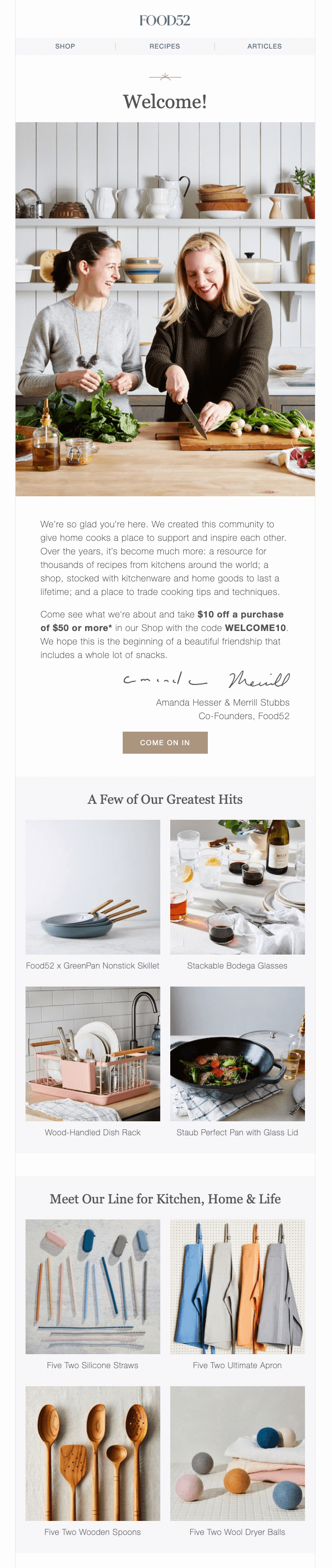
The Food52 welcome email – what makes it a winner?
While other sites have kept their welcome email simple with just one CTA, Food52 takes a far different approach. They’ve used their welcome email as an opportunity to thoroughly introduce new subscribers to their brand. There are recipes to read and products to buy. Choice is the guiding principle here. And there’s lots of it.
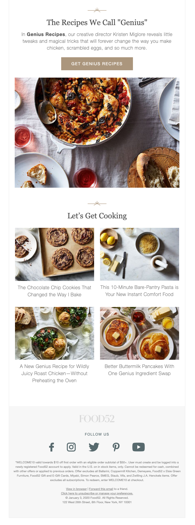
Essentially, this welcome email helps subscribers navigate the website. In the header there are navigational links to the three key areas of the website – shop, recipes and articles. And in the main body of the email there are links to Food52’s most popular products and content.
This showcases Food52 at its best. They’re sharing content and products that they know are a hit with their readers. And by including so many different links, the marketing team get to see what interests each reader. A click on the roast chicken recipe gives you a clue that this reader is likely a meat-eater. While a click on the reusable silicon straws might suggest the reader is eco-conscious.
Remember – the more you know about your subscribers, the better. It helps you tailor your content more effectively.
To drive sales, there’s an exclusive welcome discount. New subscribers get $10 off their first purchase worth $50 or more. This is delivered to potential new customers just after they’ve expressed a clear interest in the brand. In other words, if a subscriber is going to purchase from Food52, it’s likely to be now.
Using a discount code and only offering this discount in the email (not online, not on social media) is a great way to capitalise on the psychology of exclusivity in marketing. You’re making people feel part of something special. And that makes them more inclined to part with their money.
Takeaway tips
- Tell new subscribers what you’re all about – if you’re a brand that has lots to offer, consider using your welcome email as a way to show subscribers what they can get from you. Whether that’s content, services, products or a combination of all three.
- Give new subscribers an exclusive offer – improve the chances of an online purchase by offering a welcome discount. Savvy consumers will be expecting this so the intent is there. Take advantage of that intent.
- Showcase your most popular content – if your food blog is years old, it’s going to have a lot of content. Share your most popular recipes or products with new subscribers so that they see you at your best.
5. Natasha’s Kitchen
Ukrainian-born American food blogger Natasha Kravchuk has amassed a global following of nearly 10 million across social media since launching the Natasha’s Kitchen blog in 2009. And over 7 million people visit her website each month searching for family-friendly recipes made with simple ingredients.
Email is another channel in an extensive arsenal of marketing approaches that connects Natasha with her audience. So it’s no surprise that the website works hard to turn visitors into subscribers.
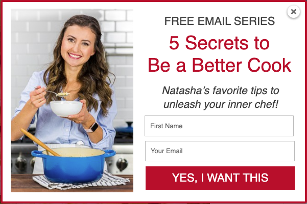
But rather than simply asking website visitors to sign up to the mailing list, Natasha’s Kitchen gives away free cooking tips in exchange for a name and email address. It’s done with a hard-to-miss sign-up form on the homepage, placed above the fold – which means it’s visible as soon as you land on the website.

And in case that sign-up form went unanswered, a pop-up window appears that’s even harder to miss. Once a visitor has been on the website for awhile, another sign-up form appears with a little more info about the freebie on offer and a different CTA to tempt new subscribers. It’s a clever use of sign-up forms to increase email opt-ins.
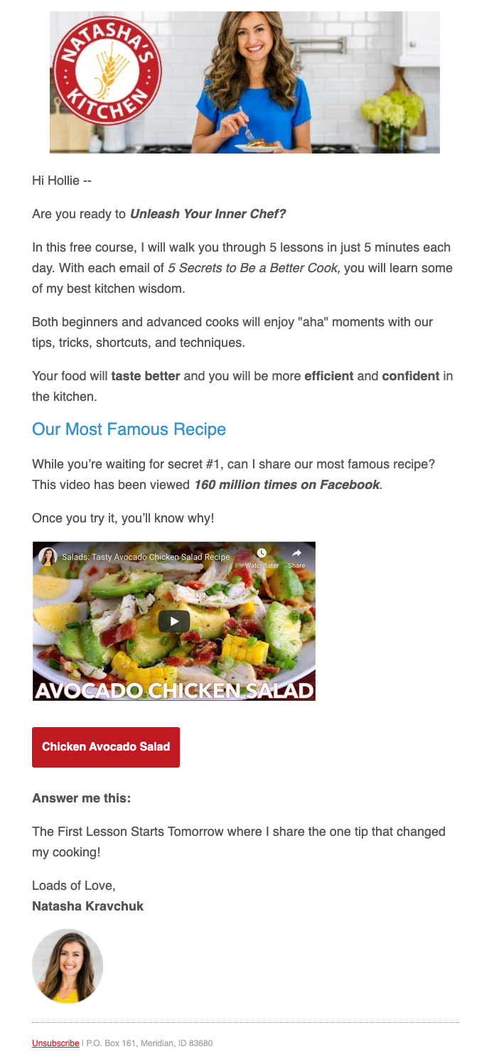
As soon as you’ve given your details, a welcome email arrives with details on what to expect. It’s a rundown of how these ‘five secrets’ will be revealed, with extra content to boot.
The Natasha’s Kitchen welcome email – what makes it a winner?
Natasha is the face of Natasha’s Kitchen. She essentially is the brand. And so like the website, pictures of Natasha are also prominent in her emails. It helps readers relate to the human behind the brand. And makes this automated communication that much more personable.
Sandwiched between these pictures of her smiling face is the main message of the email. It starts by building anticipation – “are you ready to unleash your inner chef?”. And then explains how Natasha will help you achieve that goal. In this case, through a series of emails (known as a drip campaign) that provide five daily lessons.
That was the incentive for subscribing to the mailing list. And now it’s being made clear to subscribers how that incentive will be delivered.
By setting expectations in this way, subscribers know to look out for future emails from Natasha’s Kitchen. And they understand the value that these emails will give them. It’s a great way of making sure your emails won’t be relegated to the spam folder. Or go unopened.
But subscribers don’t have to wait for value – there’s bonus content in this welcome email in the form of a popular recipe. And if that avocado chicken salad has already been viewed 160 million times on Facebook alone (a great bit of social proof there), there’s a good chance that new subscribers will like it too.
If you’re interested to see what comes next in the welcome series, check out our article on four examples of winning email courses where we teardown the Natasha’s Kitchen 5-day “How to be a better cook” sequence.
Takeaway tips
- Incentivise sign ups – repurpose your content and give it away for free in exchange for contact details. Take your most popular content and break it down into a format that works well as an email course. Make sure it’s content that people would want to receive in their inbox.
- Use drip campaigns to deliver content to new subscribers – welcoming new subscribers doesn’t have to be a one-off email. Consider using a series of emails to thoroughly introduce your brand and provide even more value with ongoing emails around a particular topic.
- Set expectations – tell readers how they will benefit from being on your mailing list and tell them when they’ll hear from you next. If you make your value obvious, subscribers will look forward to receiving your next email. Which helps future-proof your open rates.
Final thoughts
We hope after that deep-dive into these welcome emails you’re ready to create your own winning version. But here’s a few final thoughts to set you on your way.
A good welcome email campaign starts with an effective sign-up process.
Before you get to setting up your welcome email, make sure you’re clear on whether single or double opt-in is best for you. If your main goal is to grow your mailing list, then single opt-in reduces friction and makes it easier for website visitors to subscribe.
If your mailing list is already substantial and you’d rather focus on quality to improve campaign metrics, go with double opt-in. You might see a drop off between those that sign up and those that confirm their email. But those that do confirm their email are going to be higher quality subscribers.
Next think about ways you can make signing up to your mailing list an attractive proposition. Consider offering something for free – whether that’s an e-book with your most popular recipes. Or a series of emails that teach cooking tips.
Use the content that already exists on your blog to create new formats that website visitors would love to receive in their inbox.
Your next major consideration is how heavy you want to go on the HTML in your email design. The less HTML, the more likely a better delivery rate. And perhaps even more clicks. However, if you’d rather wow new subscribers with an email that showcases your branding, you’ll probably be using more HTML.
And once you’ve got your welcome email sorted, think about the different types of blogger emails you can continue to send to your audience.
Tips for writing your welcome email
When you’re ready to start writing your welcome email, keep these tips in mind:
- Personalise where you can – if you’ve collected names at time of sign up, use this in your greeting. If you’ve already asked for preferences, make sure you’re sending the content that best aligns with those preferences.
- Give it the human touch – a welcome email is an automated email. To make it seem less robotic, put a face (or multiple faces) to your brand. Sign off with your name and use images of the people behind the blog.
- Set expectations – give new subscribers an idea of how often they’ll hear from you. And what sort of content they can expect. This helps build some anticipation for your next email.
- Don’t be afraid to ask subscribers for something – you’ll rarely find subscribers as engaged with your brand as they are when they first choose to sign up to hear more from you. Now’s a good time to ask for a social follow or more information on their preferences.
- There’s no wrong or right email length – as we’ve seen, you can either keep your welcome emails short and sweet. Or pack lots of content into the one email. The choice is ultimately yours and it will depend on what you want to achieve with your welcome email. Test both options and see what works best for you.
For more tips, check out our guide to writing a great welcome email.
If you found this article useful, we’d love to hear from you in the comments section below. And we always appreciate a social share.
No Comments
Leave a comment Cancel