We have seen exponential growth in newsletters and email marketing happen in the past couple of years, and there’s no sign of stopping.
That is great, but have you noticed that the number of people signing up for your newsletter is way lesser than the number of people visiting the page with the sign-up form on it?
That’s probably because your subscription form and flow aren’t well-optimised. In this article, we’ll be discussing a few ways which will help you improve your newsletter sign-up conversion rate.
Why is this important?
We all understand how frustrating it can be to try to sign up for a newsletter or something, only to find that the sign-up form is long, unclear, and full of required fields that aren’t relevant.
To join a newsletter, users shouldn’t have to go through all of this.
Optimising sign-up forms is essential to providing a good user experience. By making the sign-up process quicker and easier, we can encourage more people to subscribe, which can lead to more customers and more revenue.
It also helps in getting better:
- RoI from paid traffic
- User experience and provides delight
- Drive long-term organic growth
1/ Ensure your form is visible
This might sound strange, but it’s a fact.
What happens is that at times that scripts from ESPs can be blocked by ad blockers that make the sign-up form hidden for those using ad blockers.
If you are using a JS-only sign-up form and if that script gets blocked by ad blockers, then the form never renders and the user doesn’t get to see it.
Here’s a real-world example of “Good Good Good” who were promoting their newsletter, but apparently their form wasn’t visible as their ESP’s scripts were blocked.
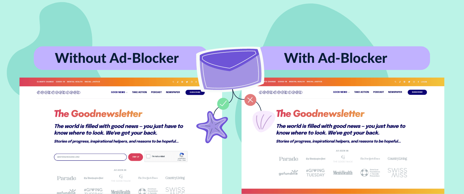
There are indeed a couple of solutions to it.
The easiest way is to just test your page which has the sign-up form with popular Ad Blockers and see if your form is still visible.
Alternatively, you can use something like HappyForms to fix this as well.
At EmailOctopus, we continuously monitor and test our scripts to prevent this issue for our customers.
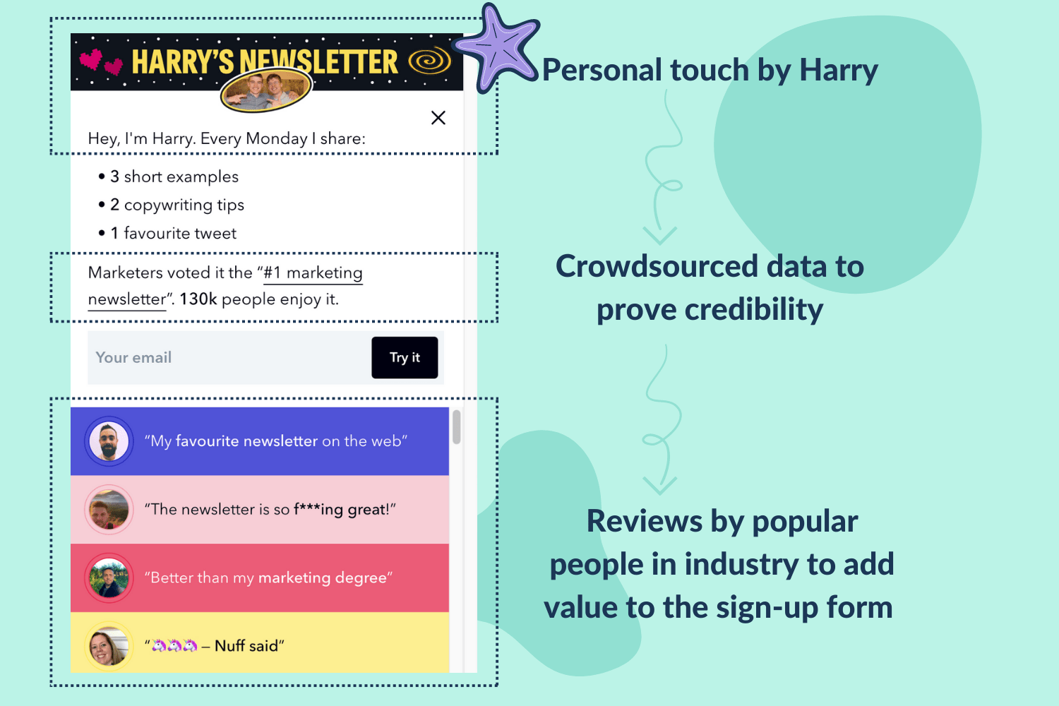
2/ Make your sign-up form feel credible
Your sign-up form comes with a purpose and that’s to motivate the user to type in their email and submit it, but if your form is too generic and boring then the conversion rate falls significantly.
People need to be motivated and excited for them to actually fill in their email and opt-in to receive your emails.
Harry from MarketingExamples does it the right way. He includes personal touch, credibility and excites the viewer to actually subscribe.
Another great example is by Glen Allsopp on his site Detailed.com which has the same thought process as of Harry’s.
Have a look.
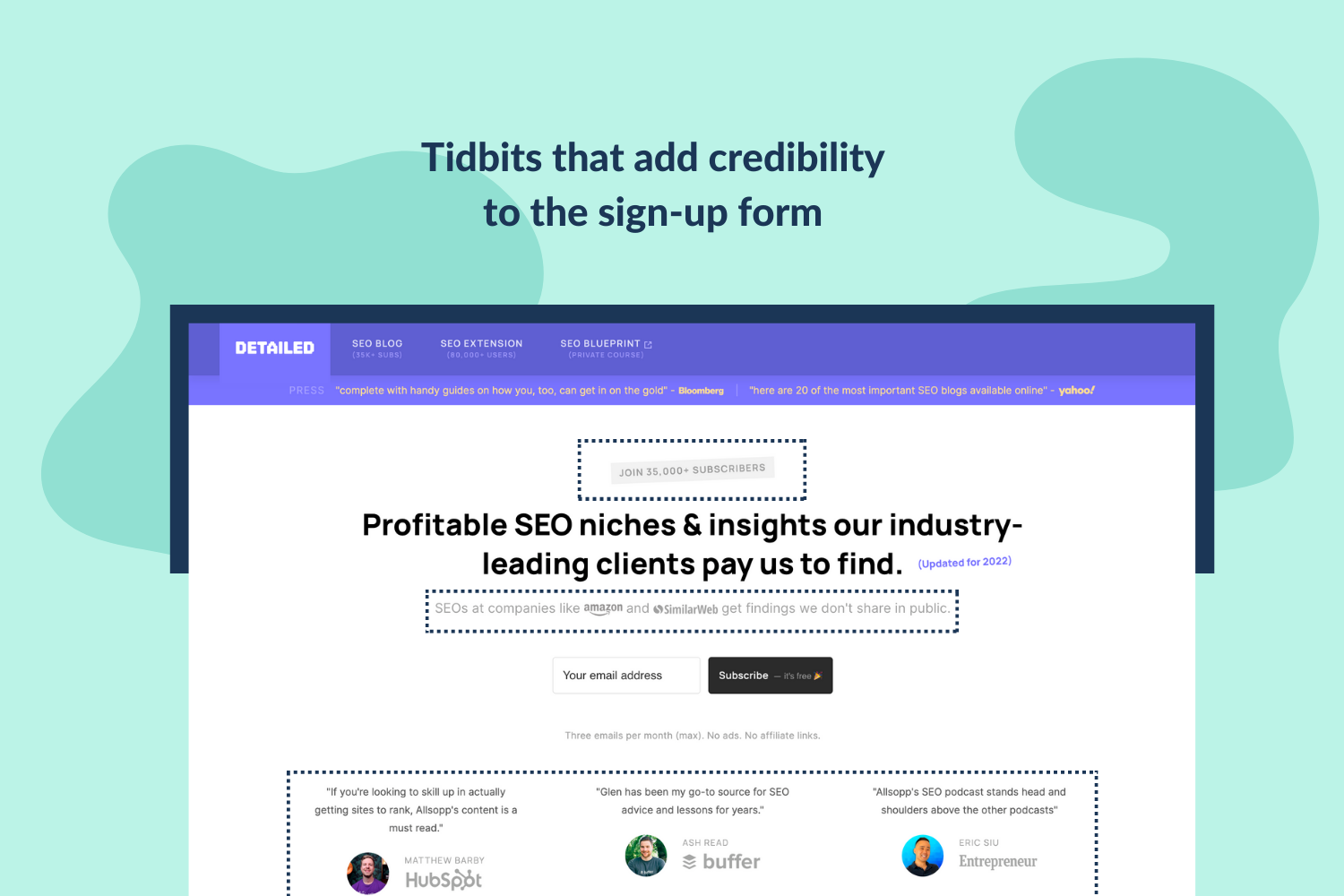
Liked them? Well, we did, and surely think you should implement at least a few elements to make your form more appealing.
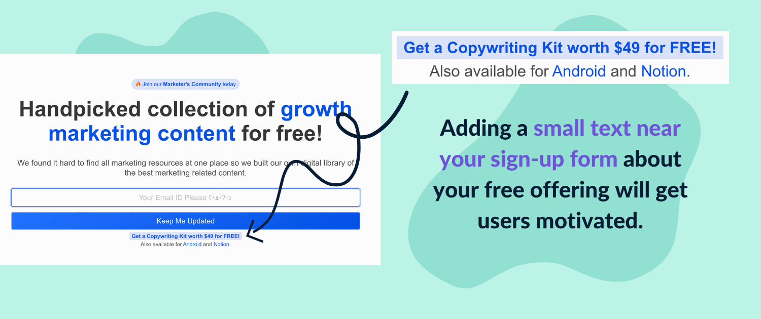
3/ Offer something in exchange
Everyone loves free stuff and that’s one great way of making them share their email in exchange for a freebie.
Now the real question is: How and what to share?
The answer is rather simple. You can barter anything that adds value to your user, it can be access to your private community or an e-book in your niche.
E-commerce brands can provide discount codes or freebies in exchange for an email subscription.
Here’s an example from Growthfyi.
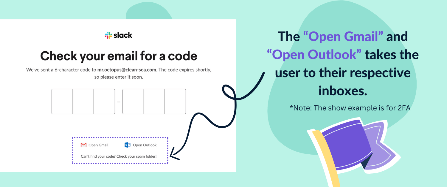
4/ Frictionless double opt-in
Most newsletters have double opt-in to stop spammy emails from creeping into your list. Well, that is great, but the general flow has a lot of friction for the user.
A great solution to solve this is by adding a CTA which takes them to their inbox.
Slack does this for 2FA. Have a look.
P.S. Though this is for 2FA, but the same can be implemented for double opt-in, scroll a bit to see the sample and code which you can implement directly on your site.
5/ Have a minimalistic form
One tip that everyone in the industry would agree on is to focus on getting the user to convert as soon as possible. Everyone knows this fact, but they still have bulky in the face forms.
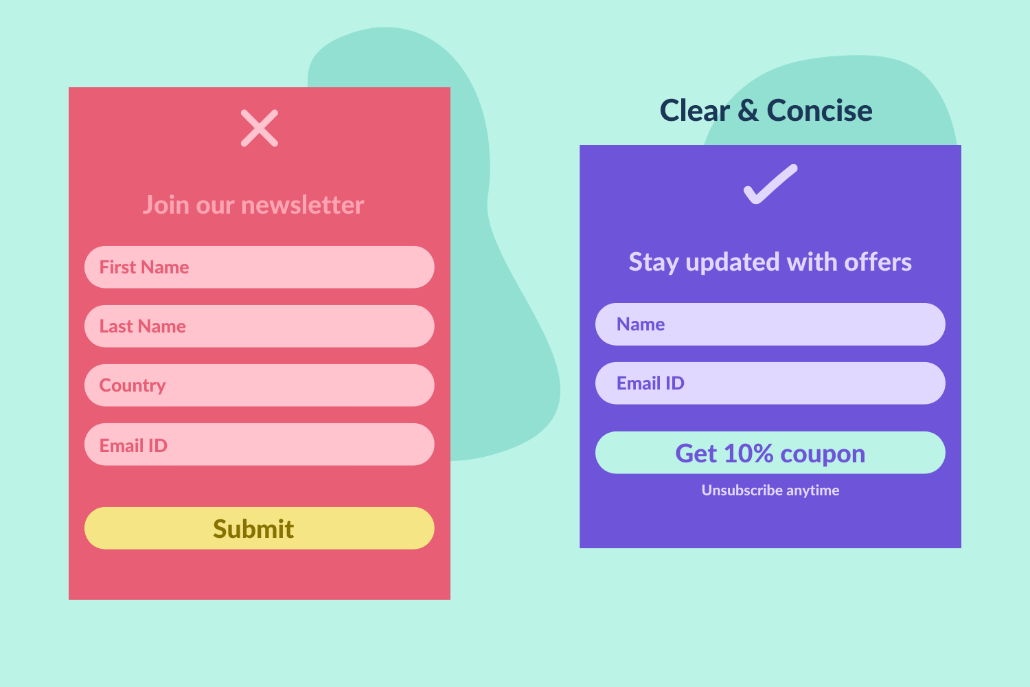
It’s highly recommended to keep your sign-up form small but if you really need additional info, try to do that by showing them on the second screen once you have already collected the emails.
Just in case they drop off, you’ll still have the most important thing – their email.
Furthermore, by keeping the form small you’ll get a good amount of white space which you can utilise to add user feedback and make it more credible.
6/ Make your actionable CTA
CTAs that say “Subscriber” or “Submit” are boring and don’t motivate the user to take any action.
They are a vital part of every form and conversion and should be given special attention.
It’s what leads to conversion, which fuels business growth. One should always refrain from using generic CTA text like “Subscribe” or “Submit”.
Here’s an image with a few options.

By making your CTAs more actionable, it motivates the user to act and actually convert.
Conclusion
Hope these tips would certainly give your newsletter sign-up conversion a nice bump up.
Now it’s time for you to go and implement these and let it do the magic. Moreover, if you loved it, then a share from you would mean a world to us.
Furthermore, if you haven’t started your newsletter yet, go make one with EmailOctopus. Completely free for up to 2500 subscribers.

No Comments
Leave a comment Cancel