The most common mistake I see in newsletter landing pages is the author not considering first-time visitors.
The author knows exactly what they’re offering readers. But they struggle to portray the benefits of subscribing to someone unfamiliar with the newsletter.
That’s why you need to ask yourself:
What would my potential subscriber need to see and read to be persuaded to sign up?
Because when we shift focus from us to them, we start seeing results.
To help, in this article I’ve put together 10 steps to improve your newsletter landing page. And ensure more visitors convert into subscribers.
Each step includes examples to help you understand the objective better. But once you’re confident, use this Newsletter Landing Page Checklist to double-check your efforts.
Hope you find value in the round-up!
1. Add personality to your copywriting
Headline text is the first thing your visitor reads upon arrival. After that it’s most likely the subtext below it. Spending some time on each is vital to capture your visitor’s attention.
Remember, there is an abundance of newsletters out there. But there’s only one of you. Adding personality or cheeky copywriting will differentiate your newsletter from the rest.
One of my favourite newsletter landing pages is this minimal approach with fantastic copywriting by Damp.
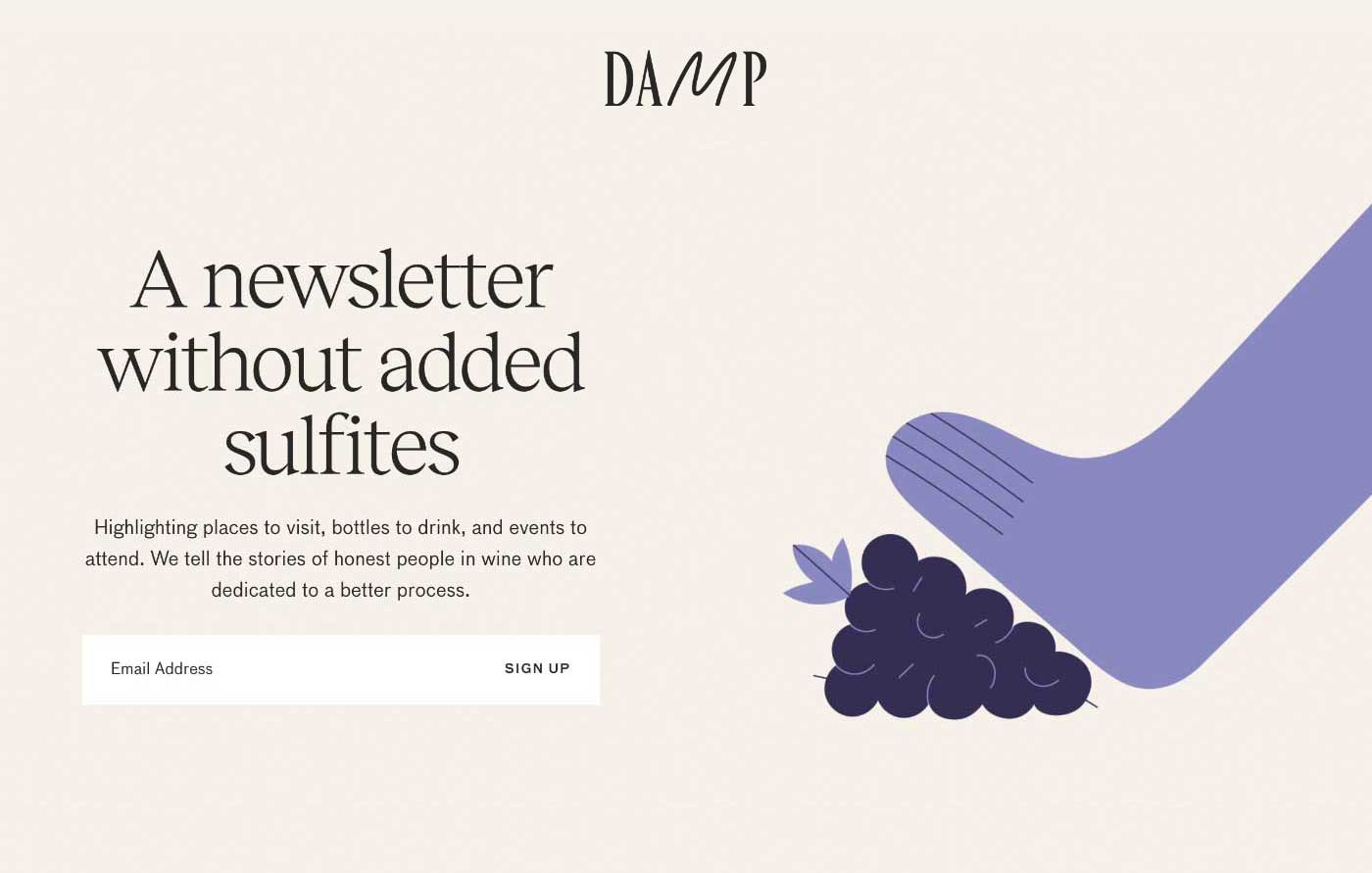
The headline includes a splash of humour perfectly aimed at Damp’s particular audience:
Headline:
🚫 Wine news
✅ A newsletter without added sulfites
Also note how the subtext clearly describes exactly what the newsletter covers:
Subtext:
🚫 News, reviews, interviews
✅ Highlighting places to visit, bottles to drink, and events to attend. We tell the stories of honest people in wine who are dedicated to a better process.

2. Embed the sign-up form in-page
With every additional page load, your conversion rate drops. So capture the visitor’s email address immediately by embedding your sign-up form in the page.
🚫 [Click here to subscribe]
✅ (Enter email) + [Subscribe]
3. Position the sign-up form above-the-fold
Arriving to a sign-up form welcoming an email address input is a smart play. It makes it easier for visitors to subscribe.
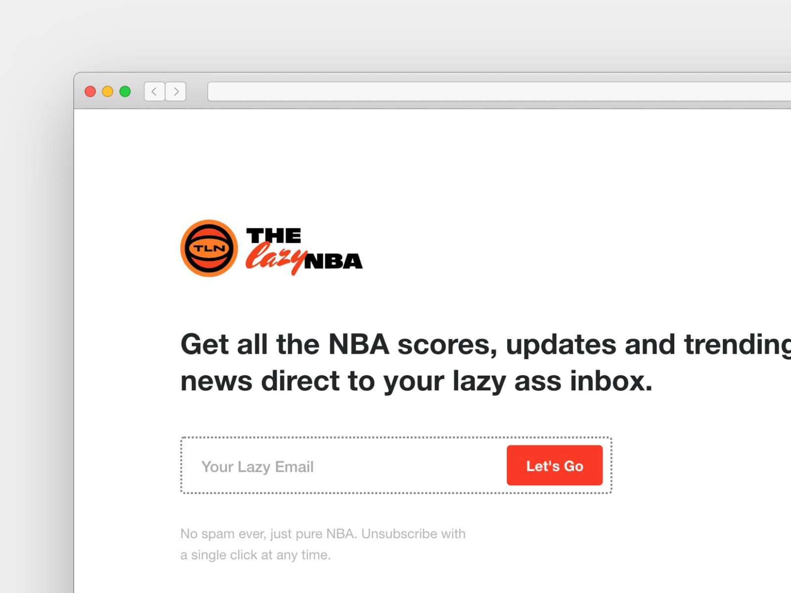
Having the visitor scroll to find the form, on the other hand, will affect sign up conversions. The harder you make it for someone to sign up, the less likely they will.
4. Spice up the call-to-action button
Remember: you’re excited for visitors to discover your newsletter!
🚫 Submit
Too bland.
Use actionable phrases.
✅ Subscribe Free
✅ Get Involved
✅ Unlock the secrets
✅ Start learning guitar
5. Add form meta subtext
Include subtext below the sign-up form that adds transparency to the experience. This can alleviate any lingering doubts the visitor may have.
🚫 We respect your privacy
✅ The Hiking Gear newsletter sends every 2 weeks. No more. No less. Unsubscribe instantly at any time.
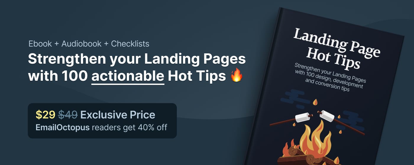
Enjoying these tips? Check out my Landing Page Hot Tips eBook for more 👇
6. Include a testimonial highlighting features
So often I see newsletter landing pages with testimonials providing very little value to the potential subscriber.
🚫 I just love the Hiking Gear Newsletter
✅ The Hiking Gear newsletter is simply packed with useful tips I take into my adventures.
🚫 The Hiking Gear newsletter is one of my favourites
✅ The Hiking Gear newsletter really brightens up my inbox every two weeks with fascinating articles from hikers from all around the world.
You could also increase sign-ups by adding social proof with pop-up notifications showing how many visitors have recently signed up.
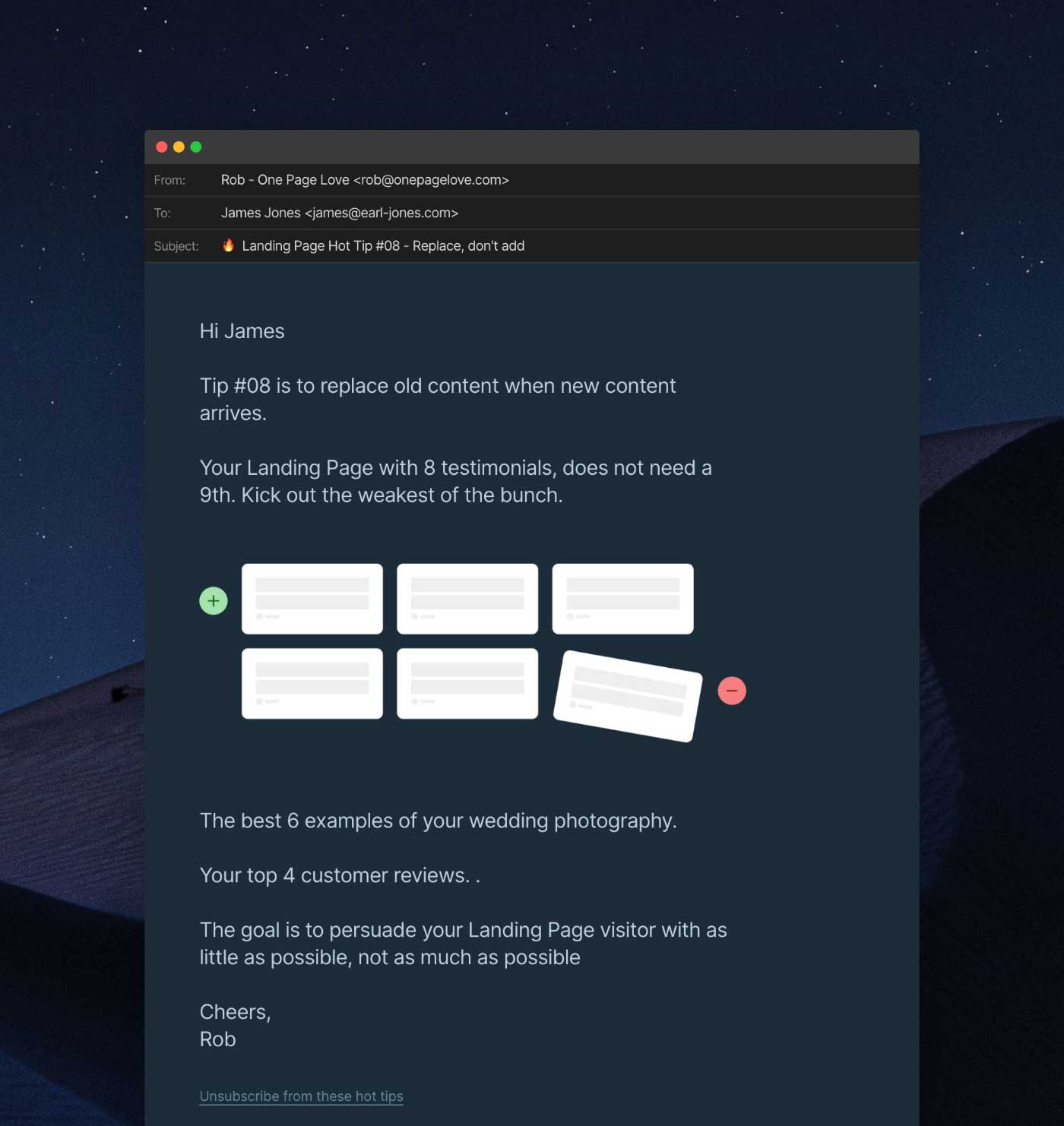
7. Preview the email
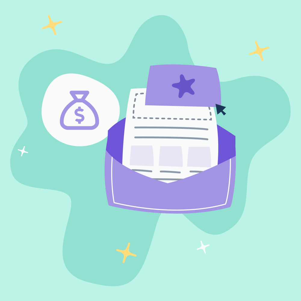
Transparency increases conversions. What better way to back up your promises than to show your visitor exactly what a send looks like.
In my landing page for the Landing Page Hot Tips email drip, I preview the newsletter within a mock-up email client:
8. Declutter the page
The objective of your newsletter landing page is to capture the email address of your visitor. Nothing else.
Remove the following:
- Other products or services
- Navigation linking to other areas of your website
- Social media share icons
- Testimonials with no value, taking space and diluting the rest
- Weak filler paragraphs with no substance
The goal of the page is to persuade your visitor with as little as possible, not as much as possible.
9. Test a mobile sign-up
A lot of your visitors will be subscribing via social media links, on the go, using their mobile phones. On smaller screens:
- Hide big graphics adding to a slow page load
- Downsize big typography – often pushing the sign-up form below the scroll
- Drop the CTA button below the form
The above should really improve the form sign-up experience (and conversions) on smaller screens.
10. Answer the WHY
It’s wonderful you have started a newsletter. But so has everyone else. Tell me why you started the newsletter. Convince me you are passionate enough about this topic that you won’t run out of steam in two months’ time.

When we share why we care about a topic, visitors can feel they are about to embark on a journey with you. A journey they cannot experience anywhere other than their inbox.
Hope you enjoyed this round-up of steps to improve your newsletter landing page! Here is a bonus checklist to recap the 10 steps when you’re working on your page.
If you have any questions hit me up at rob@onepagelove.com or @robhope on Twitter. And subscribe to my free 100-tip email drip powered by non-other than EmailOctopus!
All the best with your newsletter – have some fun with it 🙂
No Comments
Leave a comment Cancel