You’ve been working hard to attract new website visitors, expand your mailing list and get people to donate, sign-up or volunteer. You’ve been using email marketing to increase engagement with people who have already expressed interest in your organisation. But how can you make the most of your mailing list?
We’ve got the answer – a standout welcome email.
Welcome emails are how organisations say hello to their new subscribers. They’re good for sharing important information and useful links to your blog posts or social media.
Wondering how to make a ‘standout’ welcome email?
Don’t worry – we’ve compiled 5 great welcome emails by nonprofit organisations to give you some inspiration. And we’ve listed tips for you to try out to take your emails to the next level.
So let’s get to it.
Page Contents
1. British Heart Foundation
First up is the British Heart Foundation. The British Heart Foundation (BHF) funds over £100 million in research on heart and cardiovascular diseases. By doing so, they help find preventions, treatments and cures to save lives.
There’s lots of useful content on the BHF website – from information on their ‘Coronavirus support hub’ to location details of their charity shops. But if you want to receive regular updates and news stories you can sign up to the BHF’s email newsletter.
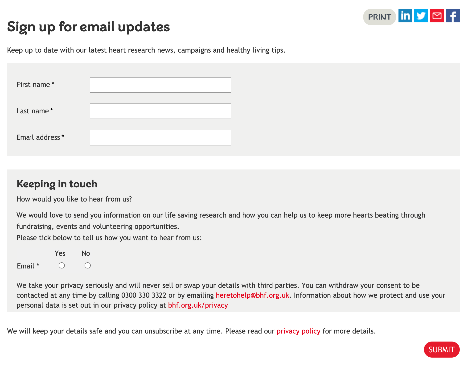
Signing up for BHF’s email newsletters is pretty straight-forward as it only requires bare minimum data (name and email address). They also have a “how would you like to hear from us?” section, which requires you to select “yes” to agree to receive email updates. This is a great way to get subscribers to double opt-in.
And here’s the welcome email you’ll receive seconds after signing up:
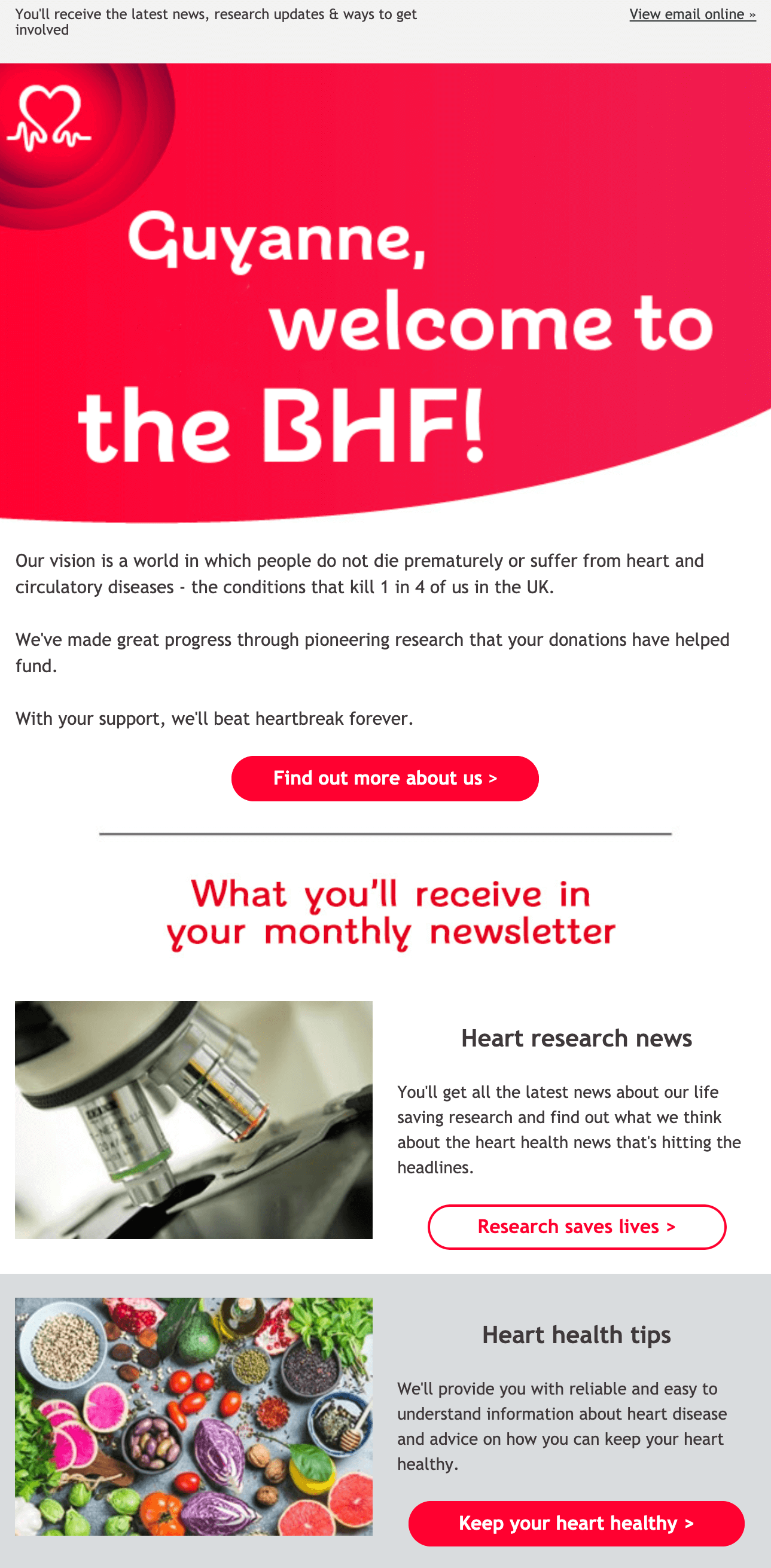
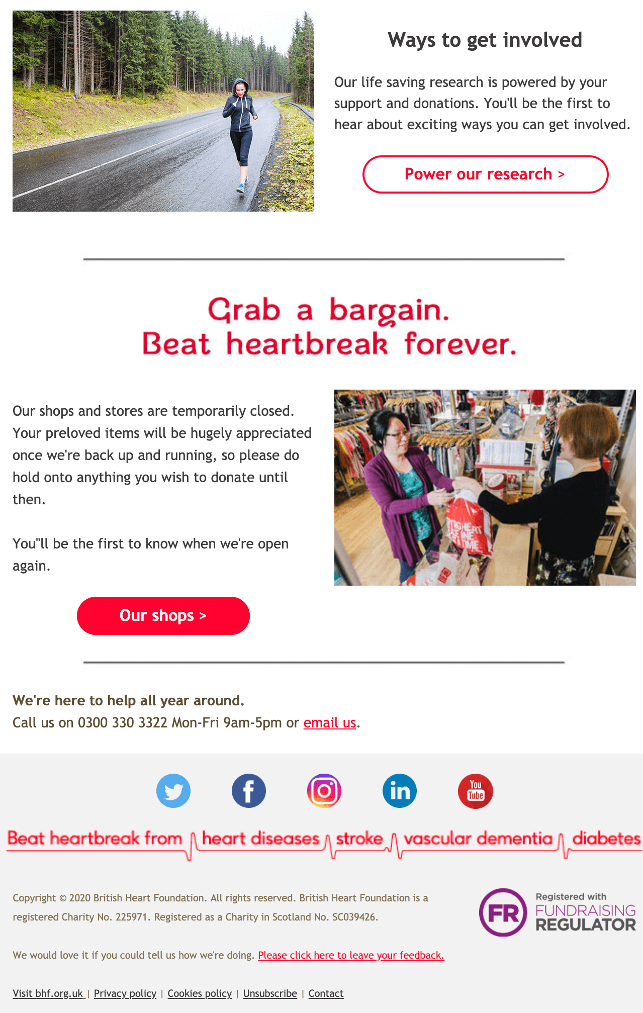
British Heart Foundation welcome email – what makes it great?
The first thing you notice when looking at the email is the big “Guyanne, welcome to the BHF!” message at the top of the email. The use of personalisation is important because it makes the recipient feel special. By using personalisation, readers are more likely to engage with your email. According to a 2016 study by Statista, open rates for emails with personalised messages was 18.8%, in comparison to 13.1% for non-personalised emails.
Another thing that BHF does well is incorporating their brand colour in their welcome email. Using the bold red colour helps to reinforce their brand image and makes the email more unique. Additionally, using the red colour specifically for the header, heading titles and CTA buttons helps key information standout. And this means readers are more likely to take action, increasing your click-through rate.
But it’s not all colour and no content.
BHF’s email explains what readers can expect to see in future emails: heart research news, heart health tips and ways to get involved in their organisation. This clarifies to the readers what updates they will receive and builds anticipation for the next email to arrive. It also helps new subscribers navigate back to important sections of the website.
Tips for you to try
- Use personalisation – using personalisation increases engagement with your emails, so make sure you get the names of your subscribers when they sign-up.
- Add some colour – don’t be afraid to sprinkle a bit of colour in your emails. Use your brand colours or utilise colour psychology to make key messages stand out.
- Keep your new subscribers informed – by telling them what they can expect in future emails. You can also use your welcome email to explain key themes or things they may have missed on your website.
2. Arts Council England
Set up in 1946, Arts Council England (ACE) funds projects and development in the creative industry. Working across the country, they help conduct research, share expertise and host activities to help new and veteran creatives thrive in the industry. And they invite website visitors to keep up-to-date with their latest funding updates via their newsletter.
ACE also keeps it short and sweet when signing up to their email updates by only asking for your name and email. And for those who may be wavering about whether to sign up, ACE makes it clear that subscribers won’t receive more than three emails a month.
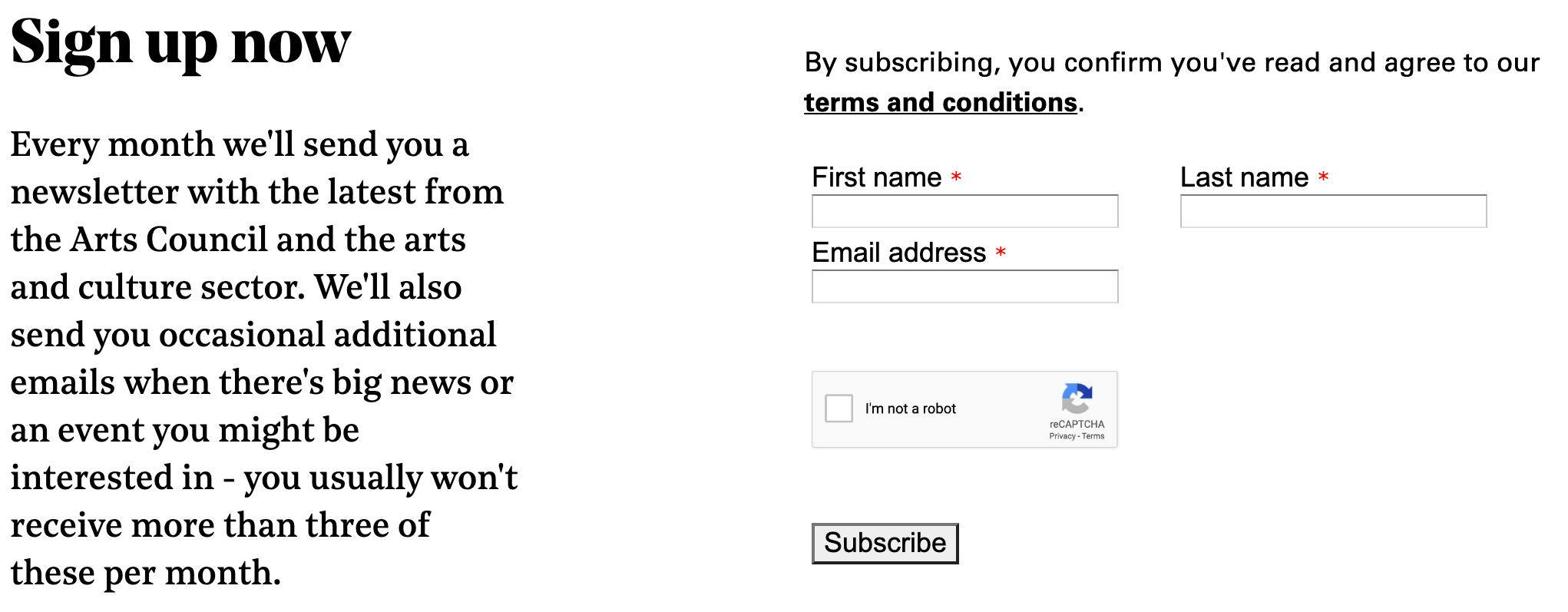
It’s always handy to know how many emails you can expect so you can be assured that you inbox won’t get too clogged up.
Now let’s take a look at their welcome email.
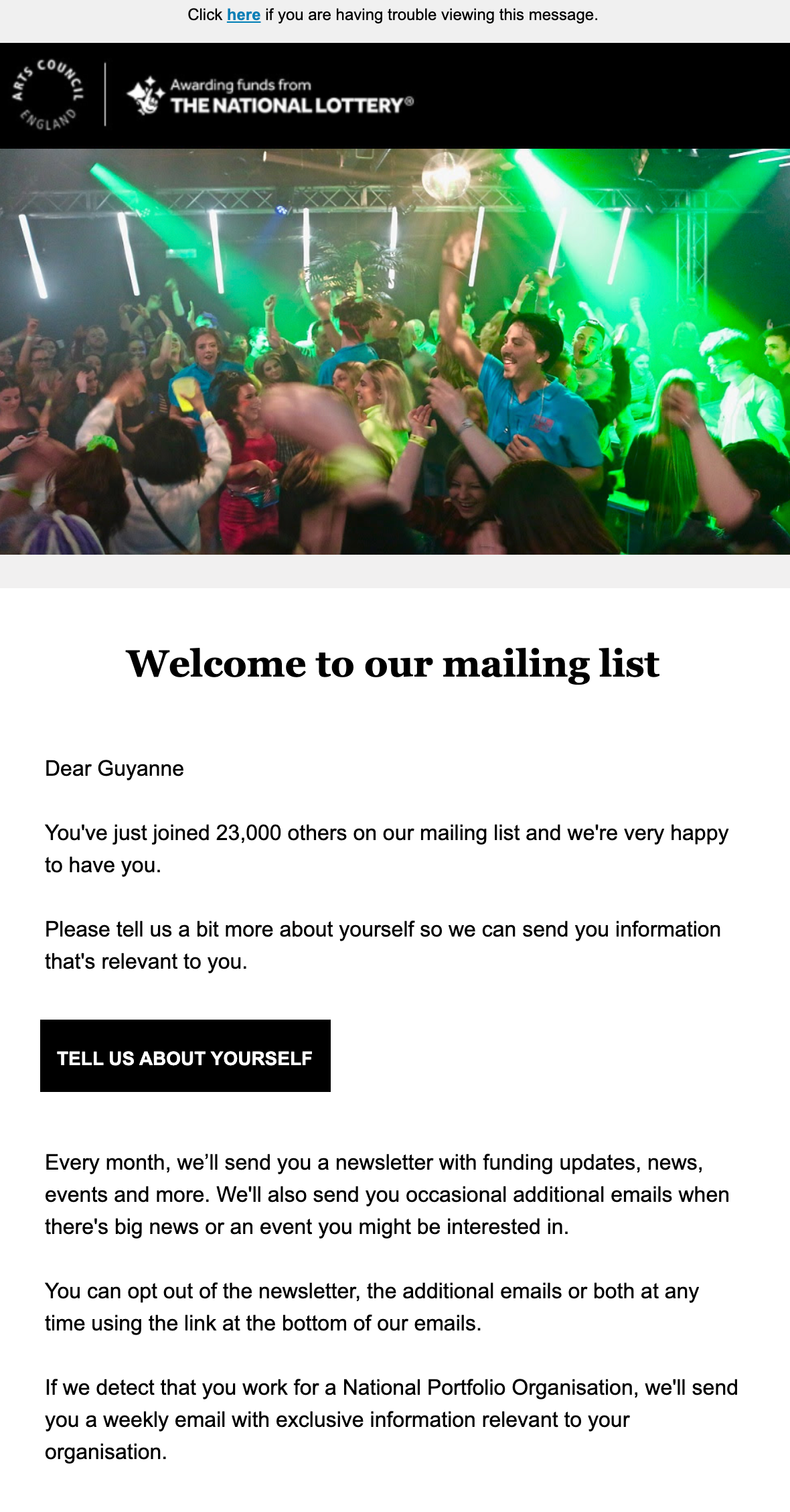
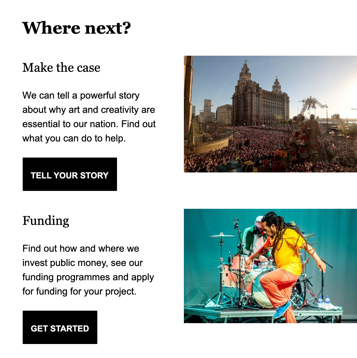
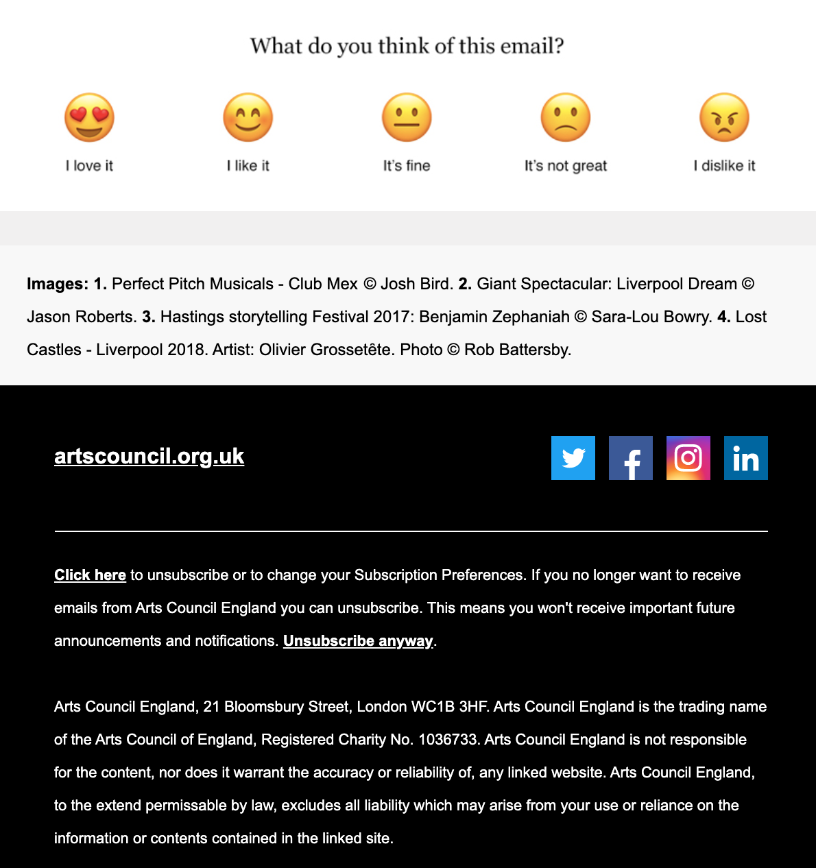
Arts Council England welcome email – what makes it great?
After a nice personalised greeting, the welcome email lets you know that you’ve “just joined 23,000 others” on their mailing list. Knowing that many others are also signed-up gives the organisation more credibility.
Next, ACE includes two surveys in their welcome email. One is an embedded survey that asks the reader what they think of the email on a scale of “I love it” to “I dislike it”. Asking your readers for feedback on your welcome email allows you to know how well it is received and if you need to make changes. Your welcome email is your first impression to your new subscriber, so it’s important to make a good one.
In the other survey, ACE asks the reader for more personal information and links to a short form where they can fill out their full name and occupation. Using surveys to ask new subscribers for further information in the welcome email will shorten the initial signup process. Yet still provide you with valuable data.
Also, readers are also more likely to give you this information once they’ve signed up and received a welcome email. Especially if providing personal details means receiving more relevant emails.
Speaking of receiving relevant emails – what if readers don’t want to receive your emails? Some readers change their mind about joining a mailing list and want to stop further communications.
Under the EU’s GDPR regulations, all subscribers must be given the opportunity to opt-out. It’s standard practice to include an unsubscribe link in the footer of every email. But here, ACE goes one step further and highlights to new subscribers that they can opt out at any time.
It’s a good way of building trust and positioning your organisation as ethical and with your audiences’ best interests at heart.
Tips for you to try
- Create a sense of community – tell your subscribers know how many others are signed up to your emails to build your reputation and make them feel they’re joining in.
- Ask for preferences – link to or embed a short survey asking new subscribers to share personal data or indicate preferences. You can entice them to take the survey by explaining that they will receive more relevant emails.
- Explain the opt-out option – assure your readers that they are able to opt-out and tell them how they can unsubscribe from your emails.
3. No Panic
No Panic is a charity that helps people who suffer with anxiety disorders, such as panic attacks, obsessive compulsive disorders and phobias. Their website is packed with lots of information for website visitors to get help, donate or become a member.
As an EmailOctopus customer, No Panic does a great job at converting website visitors to subscribers. They do this by making their mailing list sign-up form front and centre of their website homepage.
You can’t miss it.
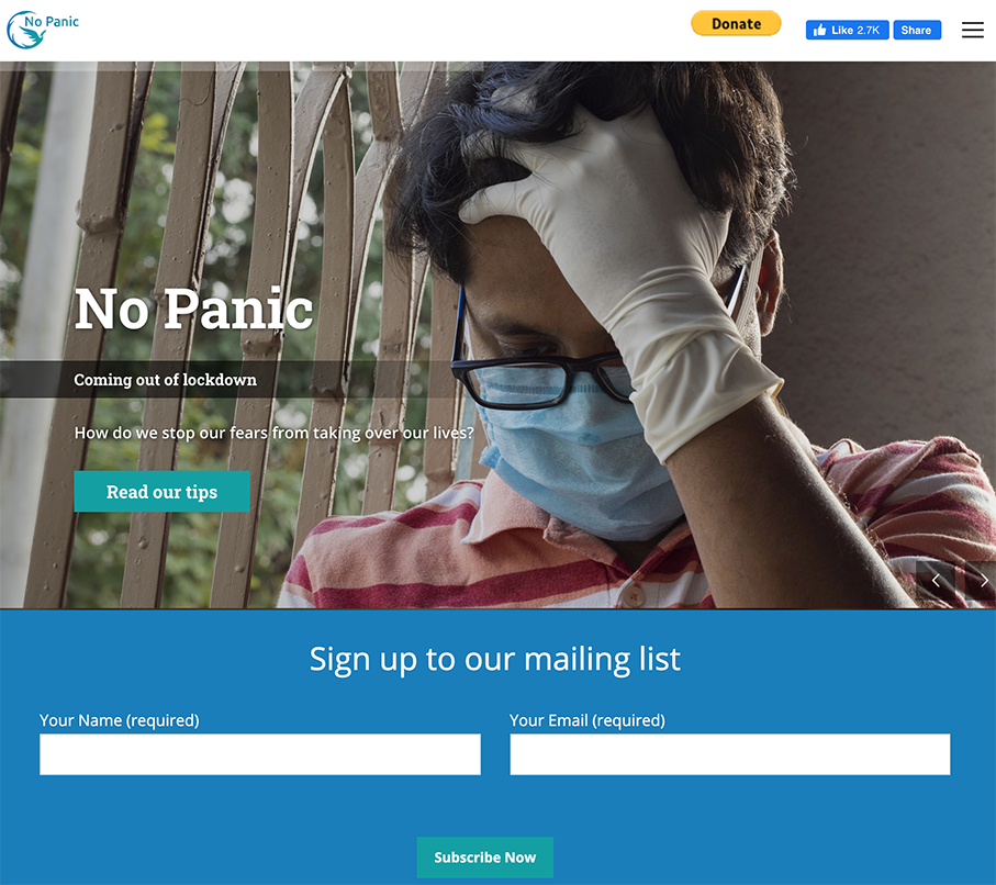
This makes the sign-up process a lot quicker as there is no need to hunt around for the right webpage.
Most organisations put their newsletter or email subscription links in the footer of their webpage, which means website visitors have to scroll down the page to find it. By placing the form above the fold on the homepage, more people are likely to sign up and join your mailing list.
New subscribers receive No Panic’s welcome email within minutes after signing up. And there’s no need to confirm your email address, which reduces the number of steps between signing up and getting the welcome email.
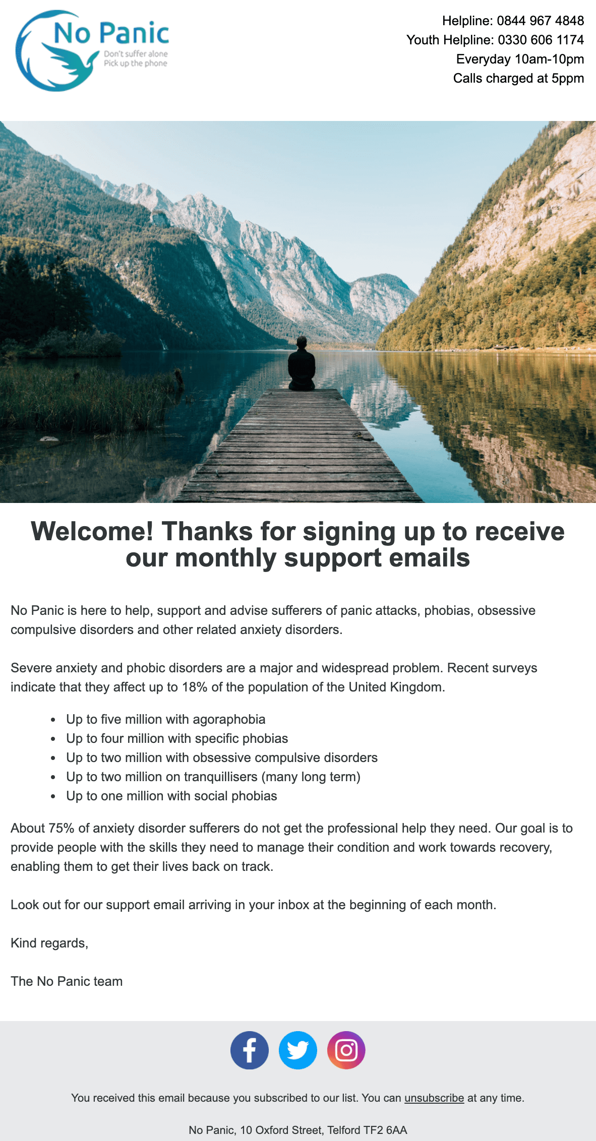
No Panic welcome email – what makes it great?
Just look at that scenery – could anything be more peaceful?
The hero image No Panic uses helps visualise the organisation’s mission to provide a calming environment for anxiety sufferers. Using imagery and icons in this way helps make your brand more memorable and relatable. It also makes your emails more readable.
Data from dotdigital reveals that people only spend around 11 seconds reading an email. But making eye-catching emails with images and colour will encourage your subscribers to spend more time reading them.
No Panic’s email shows that you can still use images and colour without needing complicated HTML. The welcome email keeps things simple by including a hero image, their logo and text. And the only links included in the email are to their social media channels and unsubscribe page.
Studies by Hubspot found that emails with a large amount of HTML had a 23% lower open rate than those with less HTML. So less really is more!
Putting the HTML to one side, No Panic has also put a lot of thought into the content and format of the text. Putting their helpline number and information in the header of the email is smart. Because it allows those in need to find the helpline quickly.
So make sure you put the information readers will find most interesting or important at the beginning of the email.
Tips For You to Try
- Use images and icons – make your emails more visually appealing for readers and they’ll spend more time looking at your email.
- Don’t overuse HTML – you can still have sleek and smart looking emails without using too much HTML. Keep your emails simple and carefully consider the images and links you use.
- Put the most relevant information first – your readers shouldn’t have to search your email for key details. Make things easier for them by putting the information they need at the top.
4. Trees For The Future
Trees for the Future are an environmental non-profit that helps train farmers across the world to manage their farmland sustainably. Through their Forest Garden Program they assist in planting thousands of trees that not only provide fruit and veg, but provide nutrients back into the soil.
Signing up for the Trees For The Future’s (TREES) email updates is an easy process. Again, all you have to do is provide your full name and email.
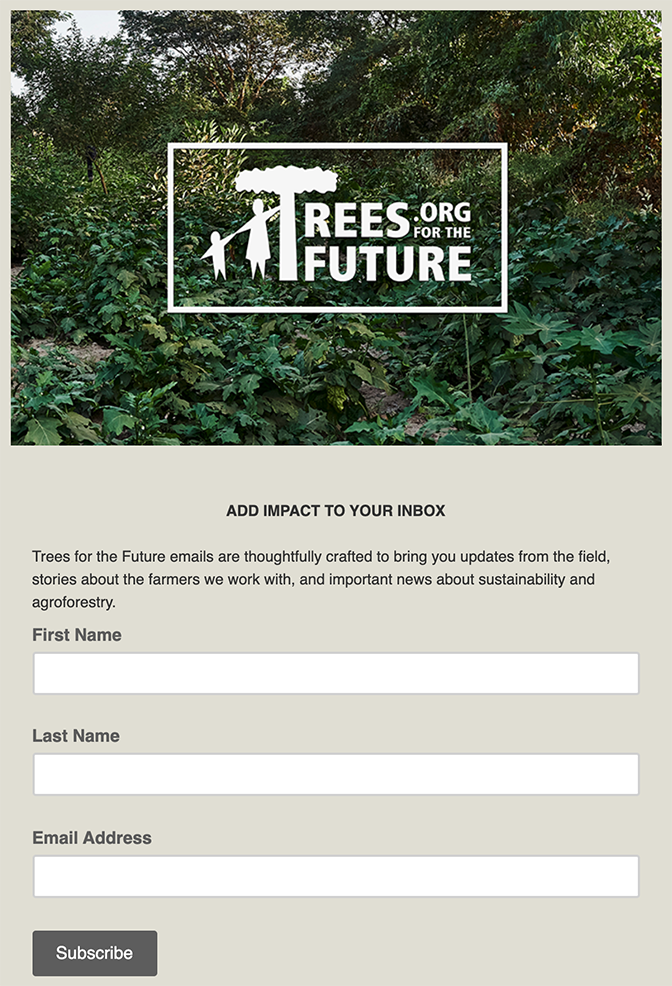
After subscribing, you are welcomed by an email from sender ‘John Leary at Trees’. John Leary, as you later find out in the email, is the Executive Director of TREES.
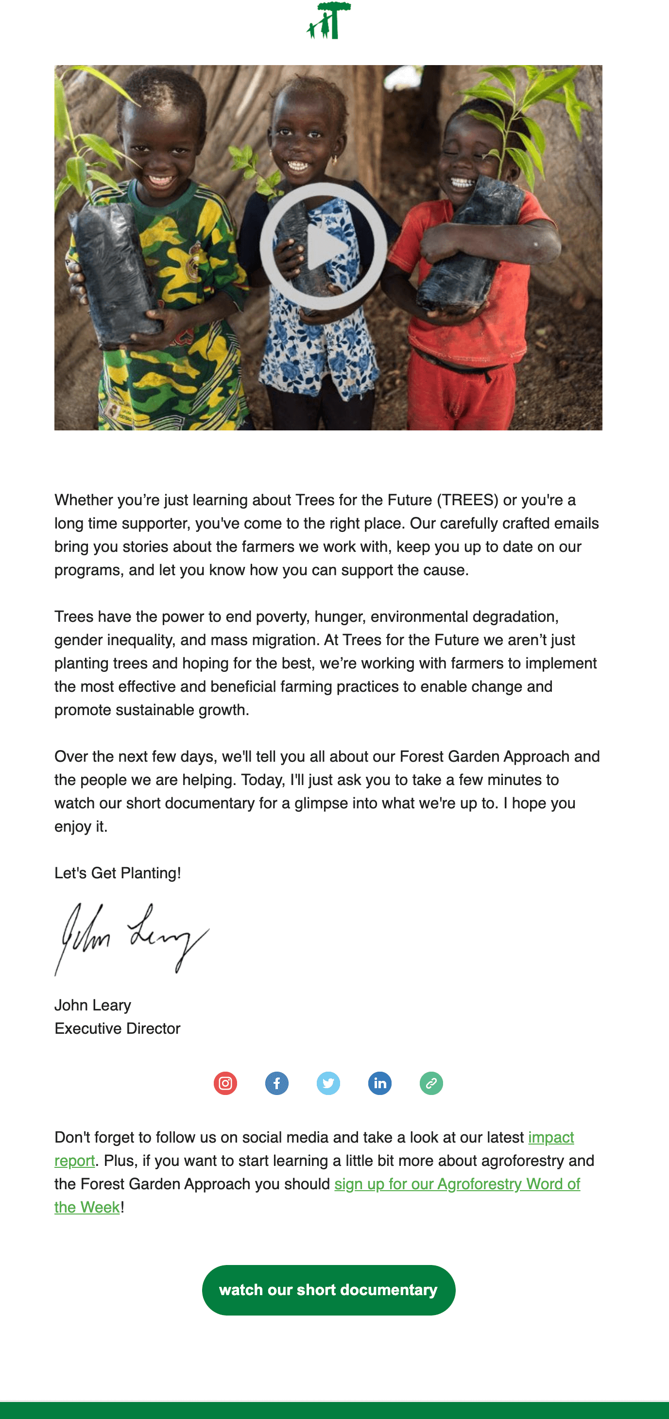
Trees for the Future welcome email – what makes it great?
Trees for the Future’s email is written in the format of an e-letter from John Leary. The style and signature at the end gives the email a personal touch. In addition, TREES has also included a preview video thumbnail. The preview thumbnail links to their YouTube video called “The Forest Garden Solution”, which explains more about what the organisation does to make a difference.
According to research, emails that include videos receive 5.6% higher open rates and 96% higher click-through rates. It’s unsurprising then, that TREES’ video has received over 32,600 views and 700 likes.
If you also want to make use of nonprofit video marketing in your emails, it is recommended to keep the videos short and to-the-point. Also remember to put the word “video” in the subject line. Just by doing that, Switchvideo reported that it increased open rates from 7% to 13%.
On the subject of subject lines, TREES are great at making catchy ones that draw attention in your inbox. The very next day, after receiving the first welcome email, new subscribers receive a second email:

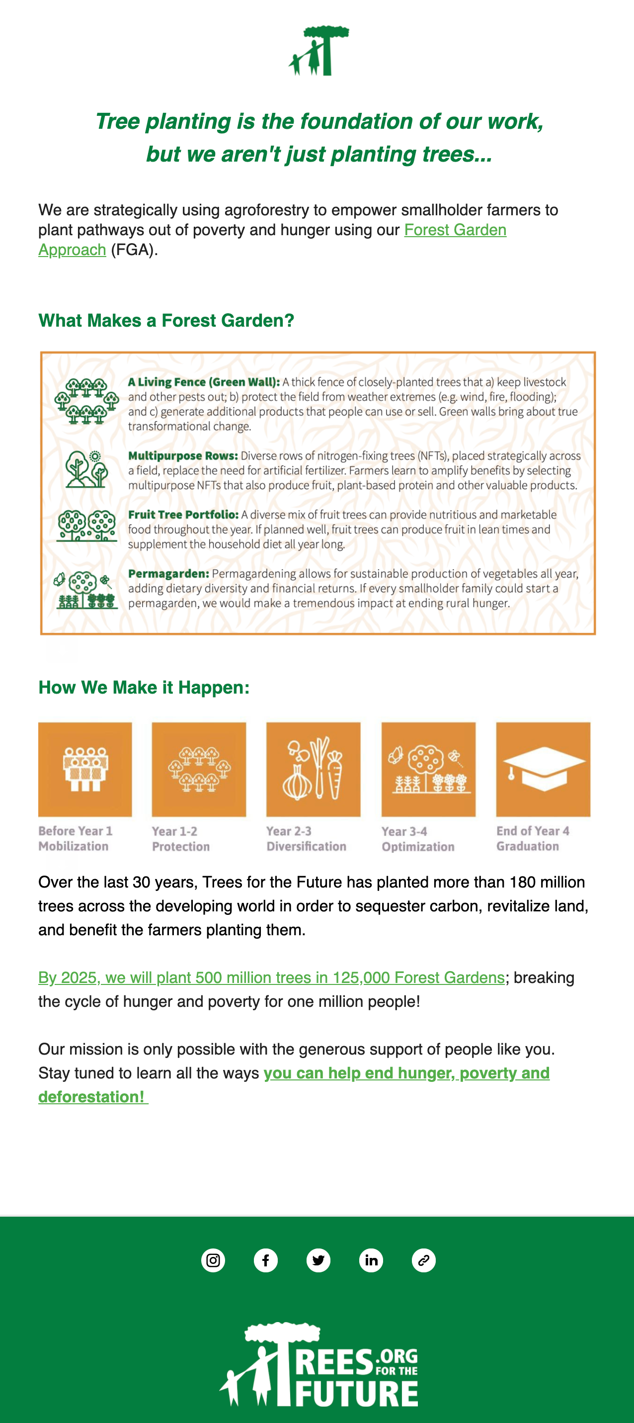
As you can see by the ‘🌳 Why TREES, you ask?🌳’ subject line, the email goes further in depth about what the organisation wants to achieve and how they are going to do it. The use of the tree emojis will immediately catch your eye. A study by Return Path found that the use of emojis and symbols on New Year’s Eve and Valentine’s Day, such as 🍾 or 💕, resulted in an 3%-6% increase in open rates.
However, using emojis and symbols in subject lines has also led to an increase in complaints and, in some cases, a decline in open rates. So be mindful of how and when you use them and don’t over-do it.
Now let’s look at the content of the email.
TREES includes infographics to further explain their Forest Garden Project and long-term plan of action. It also introduces readers to names and terms that will likely be used in future emails.
It’s always good to have in the back of your mind that your subscribers may not have much knowledge about your cause or topic. So make sure that you explain things clearly and simply.
And if that means breaking it down across a series of emails using a drip campaign, then go for it. That’s exactly what TREES has done. Rather than relying on one single welcome email, they’ve set up an automated series of two.
Drip campaigns like this means you can spread key information across a few emails to maintain engagement. Research shows drip campaigns gain up to 80% higher open rates than single send emails. And they also save overloading new subscribers with a text-heavy first email.
Tips For You to Try
- Include a video in your emails – Make your readers curious by linking or embedding a video in your emails. Shown to increase open and click-through rates, videos are useful for storytelling and communicating with subscribers.
- Try using an emoji or symbol in your subject lines – they instantly draw attention to your email and can increase open rates up to 6%. But be careful not to use too many. Sometimes they can be a little distracting in inboxes.
- Turn your welcome email into a welcome series – don’t let your subscribers forget about you. Create a drip campaign by spreading information across multiple emails. This will slowly nurture your readers to want to take action.
5. The Felix Project
The Felix Project is a food redistribution charity that collects unsold fresh food products and gives them to charities and schools. During the Coronavirus lockdown alone they’ve delivered over 5 million meals to people in need. And helped reduce food waste along the way.
Similar to No Panic, The Felix Project makes its mailing list sign up form easy to spot. And they even have a collective name for their subscribers: the #FelixFoodHeroes.
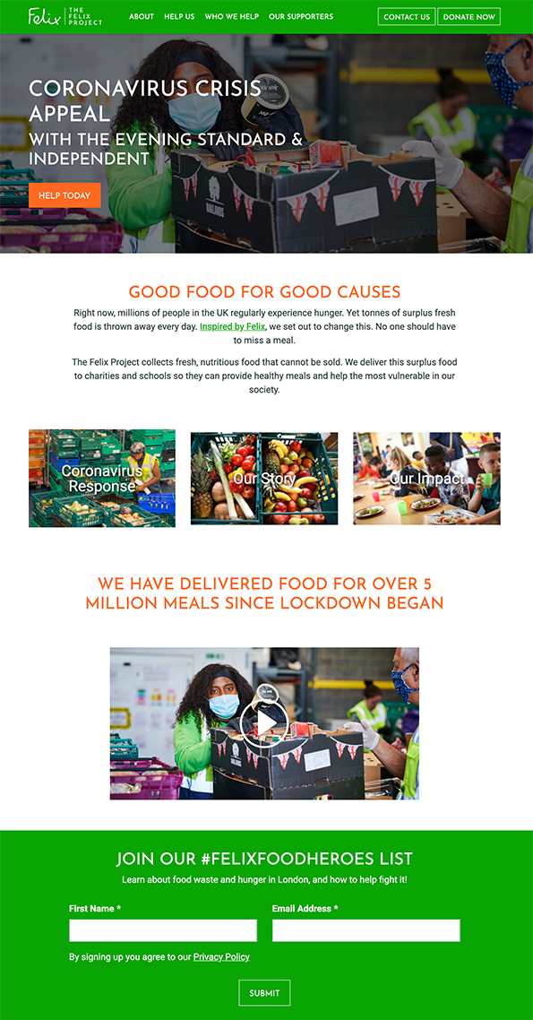
Shortly after registering to become a FelixFoodHero, you’re sent a welcome email.
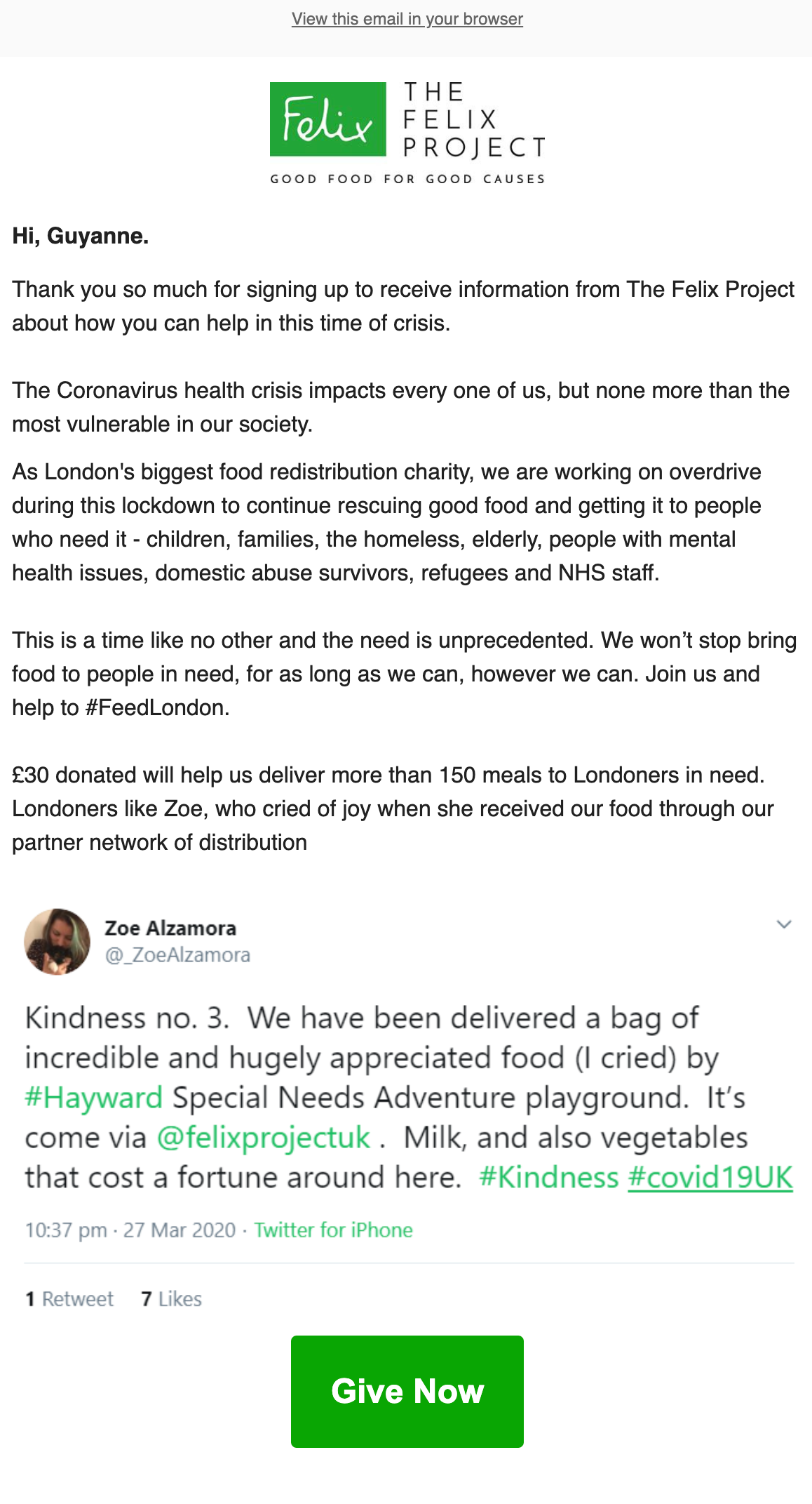
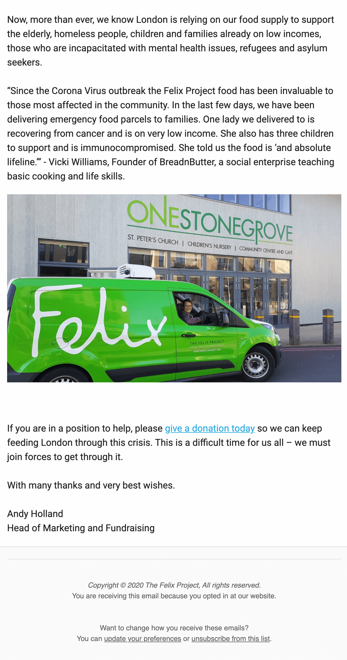
The Felix Project welcome email – what makes it great?
The first thing that The Felix Project does well is having a welcome email that reflects current affairs and shows them proactively helping those most in need. By explaining how their organisation is providing assistance during the Coronavirus health crisis, readers are more likely to connect with the stories and calls to action.
The lesson here is that you should continuously review your welcome email or series. Make sure it’s relevant to what’s currently happening in the world and up-to-date with your mission’s progress.
Tailor your welcome email to specific events and the work you are doing in response to current needs. And you can include links to new blog posts or social media content to keep your welcome emails fresh and relevant.
In this welcome email, they’ve also included a tweet from someone they have helped. This not only provides evidence of their impact, but also shows that they engage with their social media platforms. Sharing testimonials and user generated content like this provides social proof. And shows readers what their money could do and puts a face to the people they might help. Which in turn makes them more likely to donate.
They’ve taken this even further by including a message from Vicki Williams, the founder of BreadnButter, a social enterprise that works with The Felix Project. Showcasing your organisation’s ability to collaborate with others reflects well on your reputation.
After all, the people subscribing to your emails may not just be an individual – they might be another organisation or group who would like to form a partnership or become a sponsor. And showcasing how you work with other organisations, along with their appraisal of your service, is the best way to attract new opportunities.
Tips For You to Try
- Regularly update and tailor your welcome emails – include mention of current events and any new projects you are working on to stay relevant and better connect with your readers.
- Share social media posts and testimonials from people you have helped – featuring user-generated content like this helps subscribers see the people that benefit from your charity. And inspires them to want to donate.
- Let your readers know who you’re working with – showing how you effectively collaborate with others can bring new opportunities, sponsors or volunteers.
Final Thoughts and Tips
Now that you’ve gone through these standout welcome emails by other nonprofits, we hope that you’ve been inspired to brush up your welcome emails. And if you haven’t got one yet – what are you waiting for?
Start right now.
Getting website visitors to donate is no doubt your main goal. But when they don’t, the next best thing would be for them to join your mailing list. So make your sign up form easy to find and easy to fill out.
Follow No Panic and The Felix Project’s lead by putting a short sign-up form somewhere prominent on your home page. This will help grow your mailing list and maximise the number of potential donors.
Looking at these welcome emails, you’ll notice that they are quite text heavy. And that’s because explaining your mission and inspiring subscribers to become donors is the goal of your welcome email, if not your entire email marketing strategy.
Once you have a subscriber on your mailing list, you can start sending powerful and effective fundraising emails to turn those subscribers into donors.
Tips for writing your welcome emails
Give your readers key information – make sure your call to action is clear, detail what your future emails will include and explain how readers can opt-out or unsubscribe. You can also put your contact details or operating hours in the header so this info is easy to find.
Use social proof to demonstrate your impact – share testimonials, social media posts and appraisals by people you have helped or worked with to inspire your readers and get more donations. For more ideas, check out our article on how to use social proof in your email marketing campaigns.
Make your emails visual – use images and graphics to draw in your reader’s attention and make your emails stand out. You can also try putting emojis in your subject lines to increase open rates (though don’t over do it). Or go the extra mile by including a video in your emails.
Keep your welcome emails fresh – regularly update your welcome email to reflect how you’ve been responding to current issues or events. For example, if you’ve been helping with the Coronavirus response or involved in Black Lives Matter, let your readers know.
Create a welcome series – use drip campaigns to share more information with your readers over a series of emails to develop stronger connections.
Looking for more inspiration? Check out these free welcome email templates designed especially for charities with copy you can steal for your own sequence.
If you found this article useful, we’d love to hear from you in the comments section below. And we always appreciate a social share.



No Comments
Leave a comment Cancel