Considering four out of five marketers say they’d rather give up social media than email marketing, we think it’s safe to say optimising your email signup form is important for most businesses.
At EmailOctopus, we know a thing or two about doing that, so in this article, we’re going to teach you everything you need to know to 100% optimise your signup form with examples and a checklist waiting in the end.
Ready to increase your email sign-up rates? Let’s go.
What is an email sign-up form?
An email sign-up form is a way for businesses, newsletters, and email marketers to ask users to share their email, so they can be sent marketing content. You’ll usually find these mailing listing sign-up forms on landing pages, the contact or about us page of company websites, and blog posts.
Why optimising your sign-up form is a great idea.
When you optimise your mailing list sign up form, your website visitors are more likely to sign up for your newsletter because they’re attracted to its presentation and information provided.
And why care about some newsletter anyway?
Your email subscribers are up close and personal with you living in their emails. And that intimacy has its benefits – more trust, which is a big one. Which is why email newsletters can have an ROI of around $36 for every one dollar spent. They give your online business a competitive channel for recurring cash flow, traffic, and direct feedback to improve communication. Plus, once your email lands in the inbox follow our some email deliverability best practices to boost your chances), there are no algorithms at play that prevents your email from being seen by your subscribers. The same can’t be said when it comes to social media platforms like LinkedIn, Instagram and Twitter, where you need to outsmart the algorithms to succeed.
Type of mailing list sign-up form:
- Inline forms: embedded anywhere in the webpage’s body. You can also enable a sitewide signup form in a specific location on your web pages. They could be embedded within a blog post, in the nav bar, in the hero section of your homepage, and so on.
- Pop-up forms aren’t embedded but can be triggered to “pop up” and grab a visitor’s attention. You have a range of settings to customize your email sign-up popup form. Here are some of the most common ones, all of which can be done using EmailOctopus:
- Time-delayed: pops up after a certain period of time a visitor is on your page (e.g. 30 seconds).
- Scroll-delayed: a pop up is triggered after you scroll past a certain point of the page
- Exit-trigger: triggered when your page detects the user is opting to leave the site with their pointer
- Two-step: popup form appears after someone clicks a link or button on your webpage. These typically have high signup rates since the customer intentionally clicked the trigger for your offer.
- Landing page forms: not as common, but effectively gives the user an ultimatum: subscribe, or leave. There are usually no other navigational links or media elements (other than to support the user subscription).
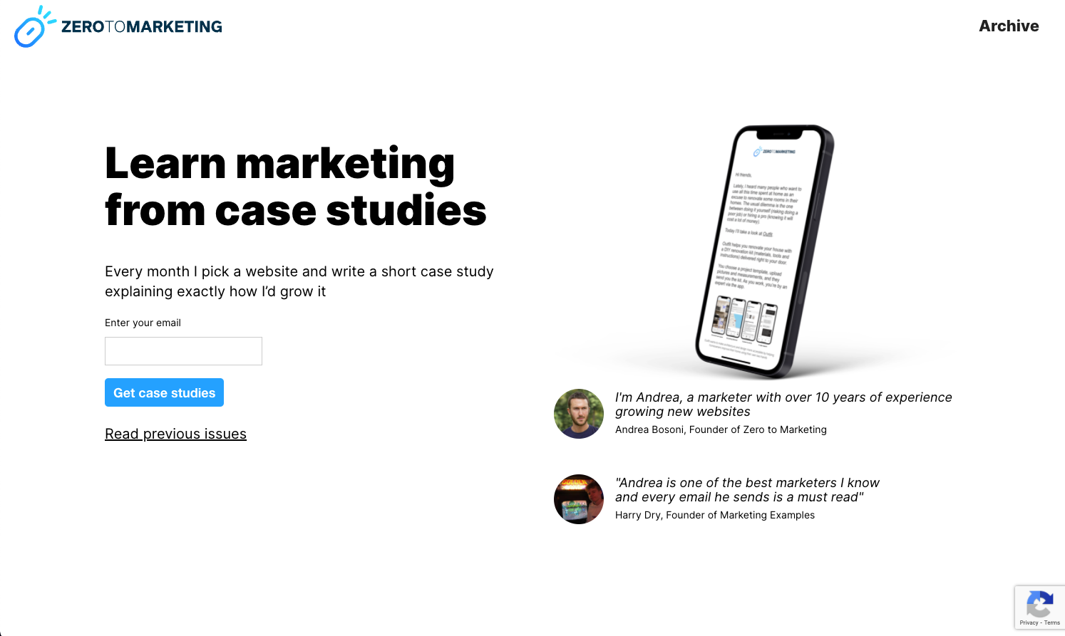
Zero to Marketing is a newsletter that chose EmailOctopuses’ simple landing page form creator to design a minimalist email signup page and rake in more than 1,400 subscribers.
In her book Doing Content Right, Steph Smith mentions how the following triggers have helped bring in subscriptions to her personal blog:
- Exit forms have nearly brought in half of her subscriptions.
- The landing page pictured below that she links directly at the end of Reddit posts or Quora answers is the second largest driver of subscriptions. Posting relevant content in very targeted communities and providing an enticing call-to-action is a fool-proof way to grow an engaged subscription base. How? The people in those communities are already interested in the topic, know that you can write well, and want to read more of what you’re writing about.
- 18% of her subscription base come from embedded forms within her articles.
- The fixed subscription button in the nav bar provided 10% of her subscriptions
Key takeaway: Experimentation is key to a successful sign up strategy! You need to experiment with different forms, copy, imagery, and descriptions in order to find the winning formula for you.
💡 Starting from scratch? You might want to check out this guide on opt-in email campaigns first.
7 areas of your email sign-up form to optimise (how-to + examples)
Imagine this. You’re about to build an email signup form from the ground up. You want everything to be perfect, so every component you touch should be conversion-optimised. Let’s take a look at what that looks like in every scenario:
1. Finding a value proposition (i.e., lead magnet)
Before you even spend a second designing your email sign up form, you need to establish what it is you’re offering in return for their email address.
Why is this so important from the get-go? Because every element from there on out can be tweaked to support your lead magnet and improve conversions.
Your value proposition can depend on your brand, industry, niche, cultural trends, and many other things.
Ideas for lead magnets that you can use:
You can tailor any of the following to your unique brand offering:
- Discounts
- Free shipping
- eBooks, cheat sheets, guides
- Webinars
- Early access to an offering
- Fun quizzes or surveys
This is a “basic” list, so don’t limit yourself to these options. In fact, we encourage you to get creative especially since those incentives are becoming increasingly mainstream.
To present an example where you could be unique to your business, let’s take a look at Flick, an Instagram hashtag research tool and manager. According to Flick’s content manager Mackenzie Taylor, the Hashtag Academy Course is their highest-converting page on their website:
Each month, we’ve received hundreds of signups through search and other online social media marketing initiatives. The course continues to be our highest conversion rate compared to all of our other pages and, each month, continues to increase our lead list more and more
Instead of recycled PDF templates or small-time discounts, Flick offers an insane amount of value through a whole interactive course. And that’s why they were uber-successful with collecting email leads.
Find your lead magnet. And then work on making it look pretty.
2. Choosing attractive imagery and on-brand colours.
Visual aids help a presentation become 43% more persuasive. And that probably has something to do with the fact that 65% of us are visual learners. You don’t need anything too crazy. Just make sure your image is (a) in high definition and (b) relevant to your message.
You can go a step further and bring your incentive to life on design tools like Canva. So if we had an eBook, it might look something like this:
Much better than a solid colour or a random picture of a book, right? And it doesn’t take much time.
As for colour, did you notice Flick (from the previous example) followed the same blue colour in their CTA button? Colours matter. In fact, according to academic research, they help customers remember about your brand across different channels.
Say you’re an eCommerce business selling pink balloons, and you’ve established that the lead magnet will be free balloons and shipping.
Using the EmailOctopus form editor, you can add a personal touch with an HD photo of the (would-be) balloons, use pink colour shades, and add bolded text, instead of keeping it all black and grey:
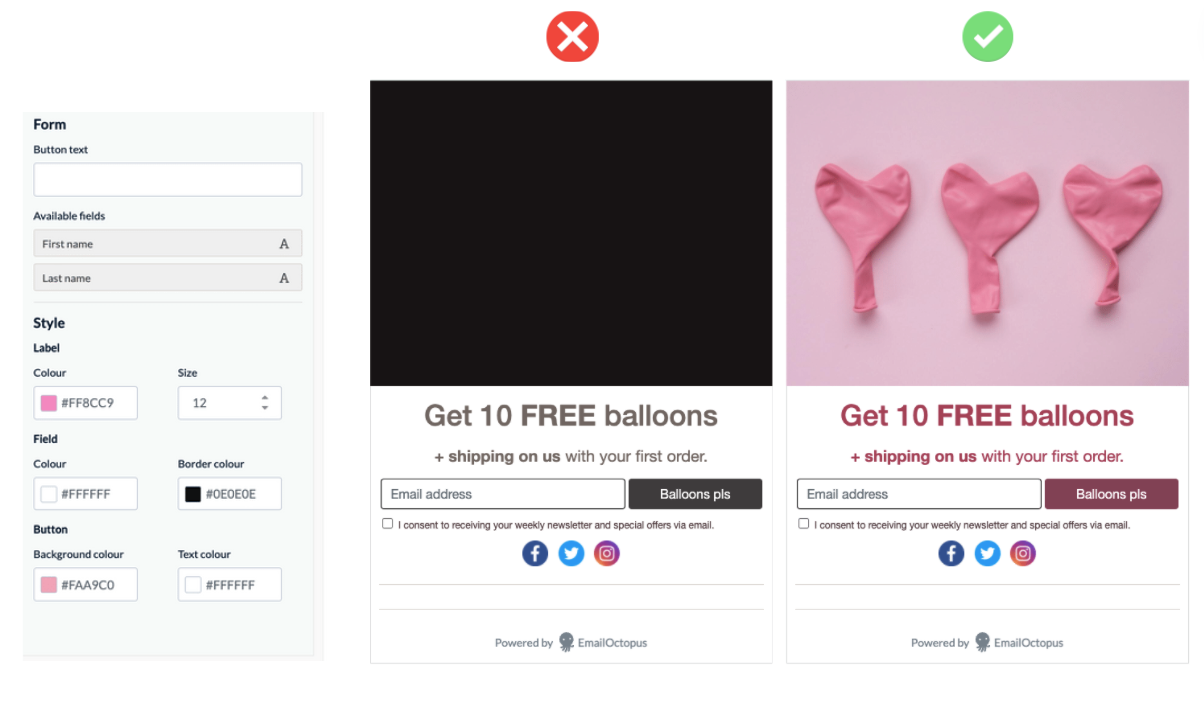
You can use a mix of colours too. Just make sure that they all contrast well against each other, even if they’re all the same shade (notice our button shade is darker along with the bolded texts).
Keep an eye out for the colour contrast in the next sections’ examples too.
3. Use a clear & concise headline
After you’ve set your colours, it’s time to set the headline copy.
Basically, this is brainstorming how to communicate your value proposition in the simplest and clearest way possible (see why it’s so important to establish your lead magnet?).
You want to use simple language that’s easily digestible. And opt for using action words since they subconsciously urge the user to take action, or more intensely feel a desire, at the very least.

Nomad Cooks is a company that enables people to easily book private chefs to come to their homes and cook restaurant-quality meals. They’ve garnered over 1,100 newsletter subscribers in under a year by primarily running their unique lead magnet of giveaways.
Reflected in the header copy, they bring out our deepest competitive desires with the exclamative word “Win!” No complex vocabulary anywhere. Then they further touch our reward centre and make us envision a fun time by saying “dinner party” cooked by a “private chef,” selling exclusivity and personalization.
4. Write an informative short description and calm any concerns
This is the short space below the headline where you can expand on the value for your subscribers. Explain how your offer works (e.g. how it solves a problem, or what you get out of it).
Again, remember to use simple language throughout. Keep the sentences short as you’re usually working with a very small amount of character space.
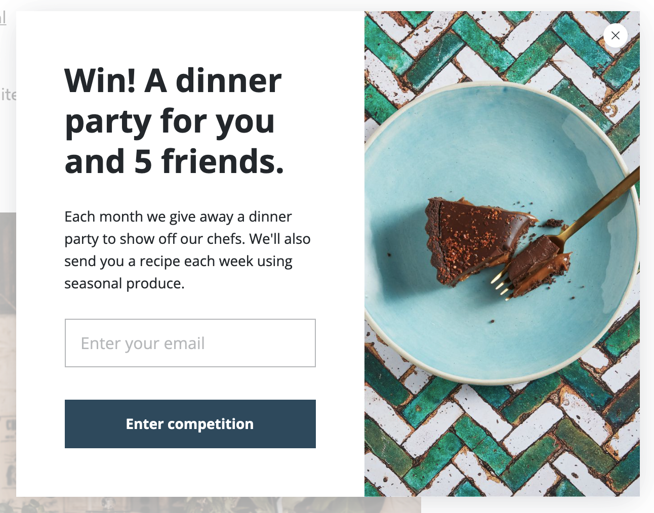
So following this Nomad Cooks pop up example, their short description reveals that they conduct this giveaway every month, and provide chef’s favourite recipes, dinner party tips and tricks, and discounts and offers (seen in the pop-up’s background).
In the two screenshots above, you’ll notice that the signup copy is a bit different on both forms. Likewise, don’t be afraid to A/B test different variants for your different email lead generation initiatives.
All in all, they used the short description to inform the reader of the ongoing value they would receive. You should also mention how frequently you’ll be posting since this is something new subscribers will be curious about.
A successful email sign-up form may also add social proof (e.g. customer testimonials, reviews, etc.) to convince people that others have seen value from subscribing and/or trying out the brand’s products or services. For example, Adam Enfroy mentions that he already has 47,000 subscribers reading his newsletter to attract new ones:
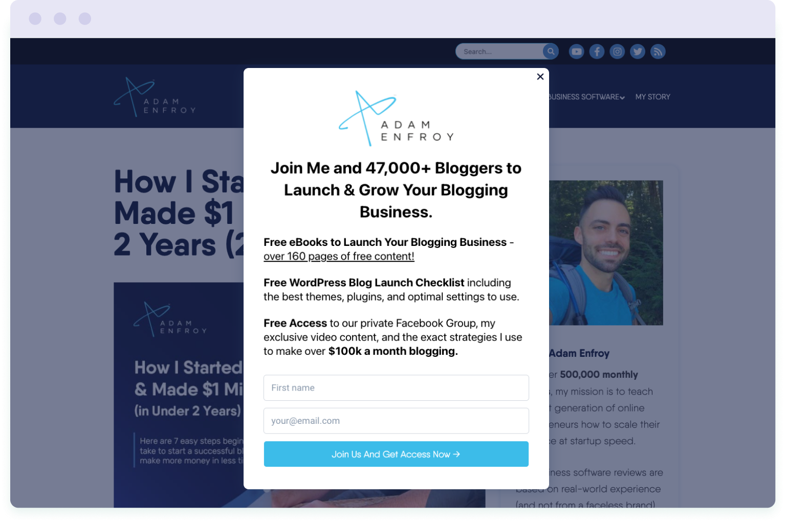
Finally, make sure to make your intentions clear regarding how you’ll be using their email address. People need to make sure that you’re not going to end up selling their email addresses or inundate their inbox with spammy sales pitches. Try to explain what they will and won’t get.
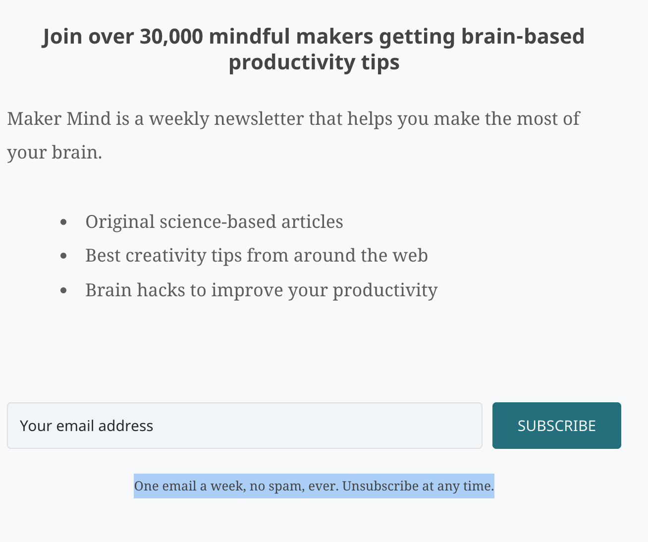
For instance, Anne-Laure from Ness Labs has this message under the input field: One email a week, no spam, ever. Unsubscribe at any time. It’s short and simple, and conveys the right point across.
5. Minimise input fields on your email sign-up form
Optimising email sign-up forms means minimising the amount of information you ask from new email subscribers. In other words, reduce the darn friction. No need for the user’s last name, for example. Or their date of birth, gender, occupation, race, phone number (unless you plan on going that route), and whatnot.
HubSpot once researched 40 000 contact forms and found that conversion rates could improve by almost 50% when you went from four fields to three on your signup form.
In most cases, all you really need is a first name (to personalise your messages) and an email address. But of course, for more lead generation goals, you could throw in some qualifying questions or filters.
6. Use a personalised call to action
If the email signup form is the door to your newsletter, then the CTA is the knob. With very few characters to work with, you must choose your words carefully. Simply reusing “Sign Up” is not only dull, but can be a lost opportunity for winning more subscribers. It’s not bad, but it could be better for a brand like yours.
Getting creative and personalised here can really pay off. A good way to go about it is to relate your CTA button to the value your new subscriber is getting.
- Offering a free guide? “Send me my free guide”
- Offering an eBook? “Start reading now”
- Selling pink balloons? “Balloons pls” might be a humorous little route
Notice that the above examples have some key persuasive elements:
- Personal or possessive language like “me”/”my” subconsciously suggest ownership
- Urgency – words that encourage visitors to take action like “Join Now!” (+ exclamation points)
- Something hyper-relatable with the community – with our imaginary eCommerce balloon business, we’re speaking super casually to gen z and millennial women. So we made our CTA like texting a friend – playful and relaxed. “Balloons pls” remains value-centric & personalised, with some bluntness and unconventionalism.
For clear and concise headers, relevant body text, and an actionable CTA, many successful online businesses opt to hire eCommerce copywriters and get an expert to optimise their email signup form for conversions.
7. Nail your sign-up form’s timing
The timing is huge. It’s the difference between making your form come off as a nuisance or a gold mine of value. This also ties in with the type of email signup form you’re using. In fact, according to a benchmark study done by Sumo on email sign ups, they found that fixed subscription forms had the lowest conversion rate, at 0.5%, and those with triggers ranged between 1.9% and 2.9%. As we’ve already mentioned, you need to experiment with different triggers to find what works for you, instead of just slapping a form to a page and calling it a day.
If you’re going to use a time-delayed pop-up, then you might not want to set it to appear in the first five seconds of a visitor’s session on your website. Give them a chance to settle in. After perhaps 40-60 seconds, you could safely assume the user has learned a bit about your site and remained interested enough to be possibly open to your newsletter.
Following that same idea, you can also use the scroll-delayed pop-up. By triggering your form to appear, say, 60% down the page, you assume the visitor was interested enough to scroll and learn more, passed certain sections, so now it’s more plausible to assume they may be open to your newsletter compared to when they were still at the top.
The exit form can be used alongside the other two. Presenting your visitors with an irresistible offer right before they’re about to leave your site can recapture their interest and score you their contact for future conversions.
If you’re using an inline form and a newsletter isn’t your main offering, then it might not be the best idea to position it at the top of your webpage, where you haven’t had the opportunity to show users who you are and why you’re worth it.
(BONUS) Rapid-fire email sign-up form design tips
Your email signup form’s success comes from three things: the incentive, quality of copy, and quality of design. We covered all three in-depth. So after you’ve optimised those three areas, you can focus on smaller tweaks to truly maximise conversion potential:
- Acquire the right traffic: You don’t market meat to vegetarians. In the same vein, you need to attract the right people to sign up to your newsletter in order to keep subscription rates high.
- Use a noticeable CTA button: alongside stellar copy, make your CTA button big and easy to read and click. Especially on mobile, it can be annoying for a user to try and click a small button that’s illegible. It also captures attention faster.
- Add social proof: under your email box, you can say something like “join 10000 others…” to reassure visitors that people like your content. But be mindful of where you use it – it’s not always effective, like for giveaways.
- Present an unfavourable alternative: For an extra push, remind your visitors what they could be missing out on on top of what they could get (which is your value prop).
- Remember to create that colour contrast: using rich on-brand colours that complement each other nicely will make your stuff fun to look at, and have you come off more professional.
- Stick to one to two font colours: Too many font colours on your signup form can be distracting. Choosing one to two colours that contrast nicely go for your copy too, not just form build.
- Use a dark, opaqued, or blurred overlay for popup forms: this adds to an overall attractive presentation. Hyper-focusing user attention to your popup and mitigating distracting elements in the back delivers a greater impact.
- Use (plenty) of white space: give your clear and concise copy room to breathe—improving readability, attractiveness, and the impact of your words.
- Nail typographic hierarchy: this is organising and formatting your information’s font types and sizes by what’s most important. Stick to one to two easy-to-read font types (e.g. Arial, Helvetica) and use different styles like italics, bold, all caps, and whatnot. So for example, you can make your header the biggest size and then italicise the short description.
- Don’t forget about opting out: Having the option to opt out is just as important as the option to opt in. Whenever you set up an opt in form, ensure that users can opt out whenever they like. For more information, check out this marketing compliance checklist.
Next step: Create your winning email signup form on EmailOctopus
Now that you know the ins and outs of optimising your email sign-up form, it’s time you get out there and action these tips and best practices.
One option to do so is through the EmailOctopus email signup form creator, where it’s ridiculously easy to optimise your form with the right images, colours, and copy with a few clicks.
Now get out there and start capturing some serious email leads.
No Comments
Leave a comment Cancel