The fashion industry is one of the most competitive around and what ultimately separates successful businesses from the rest is their marketing, both online and through more traditional channels like print.
At EmailOctopus we’re always keeping an eye on the latest trends in email marketing: how companies are onboarding their users, how they spread the word about discounts and how their emails are designed. Over the past month, we’ve been closely monitoring ten of the leading fashion brands and how they use email to convert visitors into customers and brand advocates.
You can view a full list of emails along with their HTML on this Google Sheet.
How emails are captured
First up, we looked at how brands capture email addresses.
ASOS was the only brand who didn’t make any reference to a newsletter on their homepage, instead opting to push users straight into products.
Topshop, on the other hand, include their newsletter sign up box on every page. It forms part of their footer, incentivising registration with a 10% discount on your first order.

Eight of the ten brands we looked at included a sign up box on their homepage with the box usually placed in the footer or the latter half of the sign-up page. None of the sites used pop-ups, instead leaving the focus on their products.
H&M was the final brand we looked at and, unlike the others, they mentioned their newsletter both in the header and footer although it wasn’t particularly prominent. Like Topshop they offered a 10% discount for singing up to the H&M Club.

Most of the brands we looked at stock both male and female lines. Of these, all but two asked the user’s gender at sign-up. This was done either through a simple radio button selection or a separate gender-specific button which could be clicked.
Onboarding
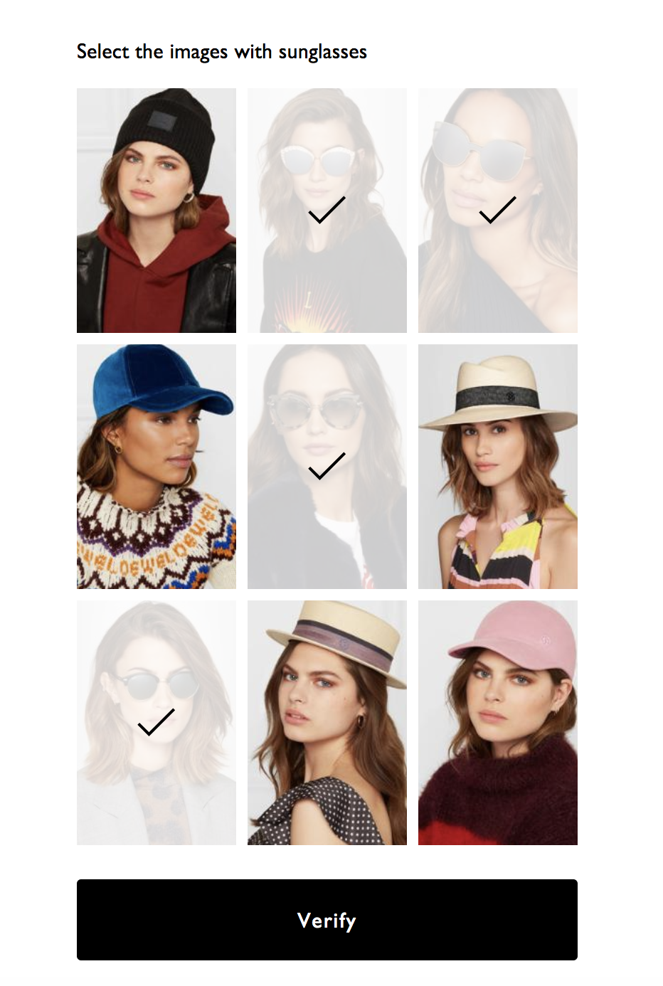
Next, we subscribed to the newsletters. Interestingly, only one website, Zara, used double opt-in to verify that we were using a legitimate email address. As GDPR comes in it will be interesting to see how many brands introduce double opt-in as a method to prove consent.
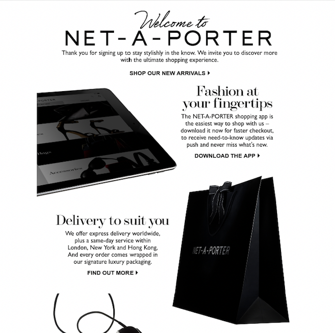
Even more surprising was that only three of the brands led us into an onboarding programme. Internet-based relative newcomers FarFetch and Net-a-Porter drip fed a series of emails over four days, firstly introducing the brands to us then encouraging us to personalise our emails. New Look also offered an onboarding program although it only consisted of two emails, the first welcoming us to the brand and the second was again welcoming us to the New Look “family” – both in a very similar, image-heavy style.
Both Urban Outfitters and Topshop used a single welcome-type email. Topshop’s was sent immediately and contained the 10% discount code whereas Urban Outfitters waited two days before welcoming us to their email campaign with a discount. Perhaps an effort to encourage those who hadn’t yet converted and to avoid reducing any potential profit from day one.
Email frequency
Next we monitored the frequency of campaigns per brand. We did this over a series of 18 days, from 25 February to 13 March. Across all ten retailers we received 59 emails, so an average of roughly one campaign every three days per retailer.
Most interestingly was the variance in regularity and frequency of the campaigns sent. Two retailers, COS and ASOS, didn’t send a single email in this period. FarFetch sent a total of 13 emails over the 18 day period, at their height sending three in a single day.
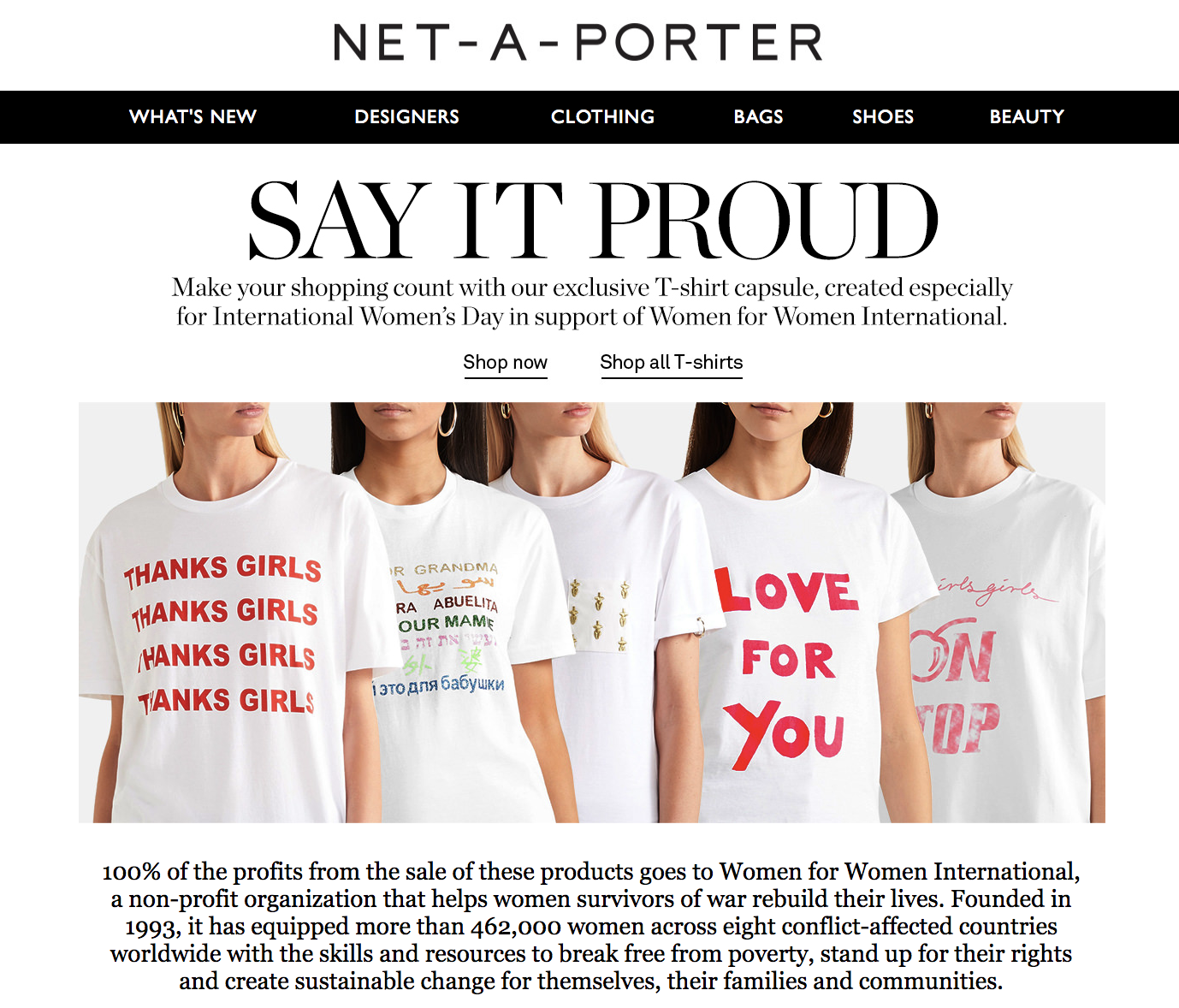
Topshop also didn’t send any emails beyond the initial welcome. This was despite important milestones, such as International Women’s Day falling during the period in which we monitored the emails. One theory behind the low rate of email sends from COS, ASOS and Topshop is that we signed up only two days after ‘payday’, the day which usually falls on the last Friday of the month and also the day that websites are not sending a significant amount of email volume on.
UrbanOutfitters had the most erratic and unpredictable of email schedules, sending only a single welcome email in the first 9 days before making up for it by hitting us with five emails in the latter half of the experiment.
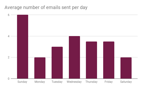
Sundays, during the experiment, were the most active of days for receiving emails with 11 March seeing all but four of the brands sending an email to us. It’s possible that as we signed up on a Sunday we were segmented into a group which had a preference for emails on this day, it’s also possible that Sunday is a strong sales day – with us all cooped up hiding from the cold weather and purchasing online.
We’ve included a full calendar of the send dates and volume here.
Email design and content
Fashion is all about looking good. So it’s important fashion-related email campaigns are immaculately designed.
We also looked at the content and how emails were designed. Overwhelmingly the brands used white backgrounds, allowing the product shots to stand out against the sparseness of the rest of the email.
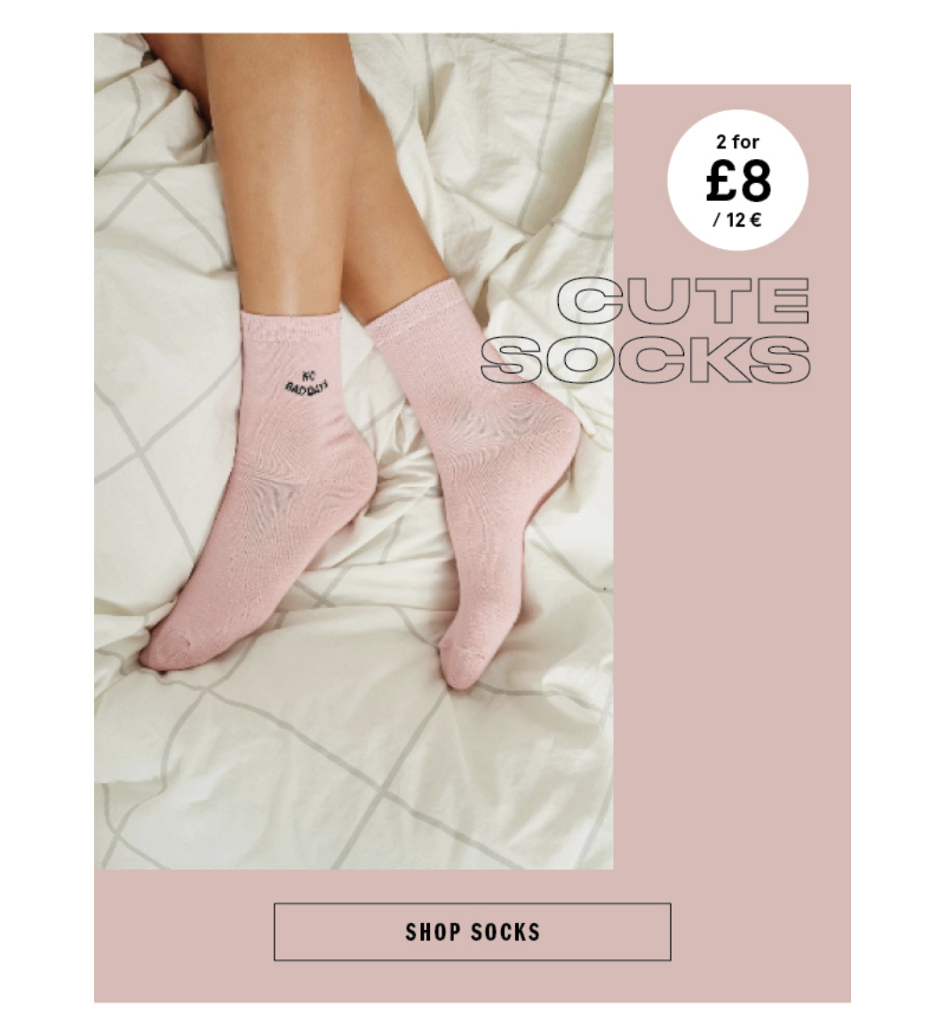
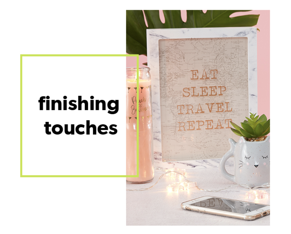
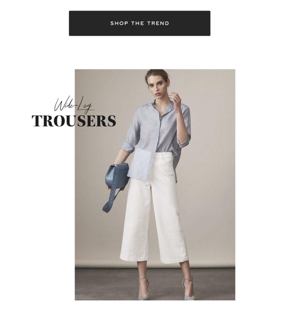
Another common trend we saw amongst the brands was for an ‘offset’ style, with images switching alignment as you scroll down the email along with text half aligned on the image. The examples here from Reiss, New Look and Urban Outfitters all demonstrate this:
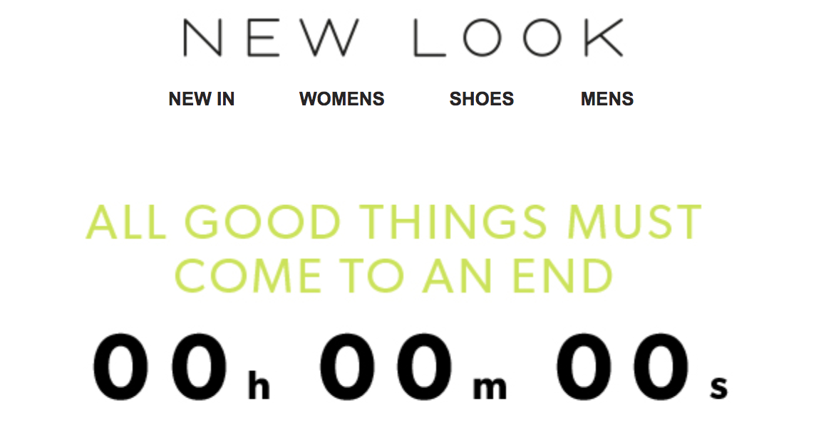
New Look also made use of a real-time countdown timer for one of their campaigns. In their 20% off sale campaign their hero image featured a timer below the headline “All good things must come to an end”. The timer was powered by Kickdynamic, the email image creator that serves personalised images to customers.
Check out our ultimate guide to email design and learn how to craft the perfect email.
Subject lines are the best way to differentiate emails and grab attention in the inbox. Interestingly, of the 58 emails only three used emojis. Two were sent by New Look and one by Urban Outfitters.
We also saw FARFETCH using the same subject line, “New In | Shop our latest arrivals” on 4 separate occasions.
Both Zara and FARFETCH also made regular use of ‘pipes’ (“|”) to break up their subject lines. Examples include: “Maxi length | A new sophisticated silhouette for a sunny getaway”

We’ve listed the full 58 subject lines on a Google Sheet here, take a look and let us know your favourite.
Takeaway tips
Big brands are often a good place to look for inspiration. And here, we’ve looked at some of the best-known brands in fashion, and how they do their email marketing.
Here’s a summary of the findings to inspire your own fashion emails:
- Optimise your opt-in forms – use single opt-in to grow your list faster and incentivise sign-ups with an exclusive discount code. Ensure your opt-in form is visible on all pages of your fashion website or portfolio and experiment with different types of opt-in forms.
- Ask for the right data at time of sign-up – if you stock men’s and women’s fashion, ask new subscribers for their gender so that you can later use this to effectively segment your list and deliver targeted messages.
- Set up a welcome email – introduce new subscribers to your fashion brand with a great welcome email and consider drip-feeding a sequence of emails to nurture subscribers towards a purchase.
- Experiment with email frequency – on average the fashion brands we looked at sent a campaign once every three days. But you might find that either fewer emails or more emails work best for your brand. Keep a close eye on engagement metrics to see how subscribers are responding to your campaign frequency.
- Send your campaigns on the right day of the week – Sunday is a busy day for fashion brands and their emails, which suggests it’s a day that works well. But to stand out in a crowded inbox, you might want to try sending your campaigns on a quieter day.
- Use emojis in your subject lines to grab attention – not many of the fashion brands we’ve looked at here used emojis in their subject lines. So to give your emails a better chance of grabbing attention, try including a few emojis.
What next?
Check out our breakdown of Everlane and their email marketing program for more ideas to steal for your own fashion campaigns.

People reacted to this story.
Show comments Hide commentsHi Tom,
Looking at the mails and subject lines. Any you nominate for the subject line pattern inspiration?
https://www.emailmonday.com/email-subject-line-pattern-inspiration/