Email marketing has been a reliable form of marketing to grow and reach out to an existing audience for years. However, not every email campaign is successful, which boils down to how it was planned.
Content, design, call-to-Action (CTA), and others play an important role in defining whether an email campaign will succeed. We have already talked about email design in the past, and today we’ll talk about CTA.
What is a call-to-action (CTA)
A call-to-action (CTA) in marketing terms means a button or a phrase which motivates the viewer to take specific actions. Mostly CTAs are in the form of a button, but sometimes can be incorporated as text with hyperlink.
Though remember, that not all buttons on a website or email are CTAs.
When CTAs are implemented with the right strategy and execution, it can help businesses boost conversion and get the user to take the desired action. This is especially important in marketing emails and landing pages.
Benefits of CTA
CTAs can impact your email marketing in various ways, and it’s an essential part of all marketing emails. Here are some key advantages of incorporating CTAs in your marketing emails:
- Improves the number of clicks: A well-designed and compelling CTA can help boost click-through rates in your marketing emails. By clearly indicating the desired action you want your users to take, such as “Shop Now,” “Learn More,” or “Download Now,” you make it easier for them to engage with your content.
- Direct traffic to specific landing pages: CTAs provide a direct pathway to guide your users for the email to specific landing pages or targeted content. By using CTAs that align with the purpose or message of your email, you can drive traffic to relevant pages on your website, product offerings, registration forms, event pages, or promotional offers. This helps in increasing conversions and achieving specific campaign goals.
- Encourages conversions and sales: CTAs are crucial in generating conversions and driving sales. When placed strategically within your marketing emails, CTAs prompt users to act, such as making a purchase, signing up for a trial, subscribing to a service, or completing a form. In addition, clear and compelling CTAs provide users with the motivation and guidance to move forward in the customer journey.
- Provides data for analysis and optimisation: CTAs in marketing emails offer valuable data for analysing and optimising your email campaigns. By tracking click-through rates and conversion with your CTAs, you can gain insights into the effectiveness of your email content and call-to-action. This information allows you to refine your strategies, experiment with different approaches, and improve future email campaigns.
Tips to build a successful CTA
Now that we know what CTA is and its importance, let’s understand some tips to help you make CTAs that convert well.
Make them actionable
The first and most important tip for any CTA is to make it actionable by adding a copy to the button, motivating the user to act. For example, instead of using phrases like “Join now” or “Try it”, you should be using “Join 1000+ marketers” or “Try EmailOctopus for free”.
Having CTA with actionable phrases has a psychological effect and motivates the user to take the desired action.
Placement is important
The placement of the CTA also defines whether it would effectively drive any conversion. Having a CTA above the fold and at the end of your email is recommended, as most people act either at the start or once they are done reading.
Sometimes it’s good to have a CTA in the middle too, if your email is too long or has an attractive section that might make people click on it.
Choose colours wisely
Colours are another factor that would affect the visibility and conversion rate of your CTA. Therefore, you must ensure that the colour of your CTA is vibrant and contrasts with the background.
A bright colour ensures that it catches the user’s attention and increases their chances of clicking it.
Create FOMO
FOMO, or the fear of missing out, can be an effective psychological trigger when used in a call-to-action (CTA) copy. By leveraging FOMO, you can create a sense of urgency and encourage users to take immediate action. This can be based on urgency, scarcity or time limitations.
CTA examples
Though the above-shared tips are a great starting point for building a high-converting CTA, seeing and learning from great examples is always helpful. Let’s go through some examples that would help you make better CTAs.
Mother’s Day email by Headspace
Many companies send emails during occasions like Mother’s Day and New Year, but most have a low conversion rate. This is because of not focusing on conversion while building the email.
Here’s the Mother’s Day email by Headspace, which has a great CTA accompanied by a beautiful design.

Things that Headspace has done right:
- CTA is placed both at the top and bottom.
- The email copy is made around the CTA.
- The CTA text is actionable as it discusses gifting now to get a discount.
- The background colour of the CTA is also contrasting.
Free gift email by ParkMobile
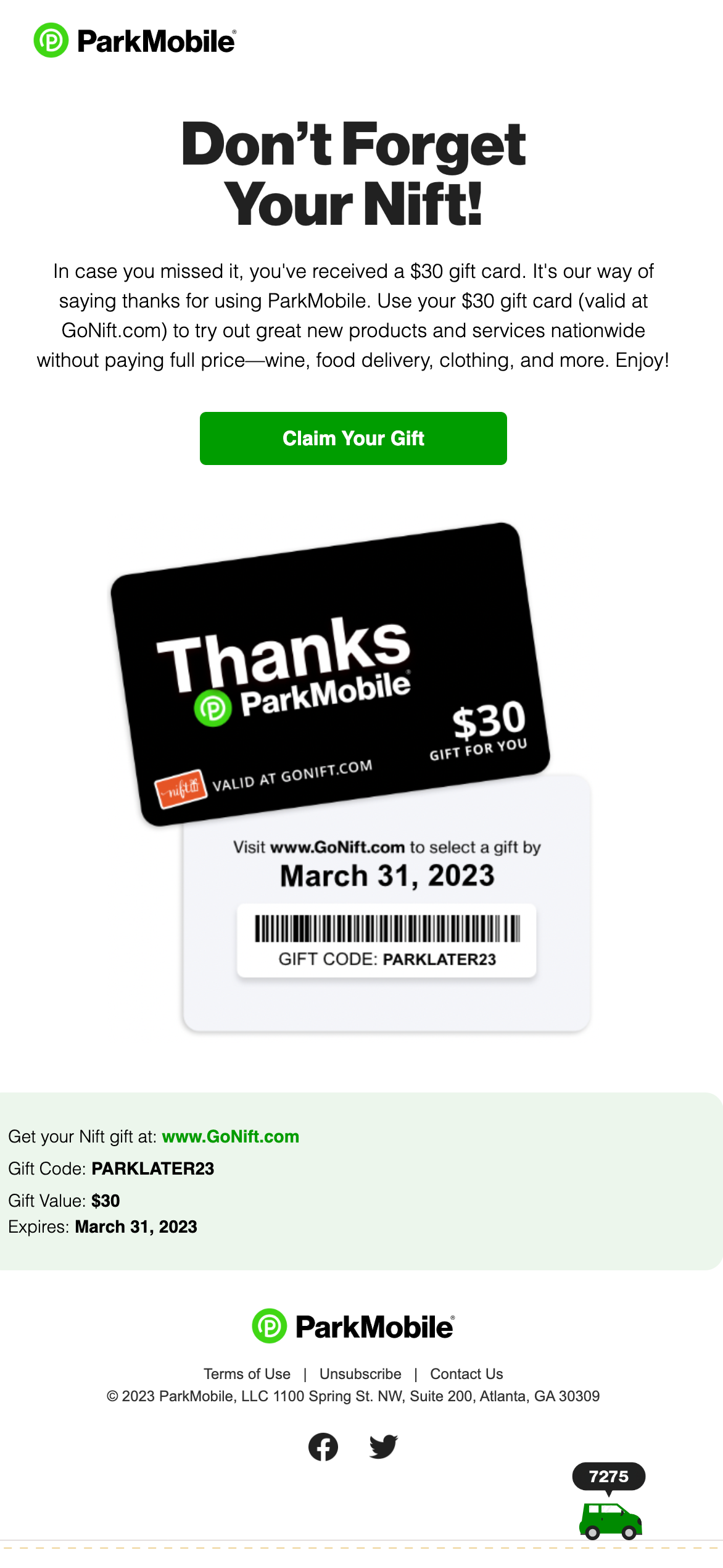
From time to time, many companies run promotions or send virtual gifts over emails and here’s a similar email by ParkMobile where they are giving free gift cards to their subscribers.
Though, in general, emails with free stuff have higher conversion when compared to paid, there are still notes that we can take from this email.

Things that ParkMobile has done right:
- Good attention-grabbing email copy.
- CTA with good contrast.
- Actionable text on the CTA.
New product launch email by Hiya
It’s very common for e-commerce companies to send marketing emails with coupons, especially when a new product launches. This is a similar email by Hiya, a D2C child nutrients company.

Things that Hiya has done right:
- The headline focuses on the prime issue they fixed (possibly the flavour wasn’t good earlier).
- Has an actionable CTA.
- Uses multiple CTAs with different copy.
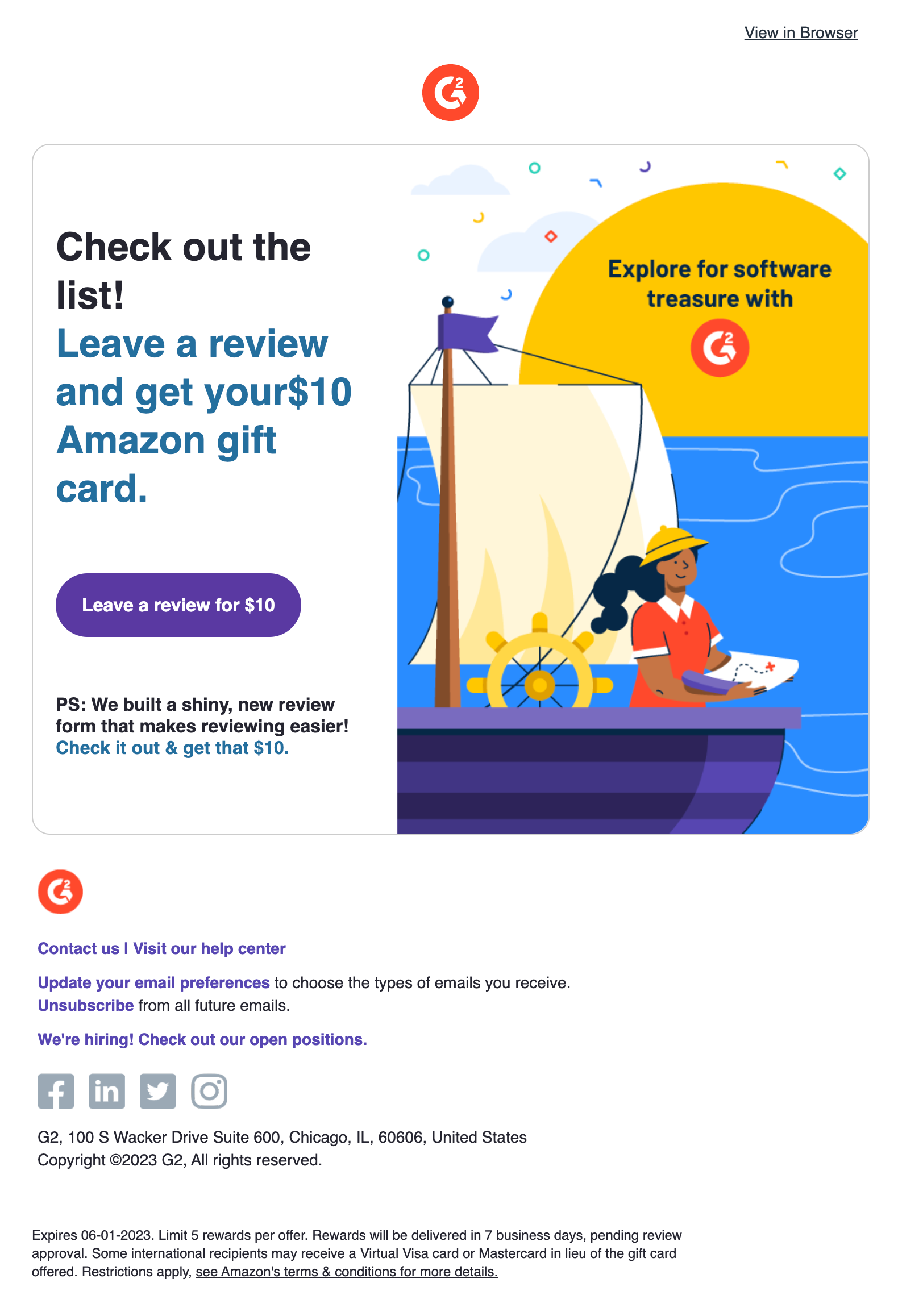
Review collection email by G2
User-generated content (UGC) is very important for platforms like G2; from time to time, they incentivise users of various software to collect their reviews.

This is a relatively small email, and the only thing to note is the CTA copy and how actionable it is.
Conclusion
In conclusion, call-to-action (CTA) is essential in email marketing. It gives the reader a clear idea of what to do next and helps drive conversions. To maximise the effectiveness of your CTA, make sure it stands out from the rest of the email, use action-oriented language, and place it in a prominent location.


No Comments
Leave a comment Cancel