Black Friday is the biggest day of the year for most ecommerce businesses. Months of planning go into their campaigns, with careful consideration paid to how their goods are merchandised and presented to potential customers. As a result of this our email inboxes are inundated with promotional offers from almost every brand, from Apple to Ann Summers.
At EmailOctopus we looked at 988 different fashion, retail, travel and sports emails which were sent on Black Friday. Here are our thoughts on how email marketing dominated Black Friday.
Subject Lines
We looked at the subject lines of the 988 emails sent on Black Friday. And unsurprisingly, the words black and Friday dominated the majority of campaigns.
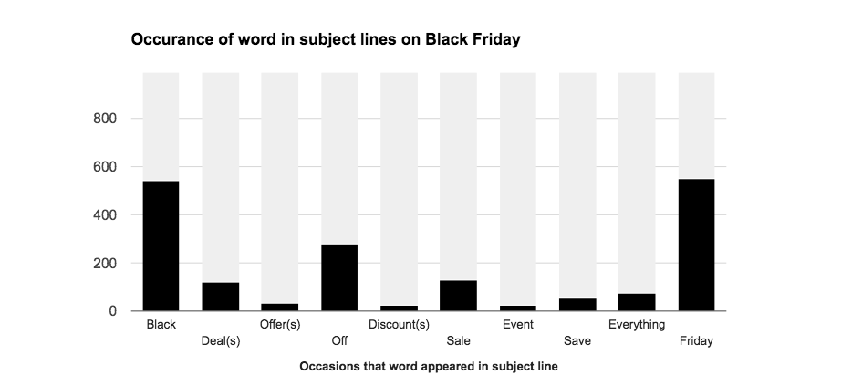
The word black featured in over 55% of all the email marketing communications received on Black Friday. This figure includes transactional emails, which shows how well publicised this ‘holiday’ has become in retail circles.
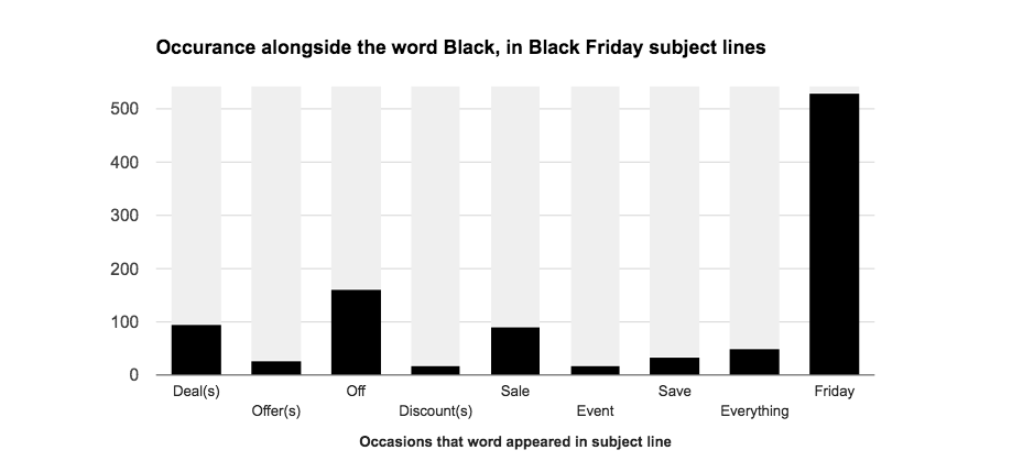
As we begin to focus specifically on Black Friday campaigns, we decided to look even closer at the words which were used in the emails. We looked at all subject lines featuring the word black and looked at the accompanying words in that subject line.
On only 13 occasions was the word black not in the same subject line as Friday. Examples here include:
RareLondon, who ran the subject line “✖️ IT’S A BLACK OUT✖️ BE QUICK! 30% OFF EVERYTHING!!?”
Curvissa, who ran the subject line “Black is back! £10 off today only”
Loft, who like a handful others went with Fri-yay “BLACK FRI-YAY IS HERE: 50% OFF E-V-E-R-Y-T-H-I-N-G”
Another interesting insight was the prevalence of the word deals, which appears to have been used interchangeably with sale. Around 17% of all subject lines featured deals, whilst another 16% opted for sale. Examples here include:
The Entertainer, who tried to inject a bit of urgency with “Quick they’re selling fast! Our Black Friday deals!”.
Trespass, who went with a very clear “Black Friday Sale Now On! Save Up To 70%”.
ProgressiveProperty who proved that even the world of property investment wasn’t free from Black Friday offers – “Black Friday Deals For Property Investors!”.
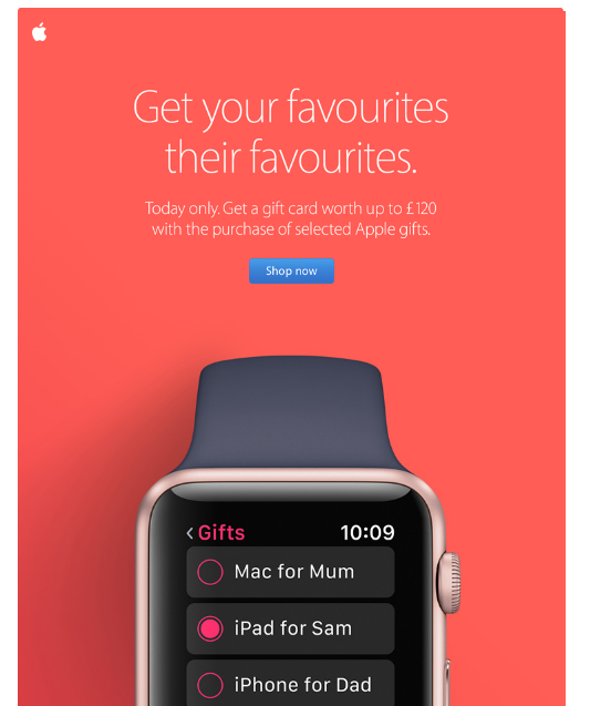
Very few ecommerce sites opted out of using Black Friday in their communications, with the notable exception of Apple. While still offering discounts, they avoided any reference to the occasion and went with a short, simple subject line – “Our shopping event is on” – alongside an atypically colourful design.
A/B tests
While analysing some of the subject lines, we also noticed some brands running A/B tests. These brands are likely hedging their bets and trying a number of alternatives to ensure they get maximum visibility and opens, within a user’s inbox.
One such example we saw was from the flash-sales travel agency, Secret Escapes who ran these 3 subject lines:
“Black Friday 24-hour sale. Incredible discounts on the hotels you didn’t realise you could afford.”
“◼️ Back to black: 24 hours. Mind-blowing discounts. Time is ticking. ◼️”
“Our biggest ever 24-hour sale is the new black”
Email design
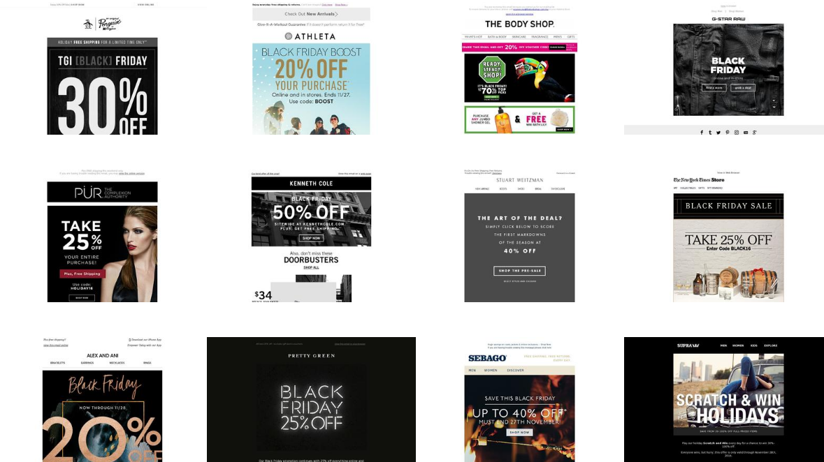
Dark colours dominated the palettes of the majority of companies, as they play on the black aspect of Black Friday. We’ve selected some of our favourite dark designs below.
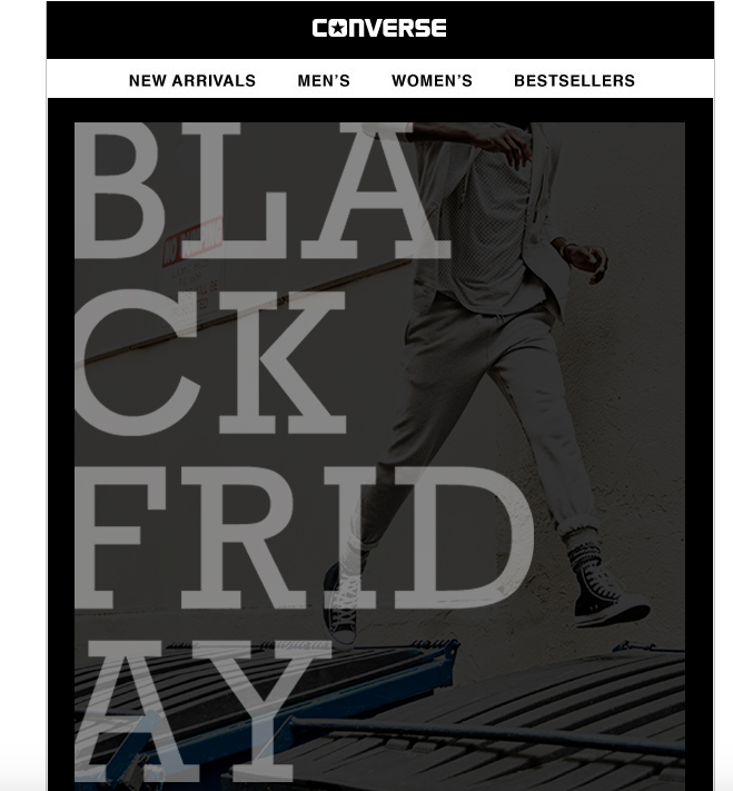
The typography of the Converse hero image is beautiful and acts as a large link which directs to the Converse sale page. The main downside of this email is that there’s no clear call to action.
Nike have carefully selected stock and imagery which compliments the dark monochrome design aesthetic of the email. The 4 clear CTAs, which sit above the fold, are unmissable at a large 20px with absolutely nothing to detract attention away from them.
Although Black Friday is often seen as a discount day, Nike look to have intentionally focused on ‘drops’ (new products) and the email makes no mention of pricing, discounts or availability. An interesting approach.
Bose are another company, like Nike, who made great use of their product to create a beautiful email. The monochrome design has unmissable buttons linking directly to the product page. The limited text drives urgency around the 45% discount; we’d argue giving actual available quantities can be stronger in driving urgency – but the concept is there.
Countdowns
A few companies also made use of countdown clocks to help drive urgency for their customers. Countdown clocks are actually incredibly easy to create for use in email, and there’s a number of free tools, such as Sendtric, which now allow you to do this. As we go into 2017 we fully expect email to become more interactive, and countdowns are just one way in which brands are doing this.
Secret Escapes usually send very minimalist emails and make the most of their luxury travel imagery to bring colour to them. For Black Friday they flipped their colour scheme and went with a totally black email. The timer counted down 24 hours, until the end of the sale on Saturday. The main banner in the email links off to a specific Black Friday landing page, where all the discounts are listed.
Merlin Entertainments, operators of the Alton Towers theme park, ran a large Black Friday campaign offering 50% off many of their attractions. We especially like how the countdown timer was integrated into the overall design of the email.
How this data was sourced
All the data above is freely available via Beetle, a free email marketing insights tool. Beetle have a record of thousands of email marketing campaigns sent. All the campaigns are searchable by industry, date, company and subject line.
You can download a list, split by industry, of the subject lines used on Black Friday here.
No Comments
Leave a comment Cancel