They say a picture paints a thousand words.
And it’s been shown that the human brain processes images 60,000 times faster than text.
So it comes as no surprise that marketers love using images in their campaigns. And consumers love consuming them.
But for your marketing campaigns to be effective, you need great images. And you need to use them correctly.
To help navigate that, we’ve compiled our top tips for using images in your email marketing campaigns.
Page Contents
1. Find suitable stock images
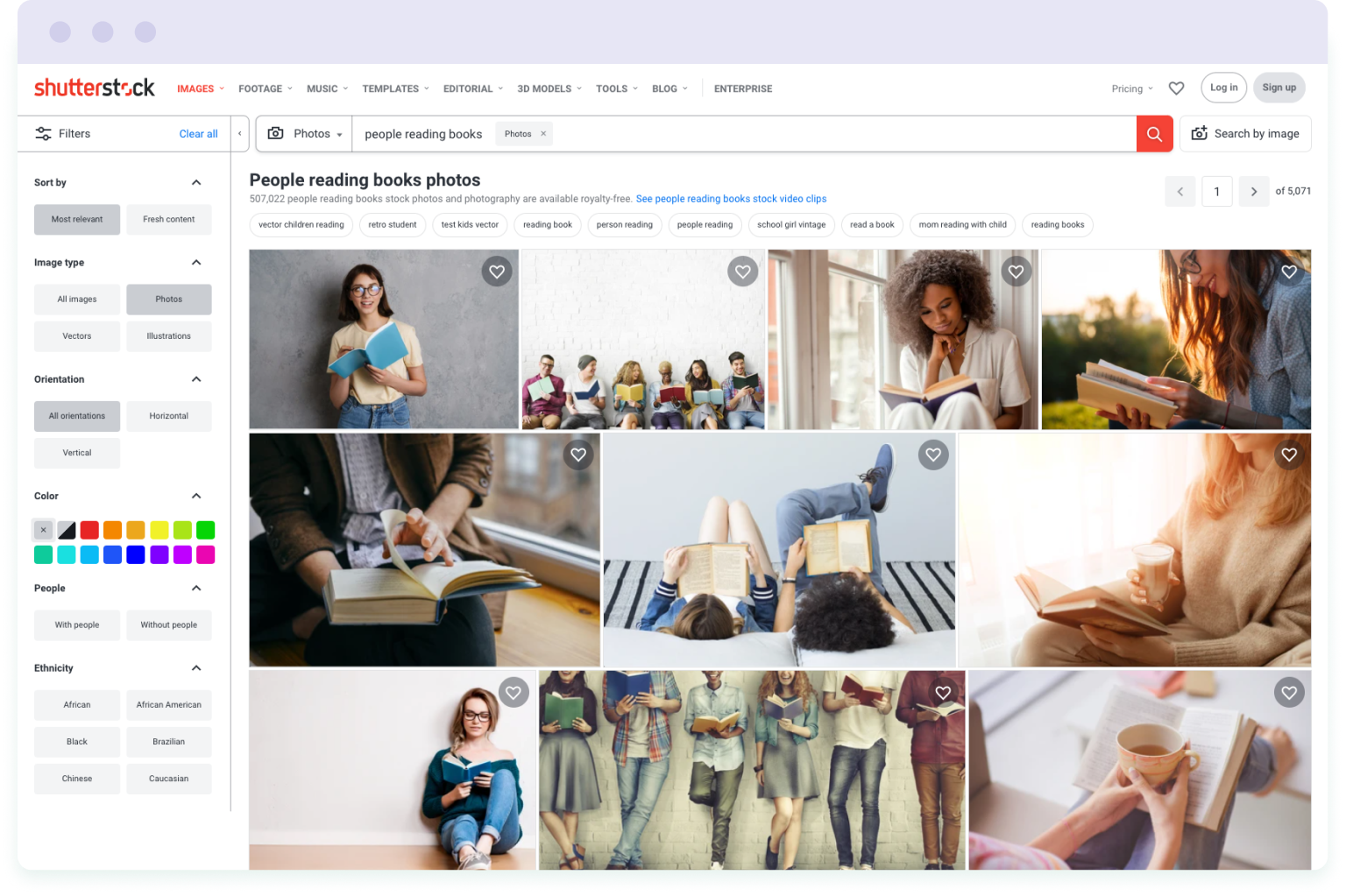
When it comes to finding images for your email marketing campaigns, you can find high-quality images on any topic on stock websites. There are millions of photos that you can use for free, even for marketing and commercial purposes.
Once you have downloaded your desired image, you can customise the image by cropping, adding text, changing colours, and adjusting the image settings.
While many stock images are quite generic in appearance, they can still give a professional look to your emails. Especially when used in tandem with other design elements, such as CTA buttons and colour blocks.
If you want to use pictures of people, rather than models, search for photos of regular-looking people instead. Because your customers might find perfectly-polished and posed models difficult to relate to.
Shutterstock is one of the most popular stock platforms where you can buy a photo for an average price of $2.90. But, if you’re on a budget, you can find free business stock photos on Unsplash or Gratisography.
2. Take your own photos

Stock images might come in handy if you don’t have much time or money. But they’re not suitable for marketing campaigns that promote new products.
If you need photos that show the products that you sell, you’ll need to create original imagery. You can either do this in-house using pro-level equipment for product shots. Or you can hire a professional photographer to take the images in a studio.
Once you have your product images, you may need to improve them by removing or replacing the backdrop, for example. You can enhance your images with the help of professional photo-editing software, such as Photoshop.
If you don’t have editing experience or don’t want to spend much time on post-processing, you can contact professional product retouching services. Photo editors can perform basic retouching and cleaning tasks from $2.50 per photo.
3. Use illustrations
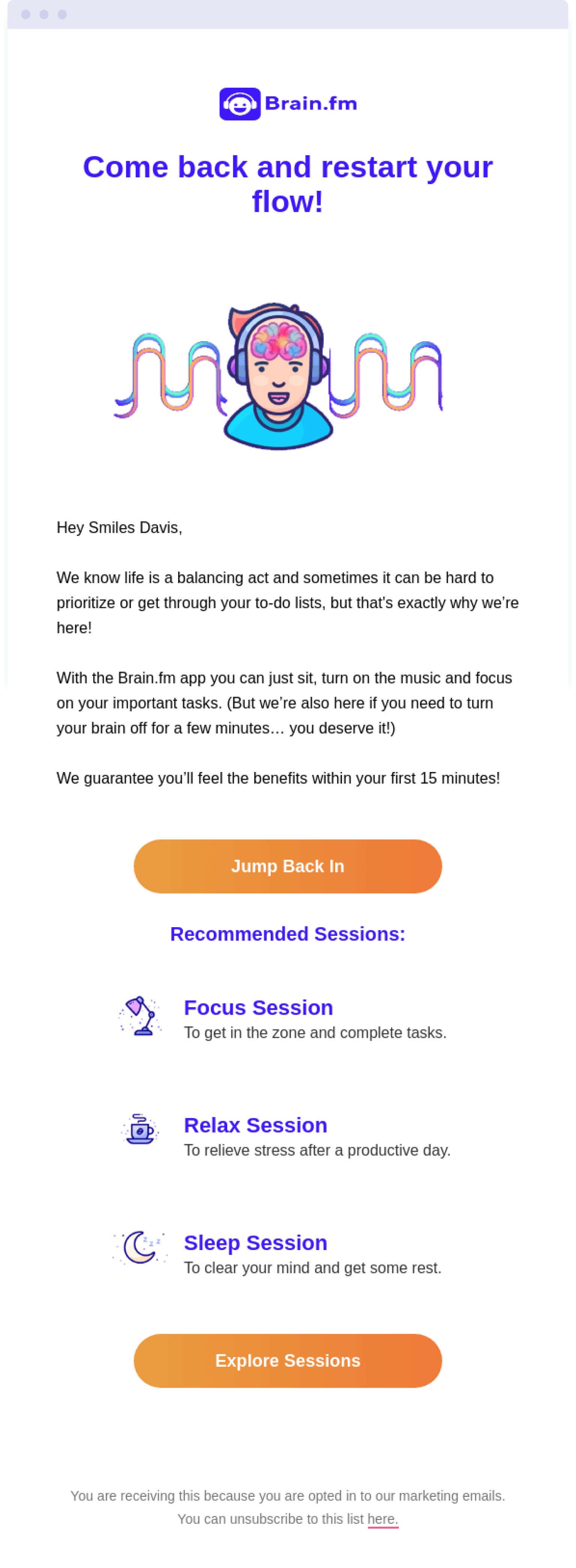
If you sell software or a service, producing images can be difficult without a physical object to photograph.
That’s where illustrations come to the rescue. They can illustrate what your software or service does. And by incorporating illustrations into your emails, you can make your emails more visually interesting. Illustrations are a particularly great choice for SaaS businesses to help represent concepts and actions related to the software.
If you wish to use illustrations in your marketing campaigns, it’s a good idea to hire a professional illustrator. They will create a unique style of illustration for your brand and help you maintain visual consistency.
Alternatively, you can purchase illustrations on stock image libraries, such as Dreamstime, or specialist illustration libraries including Ikon Images and Stock Illustrations.
For those with a designer on their team, a third option is to create your own illustrations in Adobe Illustrator or CorelDraw.
4. Incorporate charts, graphs and infographics

When you want to present data, stats and figures in an email, charts, graphs and infographics are the way to go. These enable you to visualise your data and make it easier for readers to digest.
Infographics can help you break down complex or number-heavy info in an accessible way. And they can also help you promote the benefits of your product in a more visually-attractive way. You can present hard facts about your product using pretty charts and graphs instead of chunks of text.
Infographics can be as simple or as complex as you like, depending on the purpose of the email. For example, for annual summary emails you’ll want to include lots of information. But for other emails, you might not need to visualise all the data that you have. If the purpose of your email is to illustrate the key advantages of your product, it’s better to focus on a limited number of memorable points.
For example, infographics can show how many people have purchased your product. Or how much cheaper/better it is than the product offered by competitors.
When it comes to creating engaging charts and graphs, you can use tools like Canva, Venngage and Piktochart. Or you can hire an experienced graphic designer to create a bespoke infographic that you can promote across other channels.
5. Align images with your brand style
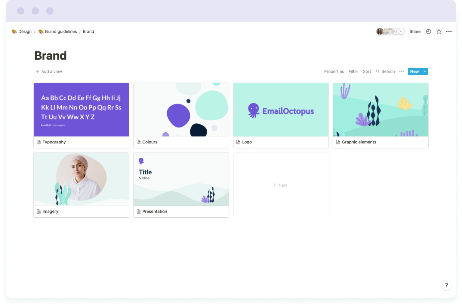
Whether you use stock imagery or illustrations, infographics or commissioned photographs, every image you include in your email marketing campaigns needs to match your brand.
Your marketing materials need to be consistent with the identity and image of your business. Because it’s the visual components of your marketing materials that make your brand recognisable and help you stand out from the competition.
Customers should be able to recognise an email from you, ideally, even if you were to remove the sender name and company logo. They should be able to open an email and from the colour palette and imagery know that it’s your brand.
So when using stock images, for example, this could mean sticking to images with a particular style and tonal range. But when using bespoke or in-house designed pictures or illustrations, this requires developing a brand style guide to define your design rules and keep everything consistent.
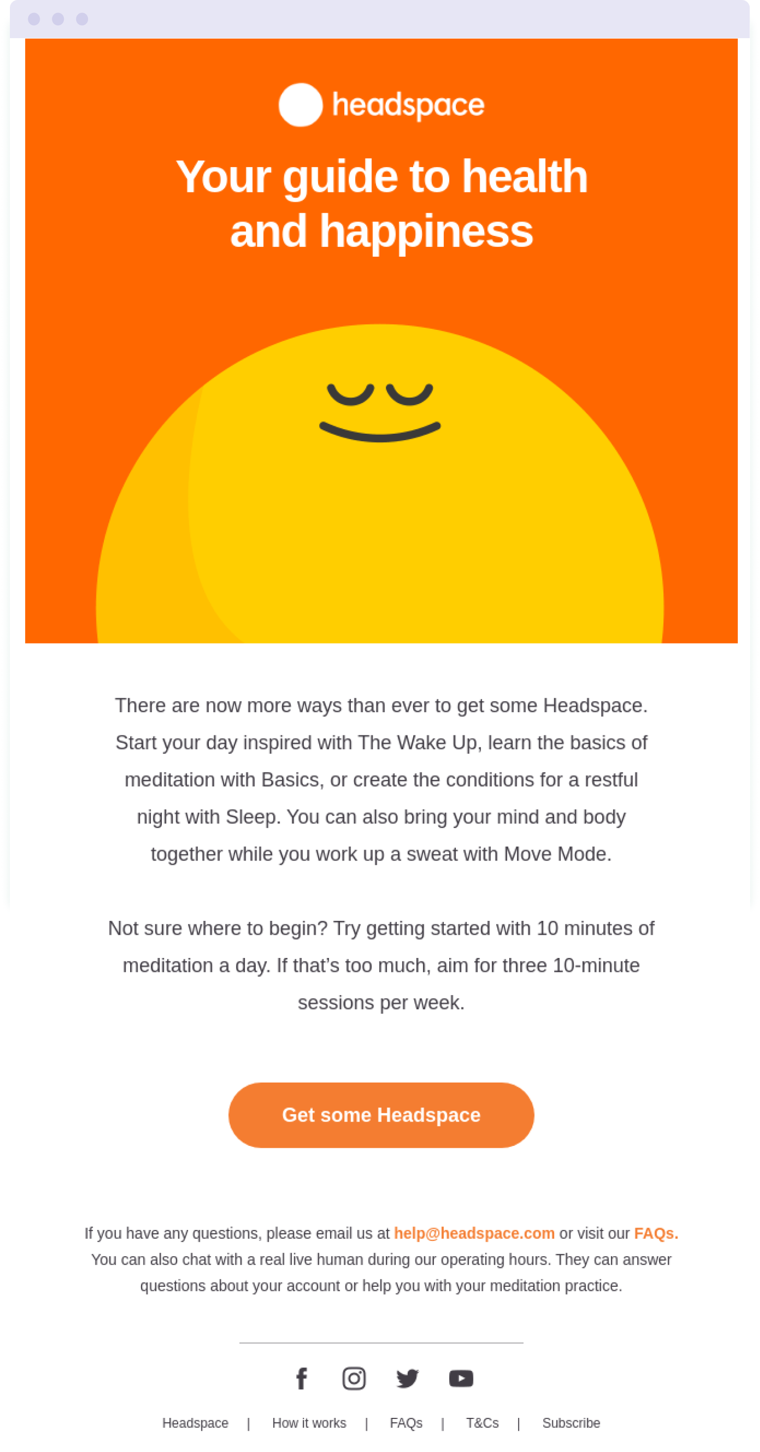
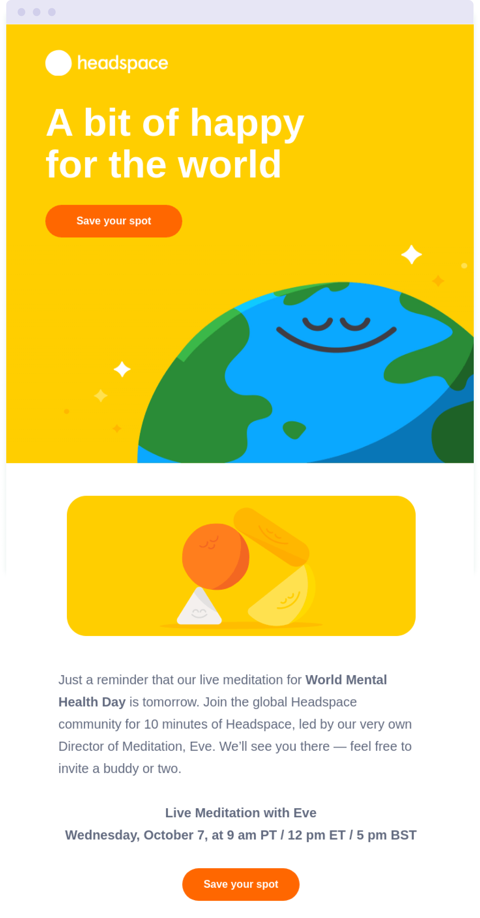
For an example of brand consistency across campaigns, take these two emails from meditation app Headspace:
Both emails use the same yellow and orange colour palette. And both use illustrations that represent Headspace’s unique style with round shapes given human facial expressions of peace and contentment.
6. Choose the right image dimensions and size

One aspect that is likely to affect a reader’s experience of your email is the way you format your images. If image files are too big, it will take a while for them to load. Which means readers will be looking at blank space. And in the worse case scenario, they might delete your email out of frustration – without reading it.
This is why you need to perform image size optimisation before adding images to your emails.
In the majority of cases, the recommended height of images is 200 pixels or less. The optimal width is 600 pixels. And in terms of image file size, images should be no more than 500KB. The smaller, the better.
Opting for smaller, correctly-sized images will ensure they load quickly when readers open your email.
However, you’re never limited to using just one size of image – to keep your emails looking fresh and unique, combine images of different sizes to create visual hierarchy. For example, your hero image will be large compared to other images in the email.
Check out our guide to email design for more tips on images and layout in emails.
7. Save images in the correct format
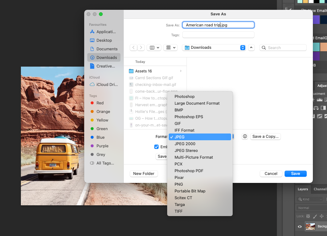
You can create digital images using many formats – BMP, EPS, JPEG, PNG, and GIF, to name a few. But email service providers and email marketing tools do not accept every format of image.
So the three image file formats that we recommend using are:
JPEG
JPEG is one of the most popular picture formats. It provides considerable image compression, decreasing the size of a file by 90% or more. This makes it ideal for creating small image files to use in email marketing campaigns.
However, during the file compression process, image quality is degraded, though you can often choose the level of compression to reduce this degradation.
JPEGs are great for photographs and images with lots of colours and rich detail. But you should avoid using this format for images containing text.
PNG
The PNG format offers great fidelity and can display good colour depths, however, not as rich as JPEG. It’s a format that’s particularly suited to rendering precise lines and clear contrasts. Which is why PNG is a better option for images of illustrations with limited colour palettes.
Unlike the JPEG format, PNG preserves the original quality while compressing the file. However, this does mean that image files are usually bigger than JPEG equivalents.
One of the biggest advantages of the PNG format is that you can create images with a transparent background. This is not possible with JPEG, and means that you can create different shaped images using PNG.
GIF
The GIF format is better suited for simple illustrations, like logos and icons. It’s not the best choice for standard images, as GIFs can only display a limited amount of colours.
GIF is widely used across the web, especially for animated graphics. And this is generally what GIFs are used for in emails – web animation. Here’s an example to illustrate:

8. Optimise your emails for different devices
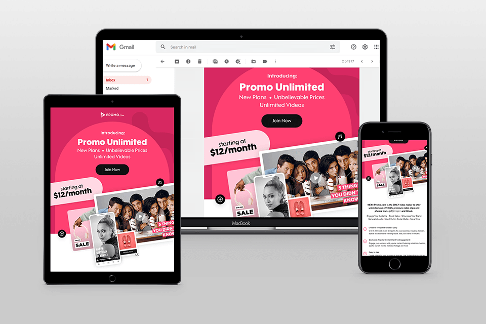
It’s important to keep in mind that your readers aren’t only going to view your email on desktop. They’re going to be using all types of devices and browsers.
Which is why you need to make sure that your emails look perfect across all devices. And it’s why we recommend sending a test email to yourself, to see how it displays on different devices.
Many consumers now read their emails on smartphones. Sometimes, images look great on desktop, and load quickly enough. But the images may be too large to load quickly on a mobile device, especially if it’s not connected to WiFi.
As we mentioned earlier, that’s why you need to compress your image files. You can use TinyPNG, Optimizilla and other similar free services to make your images smaller.
To ensure the images in your email are of good enough quality, size images to be twice the width of an average mobile phone screen, which is around 450 pixels.
Keep in mind that some of your potential customers will open your emails in email apps and web browsers. And that some people set their privacy settings to block images in emails. This is why it’s better to create an attractive design that will look good even without images.
Email marketing tools like EmailOctopus include responsive templates that adjust to the device they’re displayed on. This helps keep your email campaigns looking good and working correctly across the devices your audience will be reading them on.
It’s also worth remembering to optimise your landing pages and website for mobile. After all, if a subscriber is reading your email on a mobile device, it means they’ll also be viewing your website on a mobile device when they click a link in the email. So where you send them from the email needs to look equally as good on a phone.
9. Include alt text
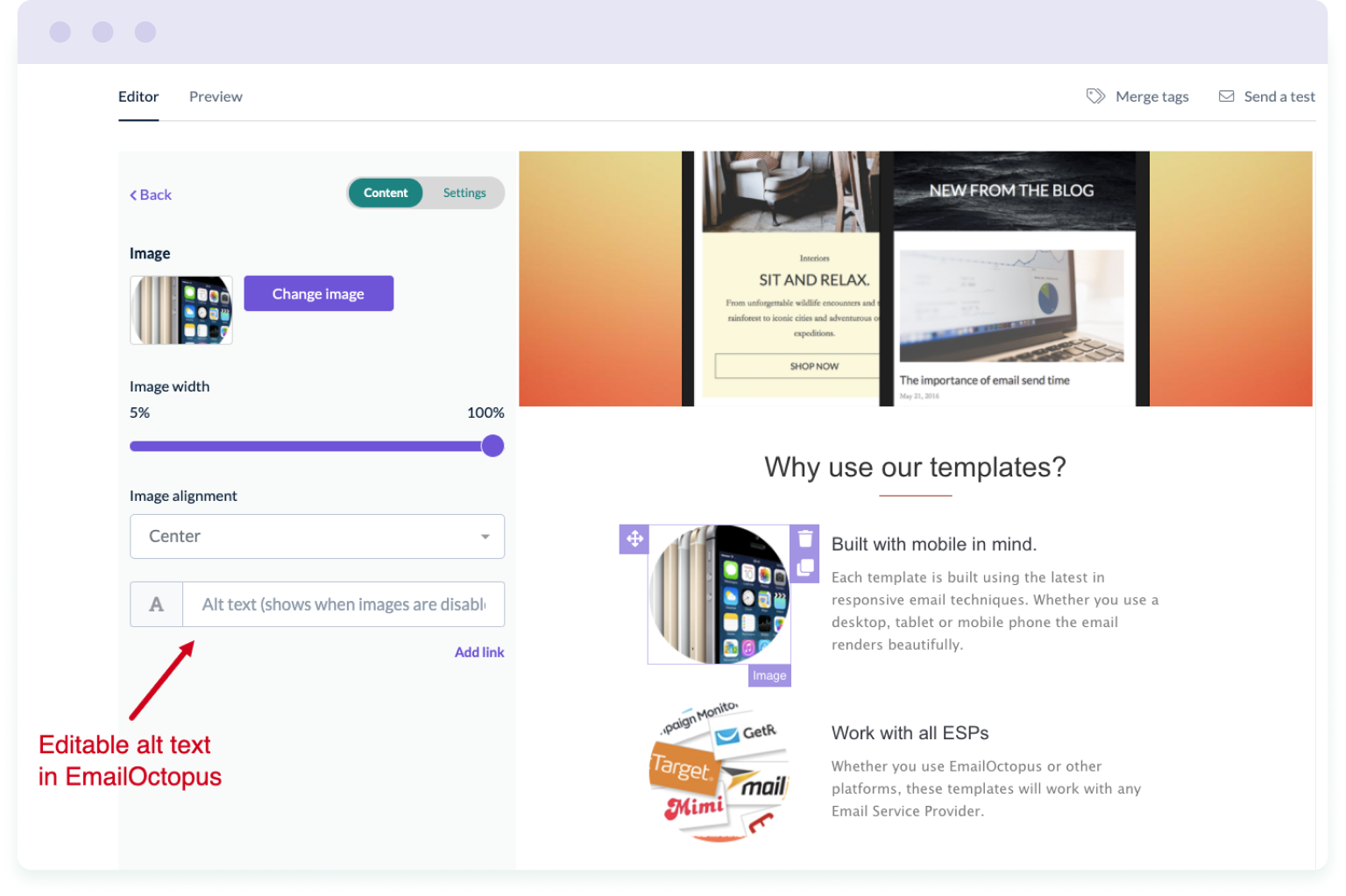
Alt text (short for ‘alternative text’) is added to images to give a short description of what’s pictured in the image. And it’s useful for two reasons:
- Screen readers can read the description aloud so that visually impaired users can understand what’s being shown in the email
- Images blocked by email clients appear as text instead so that users understand what’s meant to be shown in the email
Using alt text will go some way to ensuring that your email marketing campaigns follow accessibility best practices and comply with ADA (Americans with Disabilities Act) regulations.
When writing alt text for your email images, aim to:
- Describe the image as concisely as possible
- Use different alt text for each image
- Avoid repeating text from the main body of the email in the image alt text
Adding alt text to images in your email is easy when using an email marketing tool, such as EmailOctopus. These platforms provide the option to write alt text in the email editor, which means you don’t need to worry about trying to add alt text to the HTML code.
10. Add links to your images
Adding links to your images can help improve click-through rate, because the more links there are to click on, the more chances a reader has on clicking them.
In Gmail, if an image does not have a link, recipients are given the option to download the image instead. Take the example below, which is an image featured in an email. When the recipient hovers over the image, a download button appears. And recipients can choose to save a copy of the image.
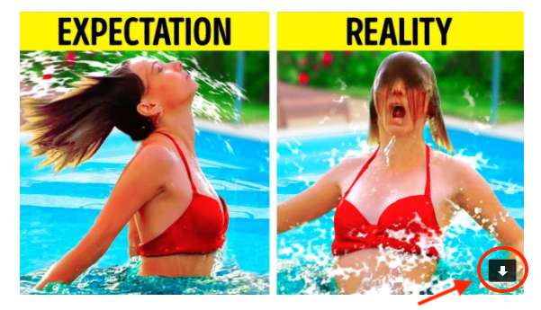
If this image had a link attached instead, recipients would not have this option. When hovering over the image, the only choice they would have is to click through to the URL.
If your image is simply for illustration purposes then it might not make sense to include a link. In which case, don’t try and force it.
But if the image appears on the webpage that the copy in your email refers to, then it makes sense to include a link. For example, when EmailOctopus email their blog subscribers with a round-up of recent articles, they include an illustration beside the summary text. Alongside the heading text link, this illustration also links through to the article.

This provides readers with two opportunities to click-through to the article, rather than just one.
11. Use countdown timers
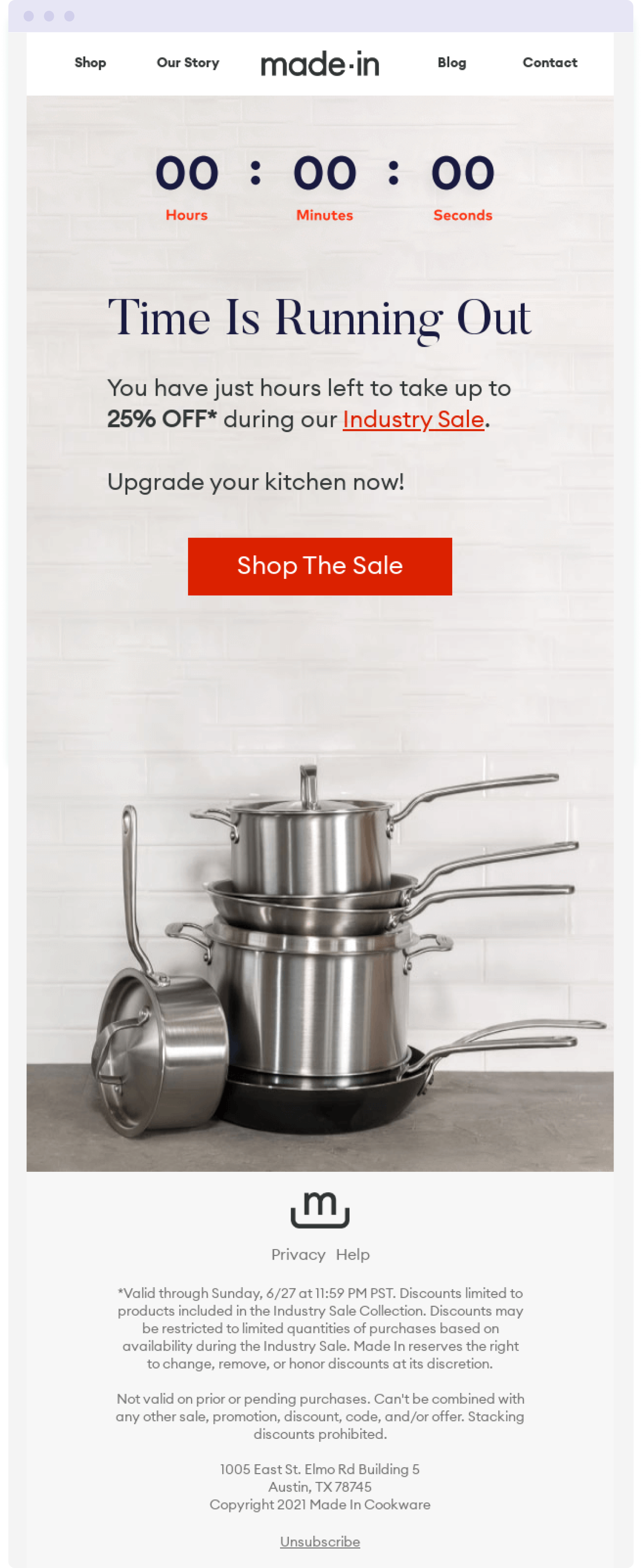
Dynamic content is a form of content that changes depending on different factors. It enables marketers to personalise and tailor content to individual members of their audience, which in turn drives engagement.
When it comes to dynamic images, countdown timers are one of the most widely used in email marketing campaigns. Countdown timers create a sense of urgency and highlight when a deal or special offer is coming to an end.
It taps into FOMO and scarcity – two highly effective marketing psychology hacks. And it compels customers to purchase before it’s too late.
Countdown timers are particularly effective when used in emails promoting flash sales, upcoming events, special offers or discounts. Using countdown timers, you can drive your customers to action and make them want to place an order before the offer expires.
With tools such as NiftyImages, you can customise timers depending on your needs. For instance, you can set a timer to start when a person opens an email. And specify when the countdown ends. You can then easily add these dynamic images to your email editor of choice.
12. Personalise images
Personalised email marketing campaigns have been shown to produce 29% higher open rates, 41% higher click rates, and generate an average ROI of 122% (source). Which goes to show that it’s worth investing in personalisation.
When it comes to personalising images in your email marketing campaigns, this would mean using different images for different segments of your mailing list. Essentially, you tailor the content of your email to suit specific groups within your audience.
For example, if you’re a food blogger and you know whether your readers prefer vegan, vegetarian or meat recipes, you can create email content to reflect these preferences. With images to match.
To automate this process at scale, you can use a tool like NiftyImages. With NiftyImages you can create images for your email marketing campaigns and add merge tags to display personalised information.
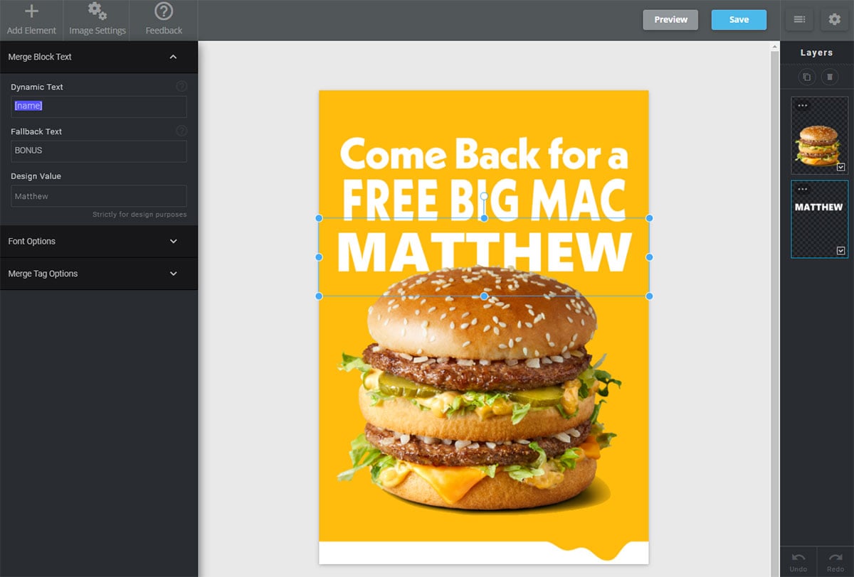
Personalisation can also be far more advanced depending on the amount of data you have on your customers. And how you can utilise that data with tech. Take this example from EasyJet:

The email summarises how customers have travelled with EasyJet over the years. The layout would have been the same for every customer that received the email, with similar content.
But the images would have changed to match the changing, dynamic text. Alex was shown a picture of Faro because that was his first destination with EasyJet. But another customer might have received a picture of Madrid instead.
This email campaign resulted in 100% higher open rates and 2% higher click-through rates compared to the average EasyJet newsletter (source). And it was all thanks to personalisation.
Wrapping up
Images not only influence how your audience engages with your email content, they also build brand recognition and credibility. Which is why it’s important to use them correctly in your email marketing campaigns.
This means developing a recognisable brand style and ensuring every image, illustration or infographic you use reflects this unique style.
It also means editing images so that they’re the right size for your email template, look great across all devices and load quickly.
To make your emails more accessible, use alt text so that those with visual impairments can use screen readers to have the image described to them out loud.
And to encourage more clicks, add links to your images where it makes sense to do so.
When you’re ready to adopt more advanced tactics, use dynamic content to personalise your images for each individual subscriber.
Follow these tips and you’ll not only have better-looking and more-engaging emails, you’ll also benefit from improved brand sentiment and conversions. Now over to you!


No Comments
Leave a comment Cancel