A referral program incentivizes current customers and brand advocates to refer your brand to their family and friends to get rewards. These rewards or incentives may range from discounts and coupons to freebies.
Sometimes all we need is a nudge from our friends to try something new, and this is why referral programs work.
Word-of-mouth is trusted by 86% of consumers, making it the MOST trusted form of marketing. In addition, 49% of U.S. consumers also consider friends and family as their top sources of brand awareness.
These numbers show that your very own customers could be valuable brand ambassadors.
But how do you get customers to promote your brand?
With a referral email campaign, that’s how.
Page Contents
What is a referral email?
A referral email tells customers how to join a referral program and promotes the rewards customers can get for successfully referring their friends.
Here’s an example of a referral email from Scott’s Cheap flights:
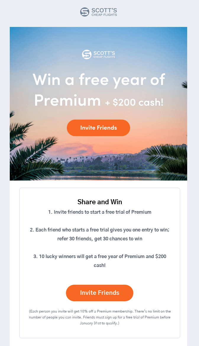
This referral email contains step-by-step instructions for inviting friends for a chance to win a free year of premium membership and $200.
Six tips for creating successful referral emails
But how do you design the perfect referral email?
Here’s what’s needed for a referral email that works.
1. Write a compelling headline and subject line
“So, what’s in it for me?”. This is the question you need to answer for your customers.
Because a referral program’s appeal lies in the incentives and prizes that customers can get. And so this is what you should lead with in your email.
Having a compelling headline and subject line that highlights the benefits customers receive is key to getting loyal customers to open and read your referral email. If you don’t get straight to the point, readers are less likely to stick around and participate.
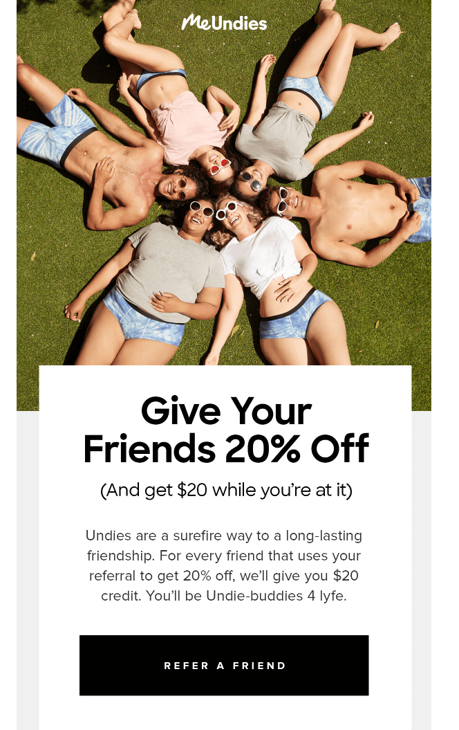
For example, MeUndies’ referral email has the headline, “Give Your Friends 20% Off”—which summarises the referral program in just five words. This headline could also be used as an email subject line to boost email open rates.
2. Design a great-looking email
To be effective, your referral email must have an eye-catching layout and design. Ideally, it should match your brand’s aesthetic to make a lasting impression among readers.
Take, for instance, Australian company, YouFoodz, which specialises in delivering healthy meals to their customers.
Their referral email has a high-quality header image that shows the freshly-cooked meals customers can get by referring their friends. At the bottom, there are graphics that illustrate the rewards available by referring more people.
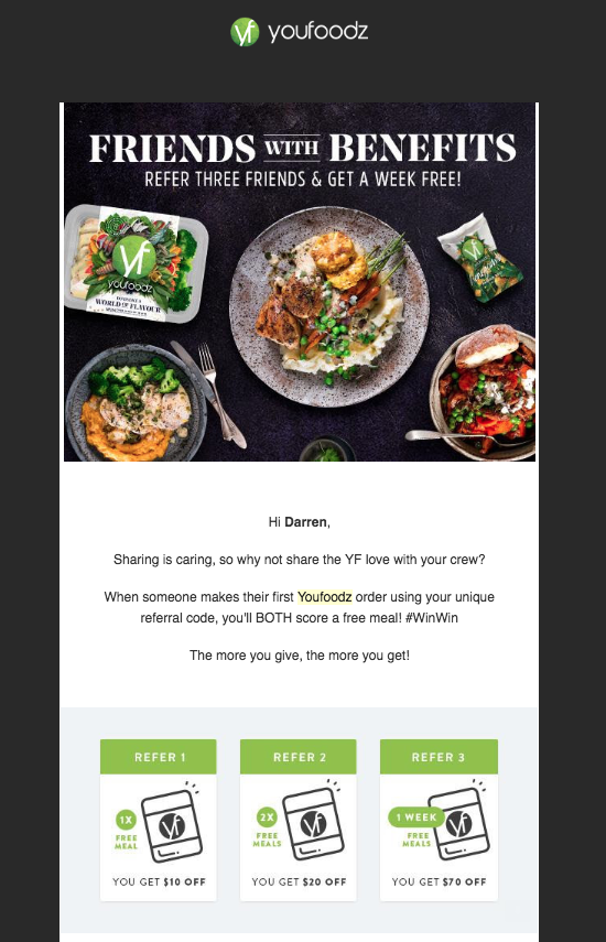
A small detail that might have a big impact on the success of your referral email is the use of personalisation, which in this example, is the use of the customer’s name in the greeting. This helps make the email feel warm and friendly and builds more of a connection between the brand and the reader.
3. Explain the referral incentives
There are multiple types of referral incentives that brands can offer.
Which one would work best for your business? Here’s our take on the rewards that work best based on your situation.
- Cash: A practical reward that can instantly motivate consumers. Unlike material goods, it’s also scalable—customers can earn more by referring more people. This rewards system is a good fit for businesses relying on expensive one-time purchases (i.e. mattresses, cars).
- Discount: Encourages customers to make repeat purchases, which makes it perfect for fashion and beauty-related ecommerce brands. Brands can either offer a percentage-off (50% off your next purchase) or a specific cash amount ($20 off your next purchase) in store credit.
- Free month of subscription: For brands with a subscription-based pricing model, a free month of subscription is a popular incentive for customers and referred friends. For example, Trello’s referral program encourages customers to refer their friends in exchange for a free month of Trello Gold.
- Custom rewards or freebies: Those who want to give customers the VIP treatment can opt for custom rewards or freebies that their customers won’t get anywhere else. For instance, Riff Raff & Co rewards customers with a free toy upon making five referrals.
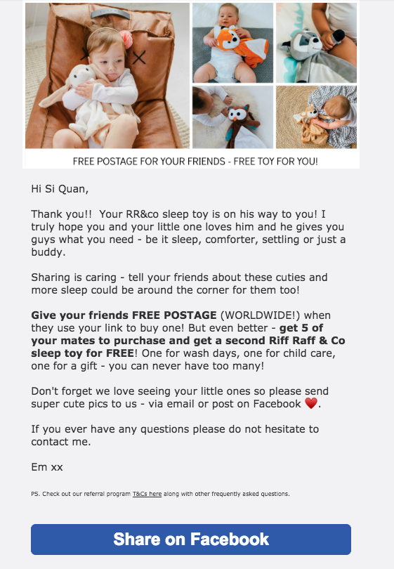
Of course, customers won’t be motivated to participate in the referral program if they don’t know what the rewards are. That’s precisely why it’s important to highlight the perks that people can get in your referral email campaign, like in Riff Raff & Co’s referral email.
4. Add an eye-catching CTA
A good incentive can encourage customers to refer their friends but it’s the CTA that seals the deal.
A CTA leads customers to the landing page or app where they can sign up for your referral program.
Of course, an effective CTA must be noticeable and clickable. This way, readers can easily opt-in, whether they’re using a desktop or mobile to view the email.
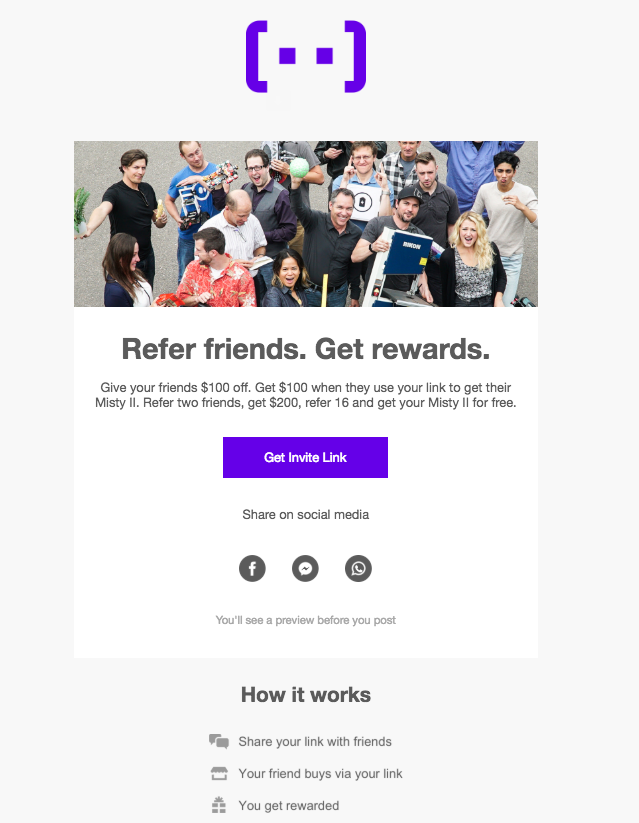
For example, Misty Robotics’ referral email has the CTA button “Get Invite Link”. The violet button is prominently displayed against the white background of the email.
5. Include social media sharing buttons
If a customer wants to share their referral link with friends and family, they can always forward on your referral email. However, it may be more convenient for customers to share their referral link and referral program details via social media.
Adding a few social sharing buttons makes it easier for customers to share their referral link on Facebook, Twitter, and other platforms.
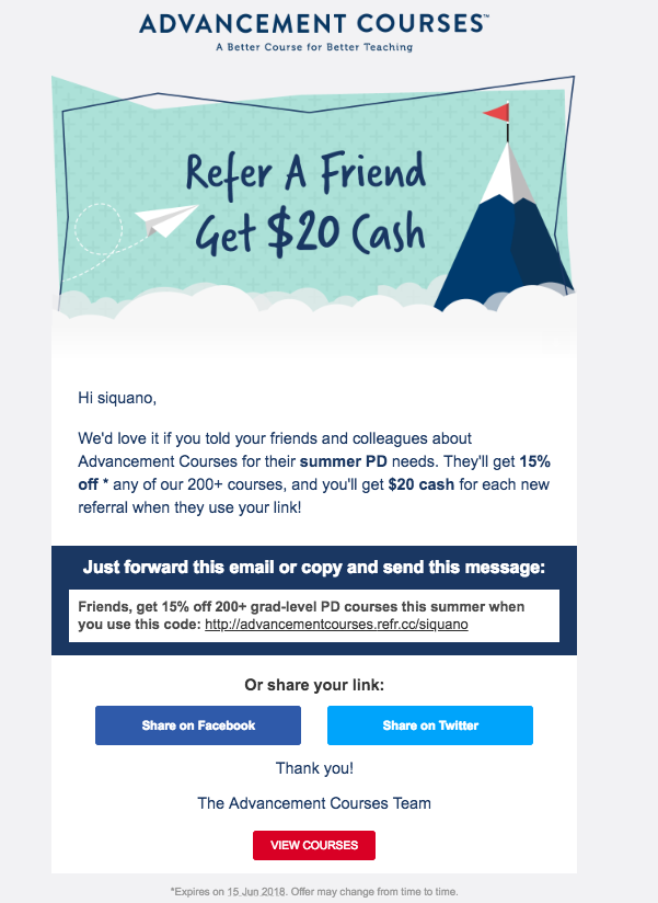
For example, Advancement Courses give customers the option to forward their referral email or copy and send the message to their friends. On top of this, there are options to share the referral link on Facebook and Twitter.
6. Explain the referral process step by step
Consumers familiar with referral programs will have a general idea of how to refer their friends. However, some customers may be joining a referral program for the first time.
As such, it’s important to have clear and concise step-by-step instructions on how the referral process works.
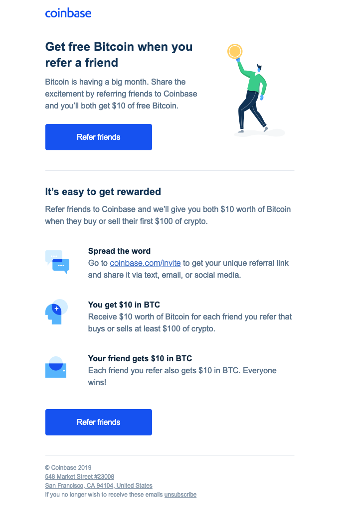
Coinbase’s referral email informs customers where they can get their referral link to invite their friends. Coinbase also explains that when the referred friend signs up to the referral program via the link, both the brand advocate and friend will instantly receive $10 worth of bitcoin in their account.
As well as step-by-step instructions, you can also provide your recipients with additional resources (such as a referral agreement or other documents) to build trust and educate your potential referral partners on the program’s T&Cs.
Over to you – how will you design your own referral email?
A referral email can be designed in an infinite number of ways. However, it’s important to remember all the elements we’ve mentioned in this article to avoid confusion and misunderstanding among participants.
The ideal referral email must have a compelling headline, an eye-catching layout and an enticing CTA. Don’t forget to provide details on the step-by-step referral process, as well as the incentive that you’re offering. As long as you keep this in mind, interested brand advocates will have the information they need to start using their referral link and recommend your brand to their friends and family.
How will you design your referral email? Let us know in the comments.
About the author
Raúl Galera is the Chief Advocate at ReferralCandy, an app that allows ecommerce brands to set up and run customer referral programs. ReferralCandy was founded over 10 years ago and has helped over 30,000 brands leverage the power of word-of-mouth and turn their customer base into their marketing team. Raúl has been leading ReferralCandy’s partnership efforts for the past five years, working alongside marketing agencies, media and tech companies.

No Comments
Leave a comment Cancel