Newsletters are no longer something that only big publishers and organisations use to provide updates. Many individuals and small creators run incredibly popular newsletters these days — emailing thousands, if not millions of subscribers each month and making a good living from it.
However, an important aspect of building a successful newsletter that’s often overlooked is the conversion rate of the newsletter sign-up page or form and its optimisation.
There are lots of different strategies and tactics to help improve the conversion rate of your newsletter’s sign-up page, but a great starting point is to learn from what others are doing well —and that’s exactly what we’ll be doing in this blog.
So let’s review some examples and learn how you too can optimise your newsletter’s sign-up page.
Newsletter signup form/page examples
There are thousands of great sign-up form examples to share, but to save your time, I’ve hand-picked some examples to discuss:
Marketing Examples
Marketing Examples is a newsletter and blog run by Harry who talks about marketing ideas, tips, and case studies.
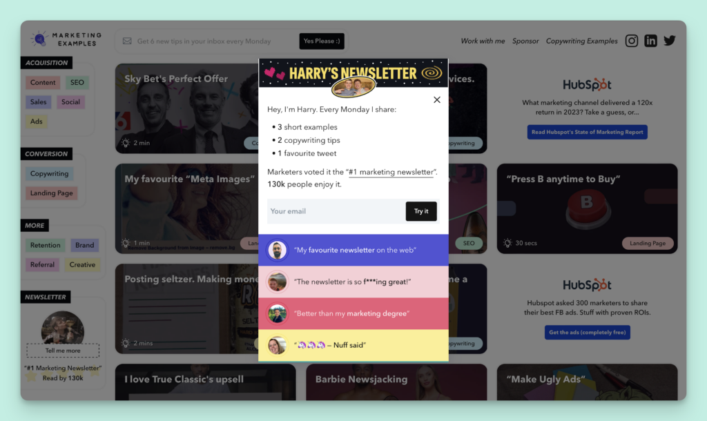
Above is a screenshot of Harry’s signup form, which has multiple elements that help him boost his conversion rate.
- Personal touch: The first and most prominent thing to note in Harry’s signup form is his personal touch, for which he uses his photo (along with his brother).
- Setting expectations: He clearly outlines what subscribers can expect in their inbox after signing up for his newsletter. This transparency helps subscribers in making an informed decision and, if the outline meets their expectations, it can also boost conversion rates.
- Multiple social proofs: There are also multiple testimonials in the form, which also plays a key role in improving the conversion rate.
Dense Discovery
Dense Discovery is another popular newsletter run by Kai that has 35,000+ readers from across the globe. Kai has paid a ton of attention to improving his newsletter’s landing page, below are the key takeaways.
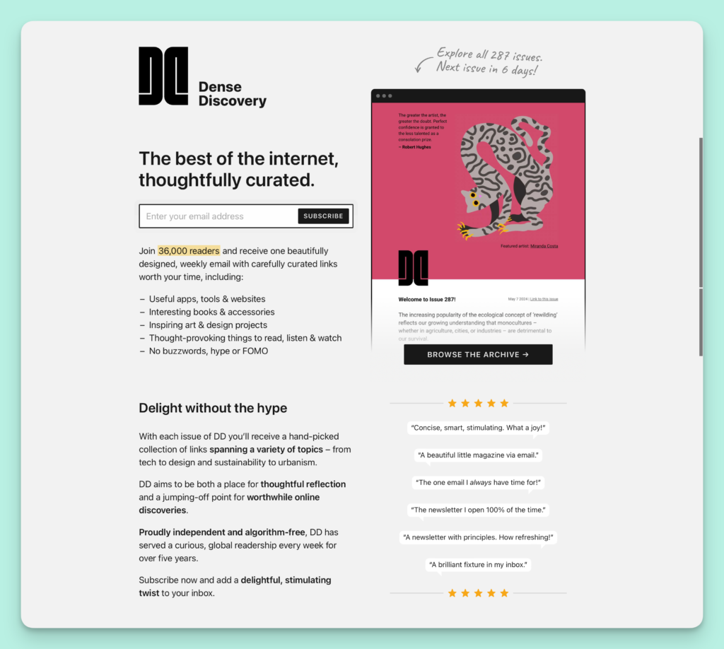
- Sharing samples: The hero section of Dense Discovery showcases the past issues, which is a great way to get a new visitor hooked on the content and then turn them into a subscriber with a gentle nudge.
- Having social proof: There’s also a focus on social proof by showcasing how many readers they have, along with some nice testimonials and subtle use of a 5-star rating.
- Clear Messaging: The form’s content is clear and straightforward, which makes it easy to understand and avoids distracting visitors from the goal of subscribing.
HI-FIVE
HI-FIVE is a popular newsletter run by a design agency called Arcade Labs for designers seeking design inspiration.
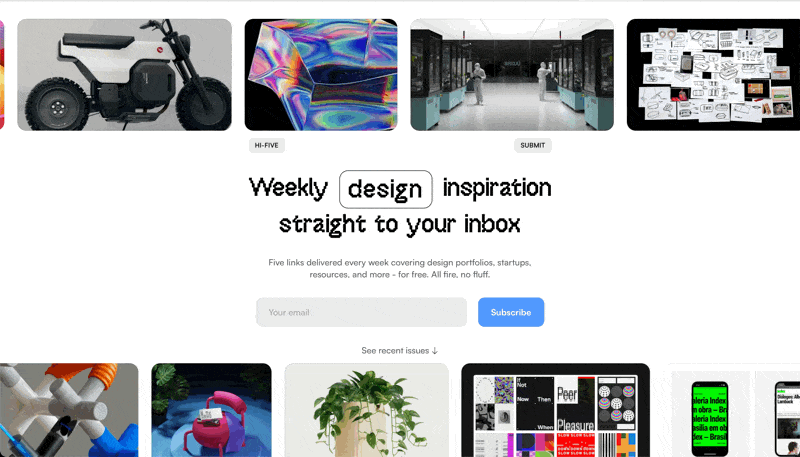
- Built for the target audience: HI-FIVE is a newsletter for designers, and there’s only one thing that can catch their attention in a second, which is a good eye-catching design. By having a well-made webpage along with micro-interactions around the form, HI-FIVE ensures they get the attention they want.
- Multiple examples: They also showcase several examples of good website designs they’ve shared in the past, which helps them get their target audience excited enough to subscribe.
OnePageLove
OnePageLove by Rob Hope is another fantastic website to get design inspiration. In addition to the exceptional content, OnePageLove also has a nice newsletter sign-up form that can serve as a source of inspiration for us.
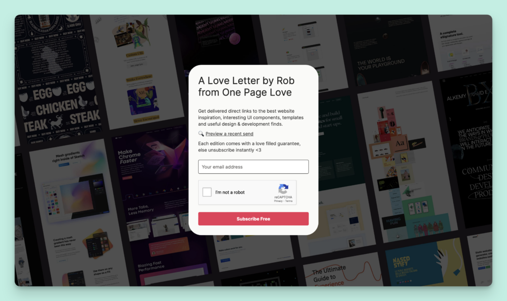
It’s a simple yet beautifully made page that serves the purpose well.
- Simple copy: The sign-up form for OnePageLove has simple and easy to understand copy which, along with the background image, sets expectations around the type of content you’ll be receiving when you subscribe. Additionally, a personal touch in the copy (use of Rob’s name) helps increase conversion rates.
- No distractions: There’s no navbar or distracting links (except a single link to archive) which helps keep the visitor stay focused on the form and taking the intended action.
Thumbstop
Thumbstop is a weekly newsletter run by Motion for performance marketers and shares tips and ideas on how to make better ads.
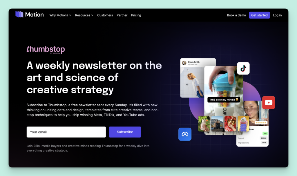
Thumbstop’s landing page is clean, easy to understand and has a clear call to action.
ogimage.org
ogimage.org is an open graph image generator that also has a creative newsletter signup form which doubles up as a lead generation form.
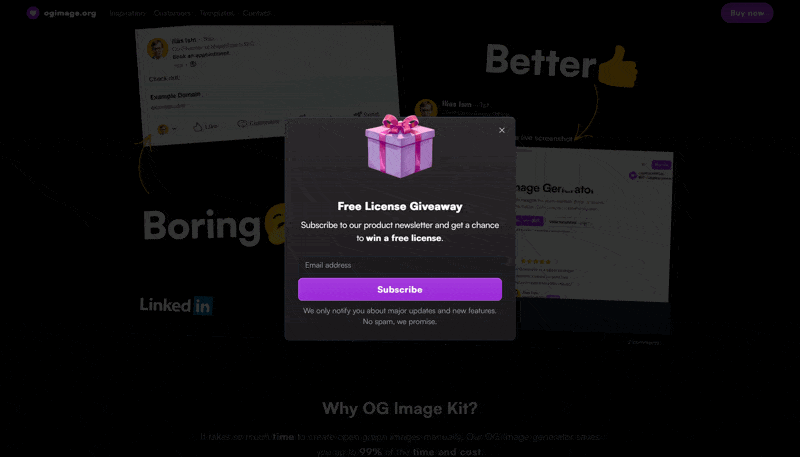
This design originally appeared on BoltAI’s landing page but has since been removed. That being said, it does have several elements to boost the conversion rate of the form.
- Subtle animation: The highlight of this form is the jumping gift box which does a great job of using a simple animation to catch attention.
- Leveraging freebies: The form also highlights that subscribers stand a chance to win a free licence, which can motivate visitors to subscribe and increase the conversion rate.
- Well-written copy: The copy of the form is also clear and catchy “Free Licence Giveaway” which motivates the visitor to subscribe.
tl;dr Marketing
tl;dr Marketing is a great example of a marketing newsletter.
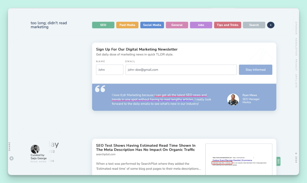
Their newsletter signup page serves a dual purpose, also functioning as an archive for all past issues. Let’s see the key takeaways from their design:
- Set expectations: Apart from a sign-up form, the landing page for the newsletter also has all of their archive, which helps in boosting the perceived value of subscribing to the newsletter.
- Clever use of social proof: The newsletter’s landing page has multiple sign-up forms and each form is accompanied by a unique testimonial, which again increases the perceived value of subscribing.
Takeaways
Here are some key takeaways from the newsletter signup form/page examples discussed above:
- Use simple copy: Keep your sign-up form content clear, concise, and easy to understand to help visitors know what to expect and encourage them to subscribe.
- Add a personal touch: Incorporate personal elements like photos or brief introductions to establish a connection with potential subscribers, making them more likely to sign up.
- Leverage social proof: Showcase testimonials, subscriber counts, or positive feedback to build credibility and trust, increasing the likelihood of conversion.
- Include micro interactions: Utilize subtle animations or interactive elements to engage visitors and make the sign-up process more enjoyable and visually appealing.
Conclusion
By implementing the strategies above, you too can create a newsletter signup form which converts. If you haven’t started a newsletter yet, then this just might be be right time.
Get started with EmailOctopus – it’s entirely free for up to 2,500 subscribers and 10,000 emails per month. Plus, paid plans start from just $9 per month.

No Comments
Leave a comment Cancel