Email as an information and marketing medium has been around for decades. People use emails to make connections, inform others, and sell products or services. Since the first email blast was sent out in 1978 and generated $13 million for its sender, emails as a form of marketing have come a long way.
Editorial newsletters, in particular, have evolved from being mere news aggregators to sophisticated operations that address long-standing customer problems and inform readers about industry trends. This type of email can strengthen your brand’s overall email marketing strategy by establishing credibility and thought leadership in your niche.
By sending well-crafted editorial newsletters, you can convince your readers that you are in an excellent position to meet their needs. Sadly, many businesses struggle with creating effective newsletters, either because their subscribers don’t find them interesting enough to open or compelling enough to click through.
This guide will share seven ways of creating a powerful editorial newsletter that attracts views and traffic. Let’s start by understanding the definition.
Page Contents
What is an editorial newsletter?
An editorial newsletter is a type of email used by publishers and businesses to distribute and promote editorial content. An editorial newsletter might contain a highlight of the best content published on a website.
For example, a business like Trello could send weekly editorial newsletters highlighting its top content for the week. This might include industry news, or tips and tricks for maximising workplace or personal productivity.
The end goals for these newsletters include drawing traffic to a website, inviting users to join an online community or to simply raise awareness of pressing issues. As such, editorial newsletters follow some of the same tactics as promotional emails. For instance, publishers use catchy subject lines to improve open rates and include images and videos to make the content more engaging.
But that’s only a handful of the basic tactics at your disposal. Here’s what more you can do differently for even better engagement with your editorial newsletter.
7 tips for writing an effective editorial newsletter
An effective editorial newsletter captures the reader’s attention right off the bat. The content is also engaging enough to retain readers’ attention and get them to click on links and CTAs through to content on your website.
Below are seven practical ways for creating such a newsletter.
1. Focus on telling a story
Emails can often suffer awful open rates with even worse click-through rates. Therefore, you must be creative when creating newsletters; otherwise, your efforts and investment will be in vain.
One of the best ways of enhancing your content is through telling stories.
Stories attract your audience by placing them in familiar situations and suggesting solutions for them. Readers will read your email, realize that the content addresses their needs and concerns, and click on your call-to-action to learn more.
So, look at the purpose of your newsletter, then figure out a way to turn formal content into an irresistible story.
Here’s an example:
The above newsletter uses storytelling incredibly well. The opening quote captures the reader’s attention, then the rest of the email tells the reader about a situation they can relate to. It promotes a podcast episode featuring an industry figure telling the story in more detail. By the end of the email, the reader will be more likely to click on the link to find out more.
2. Create a unique voice and stick to it
As a brand, you need to develop a unique voice and use it across your platforms, from your website and social media channels to your emails. Using a unique brand voice consistently will help your subscribers identify with your brand, which in turn contributes to brand loyalty.
The voice and tone can vary depending on niche and type of business. Needless to say that it should resonate with your audience and communicate the message. Don’t be afraid to make your editorial newsletters “less formal.” Many people would prefer a casual, easy-to-understand email to one full of jargon.
Take this example from Dense Discovery – a weekly newsletter about tech, design, and sustainability. The tone of the newsletter is casual and free of “buzzwords, hype, and FOMO”, which makes the content accessible enough for the average person to understand what’s being said.

The email copy above tells us about a situation that is familiar to many of us (can you see the trend here?). But aside from this relatability, the newsletter also uses friendly, accessible language, which is something not very common for a newsletter about tech. Once the reader realizes that the newsletter is written in their own style of language, they will be more likely to read and open future emails.
Besides a casual voice, you can also use humour in emails. Just make sure you know your limits because you don’t want your editorial newsletters to look like they’re trying too hard to be funny. For example, you don’t want to use too much dark humour, nor try to throw in too many pop culture references that fall flat. Remember, the goal is to inform; entertaining your reader is secondary.
3. Choose content that is relevant and that adds value
Your newsletters can attract views and drive traffic to your site only if they offer content that’s relevant to your readers. Therefore, you must understand your readers before writing the content.
One way to discover your readers’ preferences is to update your sign-up form to include a list of potential interests. You may also send a separate email that leads to a survey that can provide valuable insight into your subscribers’ preferences and demographics. Using this data, you can then segment your subscribers and send content that’s relevant to their interests.
For example, if you’re a health food company and you know whether your subscribers are vegan, vegetarian, or gluten-free, you can tailor the content of your editorial newsletters to match their preferences. You’d send articles about vegan food to the vegans and gluten-free related articles to those avoiding wheat.
Using this simple tactic, you boost your clicks since people are naturally inclined to interact with the content that they like and that’s most relevant to them.
4. Use a reader-friendly format for your editorial newsletter
Much of the appeal of editorial newsletters lies in the way you format them. Some newsletters merely aggregate links and headlines, while others utilise more human involvement in the content creation and curation process.
As a rule of thumb, though, your approach should place the reader at the centre of the experience. Here are some factors to consider when you decide on your newsletter’s format:
- Content: Some newsletters provide a summary of the featured content, while others contain entire articles. This reflects varying preferences across different types of subscribers. Some might prefer reading all their content through email alone, while others prefer reading summaries and learning more about the topic in their own time.
- Links: Most email newsletters provide links to featured articles, which is a good method to use if you are trying to drive traffic to your website. On the other hand, some users would rather stay on their email apps instead of clicking on links that open in a separate browser window.
- Images: There are pros and cons to incorporating images into your editorial newsletter. On one hand, images can enhance the reading experience for your subscribers. On the other hand, images can distract your subscribers from reading the content and can contribute to low download speeds.
Let’s look at a newsletter that’s easy to read and understand.
OFX – a currency trading platform – is well-known for its monthly Currency Outlook newsletter that gathers industry news and alerts readers about events they should monitor. The newsletter starts with a short but informative introduction:
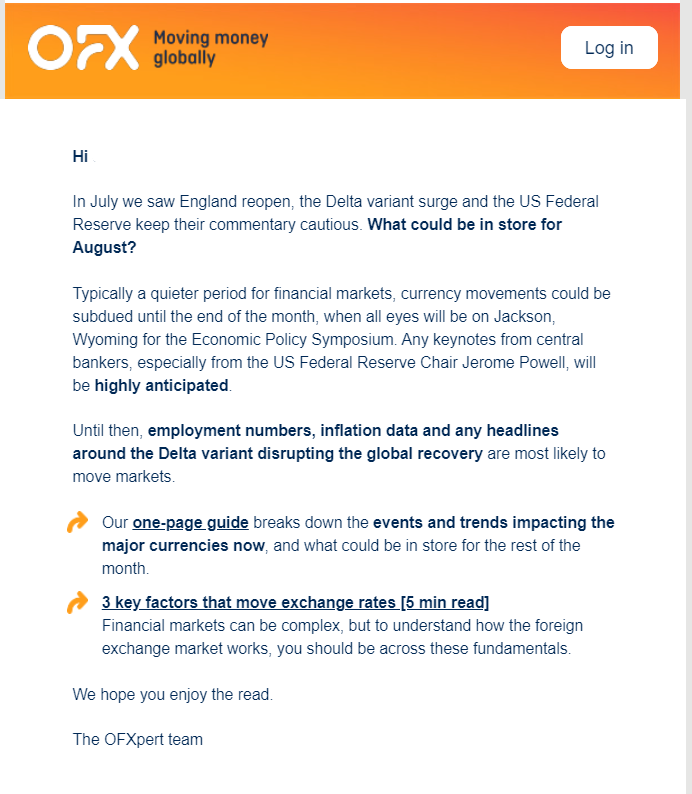
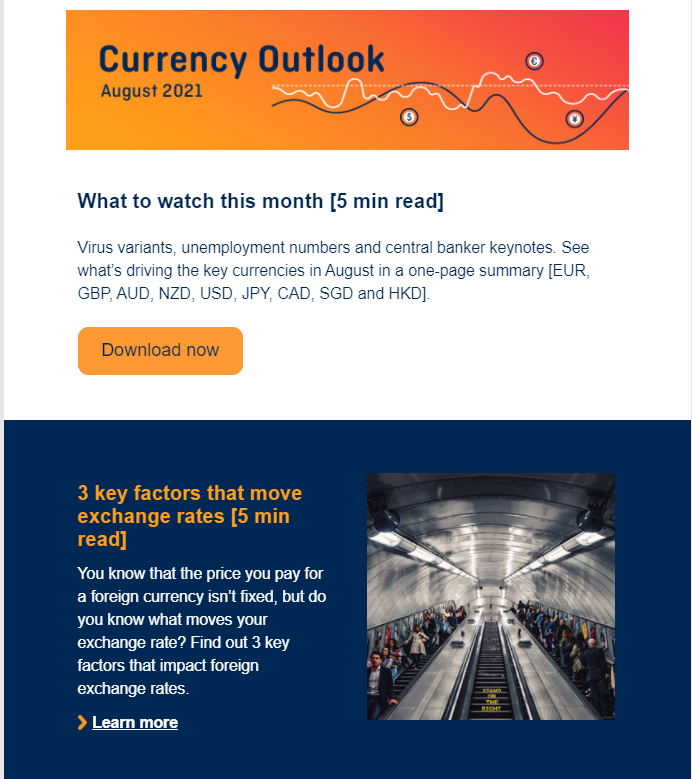
As the reader scrolls through the newsletter, they will find summaries of articles on OFX’s blog, such as outlooks for widely-traded currencies and an explanation of the factors that influence rate movements. OFX has also thoughtfully included estimated reading times for each article so readers know how long it will take them to consume the content.
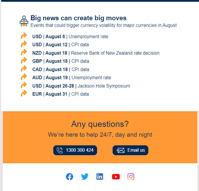
The newsletter ends with a list of currency trading events to watch out for within the month:
While your newsletter may not be as comprehensive as OFX’s, there are certain key lessons you can learn from their example, especially when it comes to formatting.
For example, adding an introductory paragraph or two will prepare the reader for the rest of the newsletter. Posting summaries of articles will help readers decide if the article is relevant, while adding links will give readers a way to read the content in full. Finally, adding key dates will raise interest and anticipation. This will also remind readers to check back on your site when the expected news finally comes out.
By adopting a reader-friendly format for your editorial newsletter, you encourage your subscribers to spend more time reading your content.
5. Add a personal touch
No one wants to go through an email that reads as though a bot wrote it. People want something personal and not some generic automated newsletter full of jargon.
Personalisation of emails improves open rates and engagements. Several studies prove this. For instance, a survey by Experian showed that personalised promotional mailings have 29% more unique open rates and 41% unique click rates than non-personalised emails.
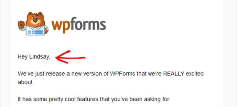
But how do you personalise emails? There are various ways of going about it. Using the subscriber’s name in the subject or opening line is by far the most popular option.
Choosing relevant content and curating it to match the subscriber’s interests is another form of personalisation. You could also sign off your emails with your name. This helps give your brand a human voice.
6. Analyse your newsletter and improve its performance
Just like any other type of email-based marketing, your editorial newsletter will benefit from an in-depth analysis of its performance. For instance, if you notice that your newsletter’s open rate is lower than usual, you need to find out why it’s not performing well. Comparing two or more email newsletters will give you an insight into what works and what doesn’t.
If you notice a particular email had a high engagement, analyse the content and find the reason behind its success. Is it the email tone, content, or formatting?
Similarly, if a campaign has terrible metrics, don’t ignore it. Do the analysis and find the reason for its poor performance, then avoid repeating the same mistakes in the future.
You can do this analysis over a few weeks. By varying your newsletter content and formatting a little bit each time you send them, you will be able to detect variances in subscriber behaviour.
You may also take a more direct approach and ask your subscribers to answer a survey where they can provide feedback on your newsletter and suggest topics they’d like to see.
7. Don’t forget mobile readers
According to Statista, close to 50% of all emails are opened on mobile devices. If your editorial newsletters are formatted purely for laptop or desktop platforms, your mobile readers will suffer. They may find themselves having to zoom in and out or keep scrolling just to read your content or click on a CTA. Therefore, optimising your newsletters for mobile devices will greatly improve the user experience and improve open rates.
There are many ways you can optimise your newsletters for mobile devices, including:
- ensuring that your subject lines are concise
- making the text easy to read and scan
- combining different text colours
- and having the email design fit perfectly in a smartphone or tablet.
Compared to long blocks of text, images are retained and processed better by the human brain. By adding quality images to your newsletter, you make it more visually appealing and encourage your subscribers to engage with your content.
You can even go as far as adding an amusing GIF, something that Tedium does well with their welcome newsletter.
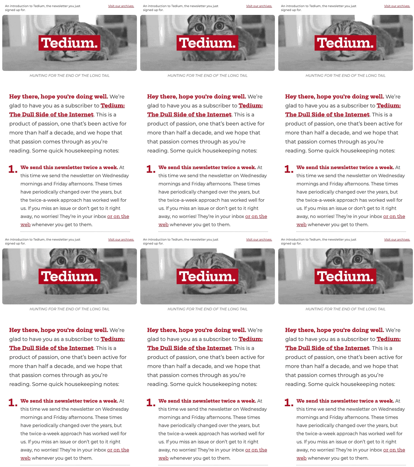
The cat GIF fits perfectly on any mobile device and captures the reader’s attention right away. It also lightens the mood, increasing one’s chances of reading through the email.
If you’d rather not use images, consider breaking down your newsletter into several digestible sections. For example, Popbitch splits one newsletter containing different topics into several small categories. The minimalist layout and overall design of the newsletter make the text easier to load on a mobile device.
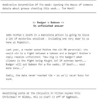
Popbitch has more than half a million email subscribers, so it’s fair to say this method works.
Wrapping up
An editorial newsletter is an excellent tool for keeping your customers informed about what’s going on with your business. It also allows you to market content and drive traffic to your website. However, an editorial newsletter can only serve its purpose if it is written, formatted, and targeted correctly.
Focus on telling a story and creating relevant content. Use a unique voice and personalise your emails. And don’t forget to optimising your newsletters for mobile devices. Finally, analyse your results and adjust your campaigns accordingly.
There’s no doubt that this process can be challenging, especially for first-timers. But we can all agree on one thing: the results are well worth it.
Author bio
Baidhurya Mani is the founder of SellCoursesOnline.com. He regularly shares tips, tools, and strategies to help creators and entrepreneurs build a successful online course business.


No Comments
Leave a comment Cancel