Dark mode is a popular feature adopted by many email clients and has become an important consideration for email marketers when designing their email campaigns.
Dark mode is a display setting that uses a darker colour palette to reduce eye strain and improve readability in low-light environments. It is particularly popular on mobile devices and can significantly impact your emails’ readability and visual appeal. Here are some reasons why you should consider dark mode when designing emails.
Importance of dark mode email design
Dark mode has seen significant adoption recently, and it’s clear that it’s here to stay. It’s more than just another design trend, as it offers several benefits. Here are some:
Less strain on the eyes: One of the key benefits of dark mode is that it puts less strain on your eyes, which is very important considering the amount of screen time we all have.
Improved battery life: Nowadays, most devices have an OLED screen, which uses less power when dark mode is turned on. It’s done by turning off individual pixels whenever black colour is shown on screen, resulting in increased battery life.
Part of default settings: Nowadays, many devices either come with dark mode as the default setting or automatically switch to it based on your time zone. Since it’s part of the default system settings, it’s rarely changed.
Looks aesthetic: Many people prefer dark mode because it appears aesthetic, modern, and clean. This is one reason why dark mode is particularly popular among younger individuals.
As more and more people use dark mode on their devices, it’s essential to ensure that your email campaigns are optimised for this display mode. According to a recent survey, over 80% of users use dark mode on their devices, and this number is expected to continue to rise.
If you don’t design your emails with dark mode in mind, it can significantly impact the readability of your content. For example, using light text on a dark background can cause eye strain and make reading challenging, especially for people with visual impairments. By considering dark mode when designing your emails, you can ensure your content is easily readable and accessible to all recipients.
How to optimise your emails for dark mode
Here are some tips to help you optimise your emails for dark mode
Check for text with proper contrast
If your email is primarily designed for light mode, then there are high chances that your email’s background colour will automatically revert to a dark shade of black when it’s opened on a device with dark mode enabled. While it’s soothing to the eyes, some coloured text when inverted might have a low contrast ration which can be hard to read.
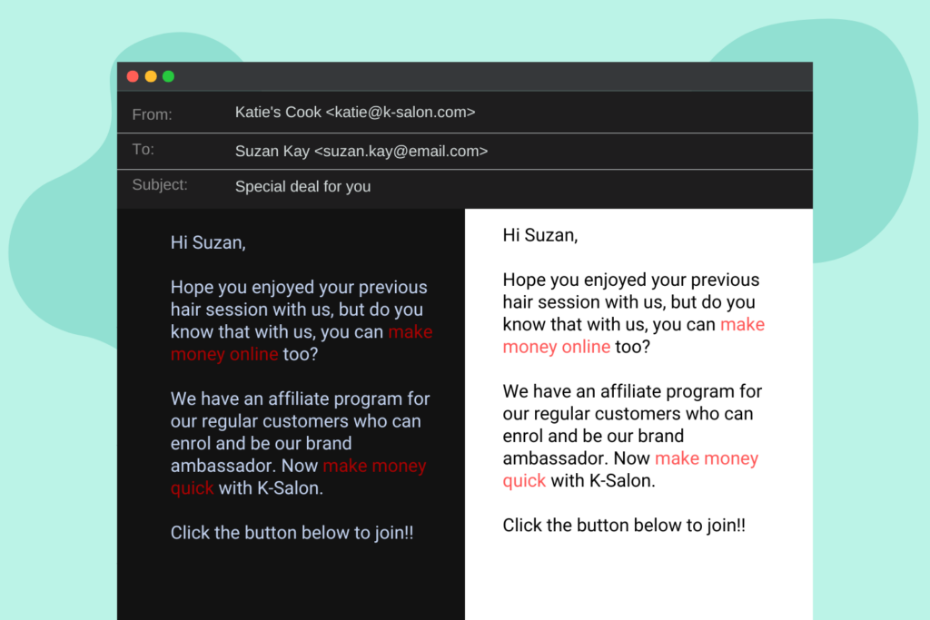
So if you have any coloured text, then be sure to check if your text is properly visible when dark mode is enabled.
Choose moderate contrasts
For text, opt for shades of dark grey on light backgrounds rather than pure black text on white, which can be too harsh when inverted in dark mode.
Choose dark colours carefully
If you exclusively use dark colours in your design, choose colours that are easy to read and do not blend in with the background. Avoid using dark grey or other colours that can blend into the background in dark mode.
Add a stroke around your logo
Your logo is likely one of the most important branding elements in your email, and it’s important to ensure its visibility isn’t compromised by dark mode.
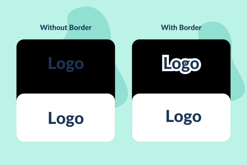
If your logo has dark elements, it may not be properly visible in dark mode. The easiest solution for this is to add a white stroke around your logo.
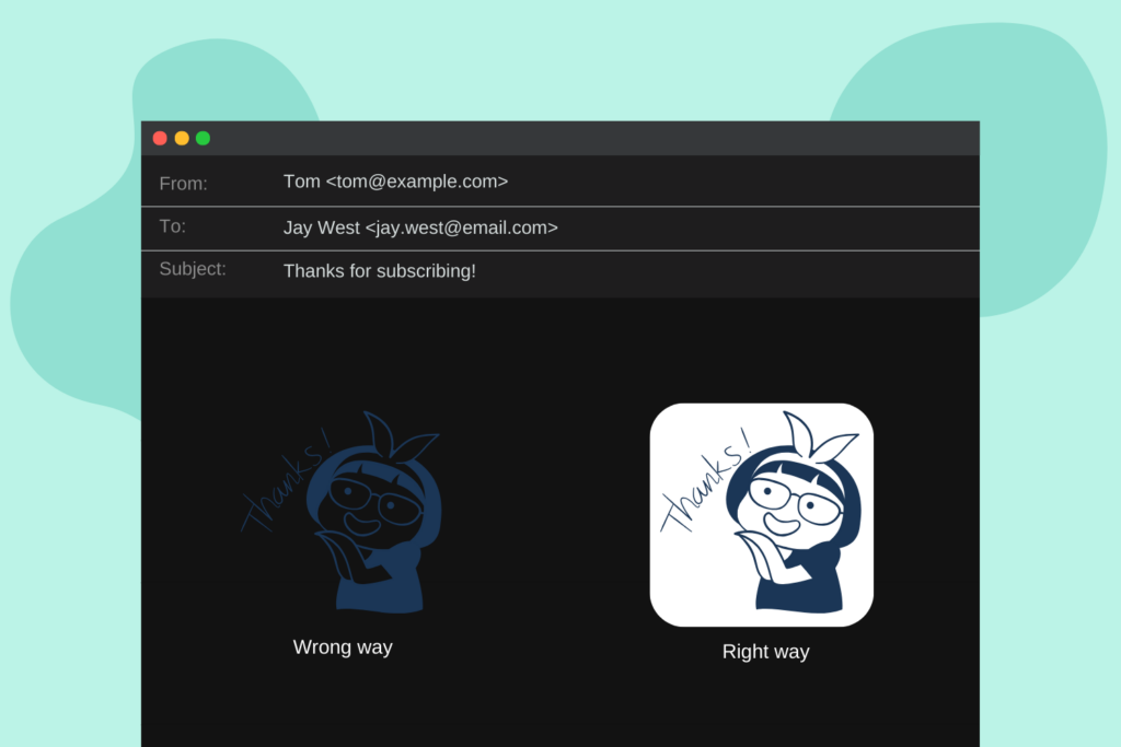
Optimising images for dark mode
Apart from your logo, the images in your email may also require optimisation to remain legible in dark mode. A common mistake is not having a background in your images.
While they may appear fine in light mode, visibility can be significantly reduced in dark mode. Therefore, it is advisable to include a background in all your images.
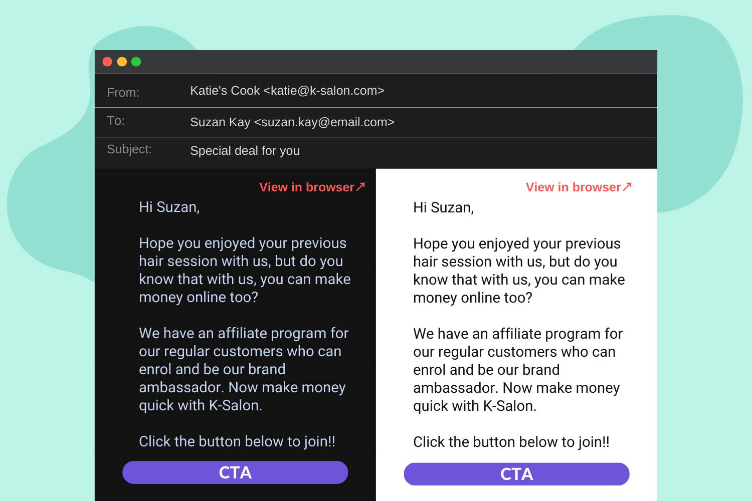
Also, consider the above image as an example, as pure white backgrounds can sometimes look too stark when inverted in dark mode and cause eye strain, so using softer shades of off-white or light grey can be more comfortable.
Do an accessibility check
Before sending out your emails, ensure you test them in both light and dark modes to guarantee they are easily readable in both display settings. Additionally, double-check that the links are easily recognisable and that all your CTAs are clear.
Consider using a dark mode-specific theme
Some email clients can display emails in a dark mode-specific theme. Consider designing a dark mode-specific email theme to ensure optimal readability and visual appeal. However, this will be possible when you use code to design the email instead of drag & drop email builder.
In conclusion, by considering dark mode when designing your email campaigns, you can improve the effectiveness of your emails and ensure that they are accessible to all recipients.


No Comments
Leave a comment Cancel