Most websites these days have some pop-up forms, and mostly it’s there to collect emails. Furthermore, the best part is that pop-ups these days don’t interfere much with the user experience as most of them are based on events such as time on page or exit intent. Plus, it’s easy for the users to close these pop-ups.
Pop-ups are also a great way to collect more emails, which helps businesses in many ways. In this blog, we’ll cover the benefits of pop-ups and also see some of the best examples of pop-ups to take notes from.
Benefits of pop-up
- Increased Conversion Rates: Pop-ups are a great way to increase the conversion rate (for email collection) of any website. This is done by capturing visitors’ attention with a clear copy, and actionable call-to-action paired on top of a pop-up that can encourage more people to sign up for the email list.
- Targeted: Pop-ups can be easily targeted too; you can have a different pop-up for various pages and also a different one for actions like link click or exit intent.
- Collect details at exit intent: When someone is leaving your site, then it means they have already lost interest, and this is where a pop-up can work but getting their email before they leave. This helps in establishing future communications and growing your business.
- Increased visibility: Generally, newsletter sign-up forms are at the footer or somewhere with low visibility; pop-ups can be helpful here, as they bring the sign-up form on top of the page’s content.
Though pop-ups have several benefits, it’s equally important to keep a check on their frequency, design, and timing to ensure a positive user experience and avoid irritating your website visitors.
Things to keep in mind
It’s easy to mess up when adding pop-ups to your website, and there are numerous things to keep in mind.
- Make it mobile-friendly: The first thing to consider is that your pop-up should be compatible with mobile devices so it doesn’t affect the user experience of those who are using mobile devices.
- Don’t trigger it instantly: Another thing to keep in mind is that your pop-up shouldn’t trigger instantly, either add a good amount of delay or trigger it based on actions such as exit intent.
- Have clear messaging: Pop-ups should also have a clear messaging, and the copy should instantly grab their attention, else they would close it as soon as it triggers.
- Make it easy to close: Finally, your pop-up should be easy to close, else it would hamper the user experience, and that’s the last thing you’d want.
Pop-up examples
There are many websites that ace pop-ups, but it’s practically not possible to have all of them listed and explained here, so we’ll stick to a few best ones that, in general, are great examples to learn from.
Bummer
Bummer is a D2C underwear brand that makes clothing for youth (more of Gen Z). They do have a cool, colourful website with excellent copy everywhere, and they also have a lovely pop-up for lead generation.
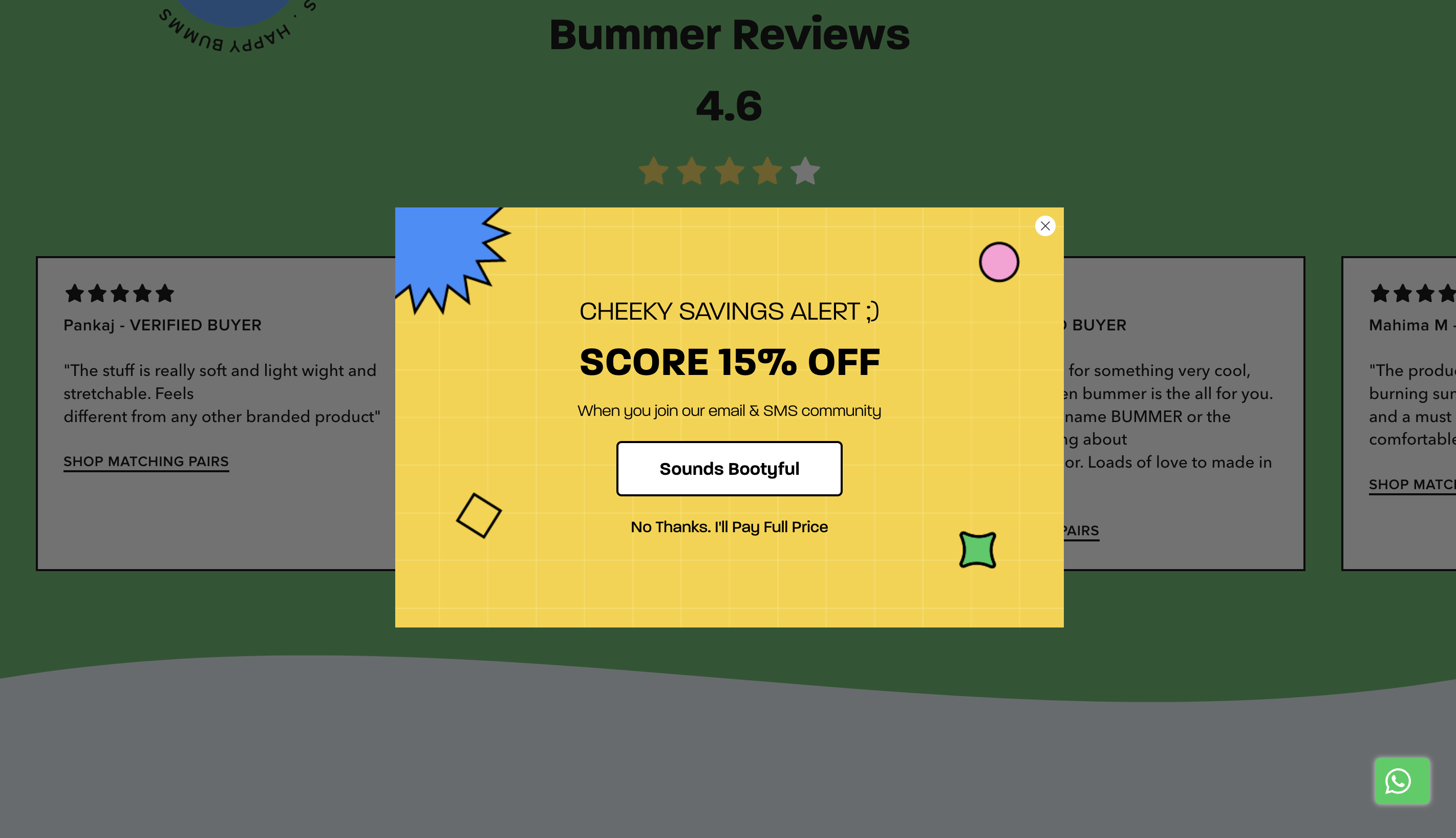
Takeaways:
- It has a two-step form, and the user only needs to click a button to take the first action. This type of form can increase email opt-ins.
- Gives a discount in return for email & number.
Marketing Examples
Marketing Examples is a marketing blog and newsletter Harry runs where he talks about various real-life marketing case studies and examples. The Marketing Examples site also has one of the best pop-ups that you’d see on a website.
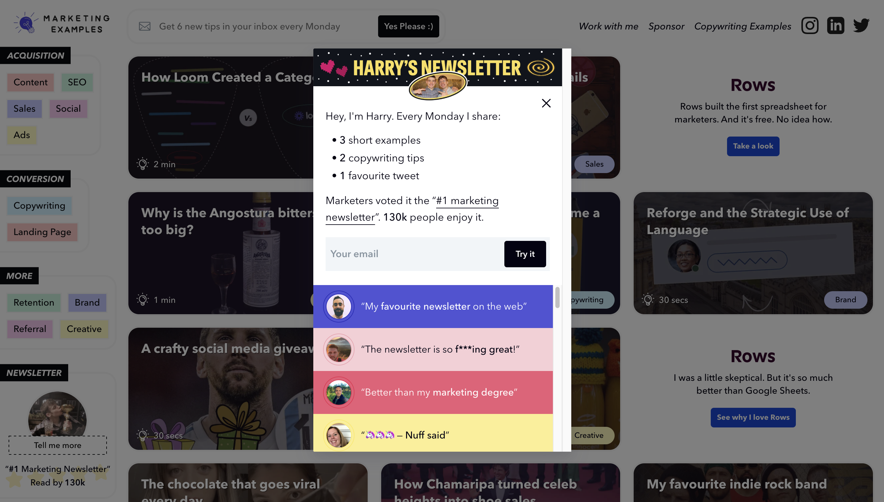
Takeaways:
- Clear messaging about why you should submit your email and what to expect.
- Includes social proof in the form of user testimonials and a link to the blog by Ahrefs where Marketing Examples is mentioned.
The pop-up also includes Harry’s face, which is a great way to build relationships without actually talking.
OptinMonster
OptinMonster is a popular pop-up builder. Being a pop-up builder themselves, they have some great pop-ups on their website. Let’s look at one of their pop-ups and see what we can learn from it.
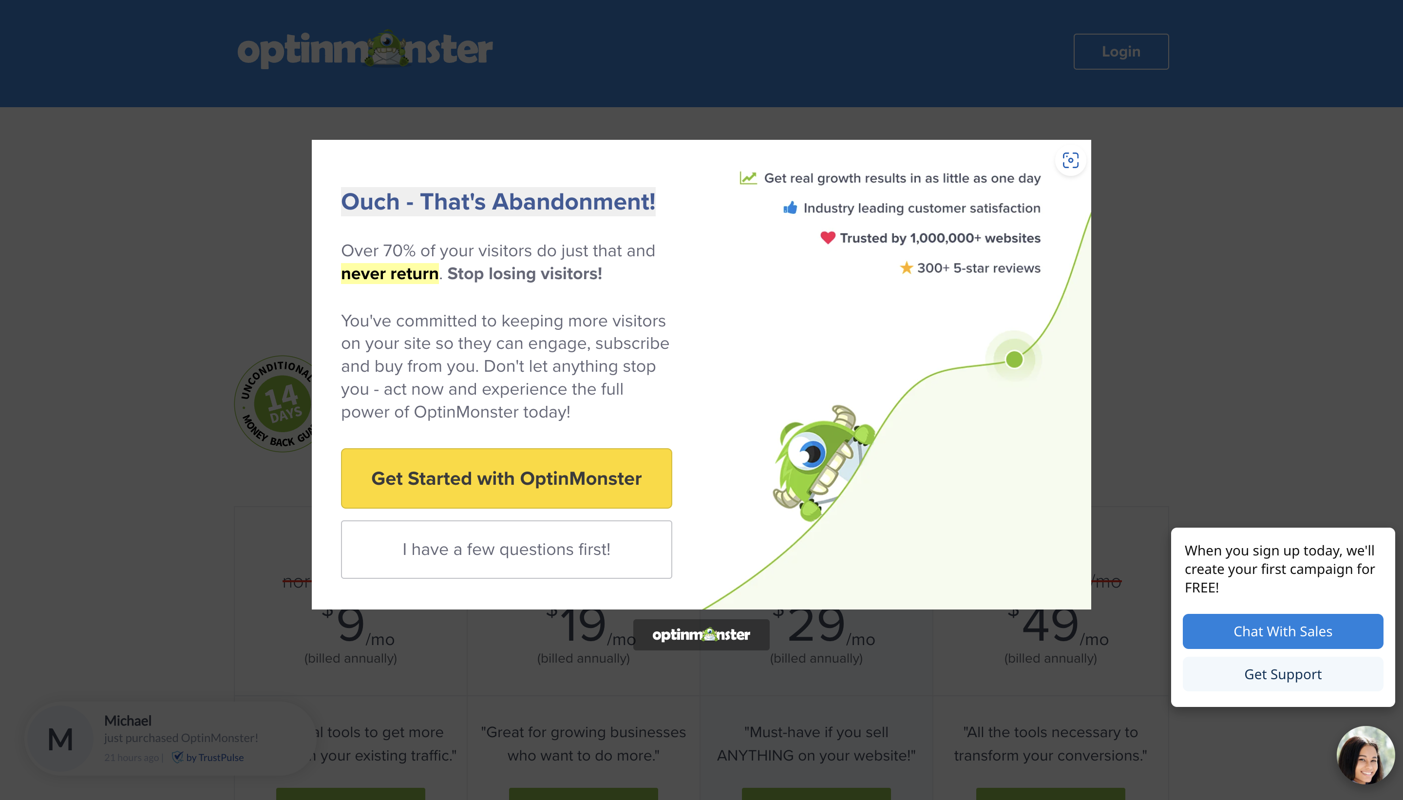
Takeaways:
- Clear copy, the messaging is catchy and explains the use-case with a real-life example.
- Highlights benefits clearly by making them bold, marked and mentioning then on the right side.
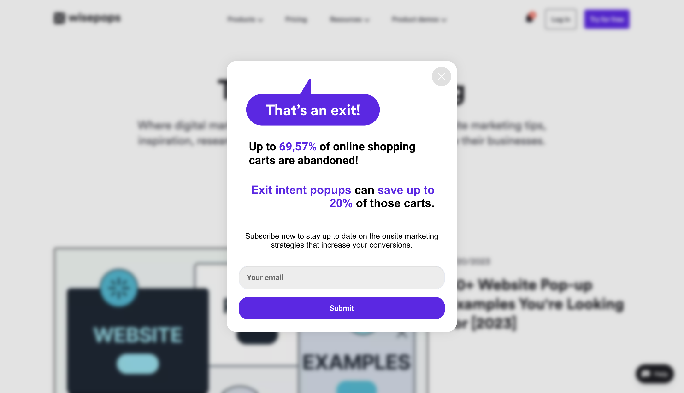
Wisepops, another pop-up builder, has a similar kind of pop-up but with a different design.
Neil Patel
Neil Patel is a well known digital marketer and also runs his digital marketing agency under his name. His website “NeilPatel.com” has one of the simplest yet effective full-screen pop-ups.
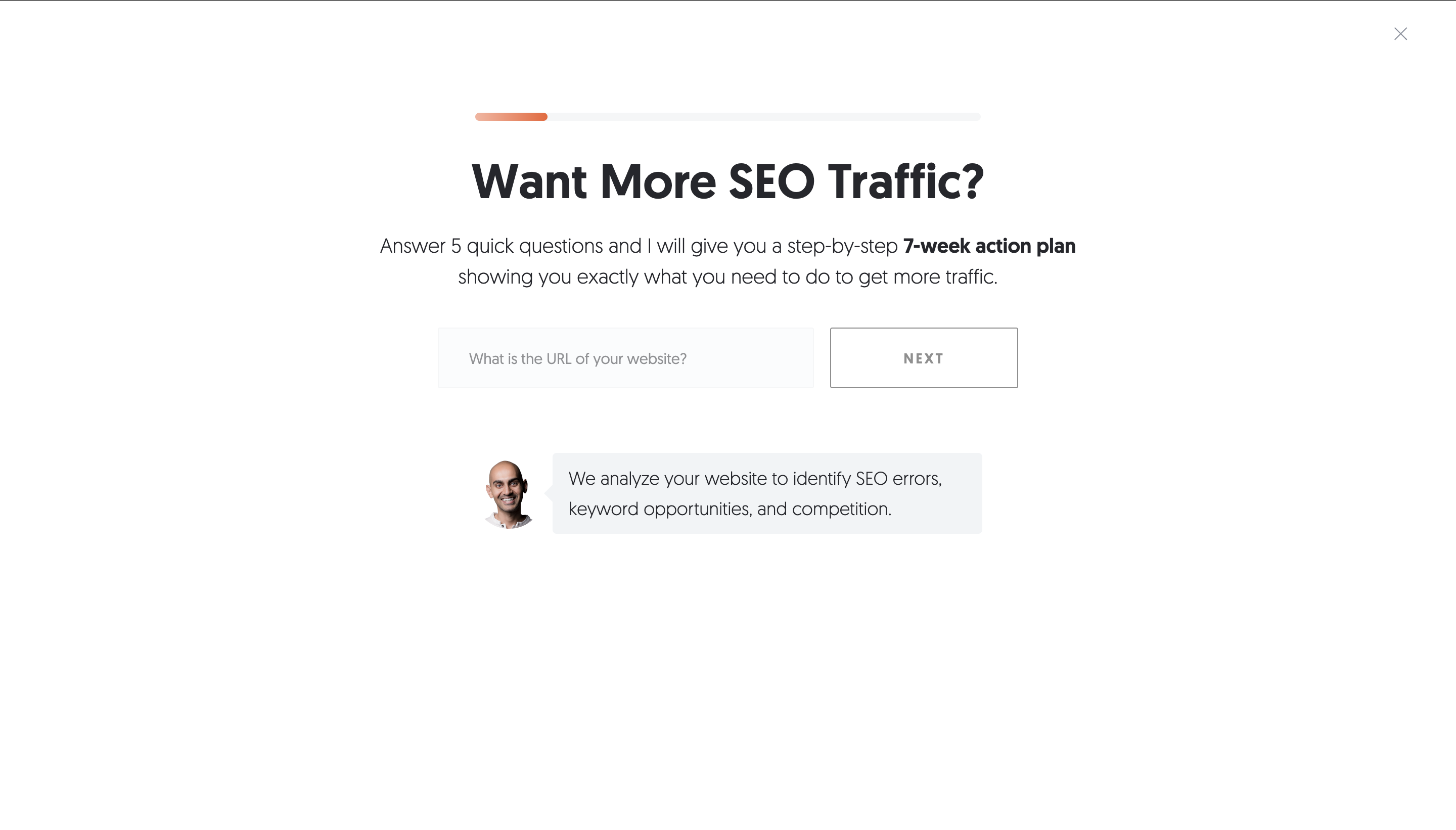
Takeaways:
- An actionable headline to which most (his audience) would agree.
- Is multistep just like Bummer.
- Uses his face to build connection and credibility.
Ways to a pop-up
Now that the benefits of a pop-up form are clear, and we have seen some great examples, it’s time to create one. Let’s see some ways to create one right now.
EmailOctopus
If you are an EmailOctopus customer or planning to sign up, using the internal pop-up builder is the easiest and fastest solution. Using EmailOctopus, you can build various types of pop-ups with many pre-made templates, and you can build your own as well.
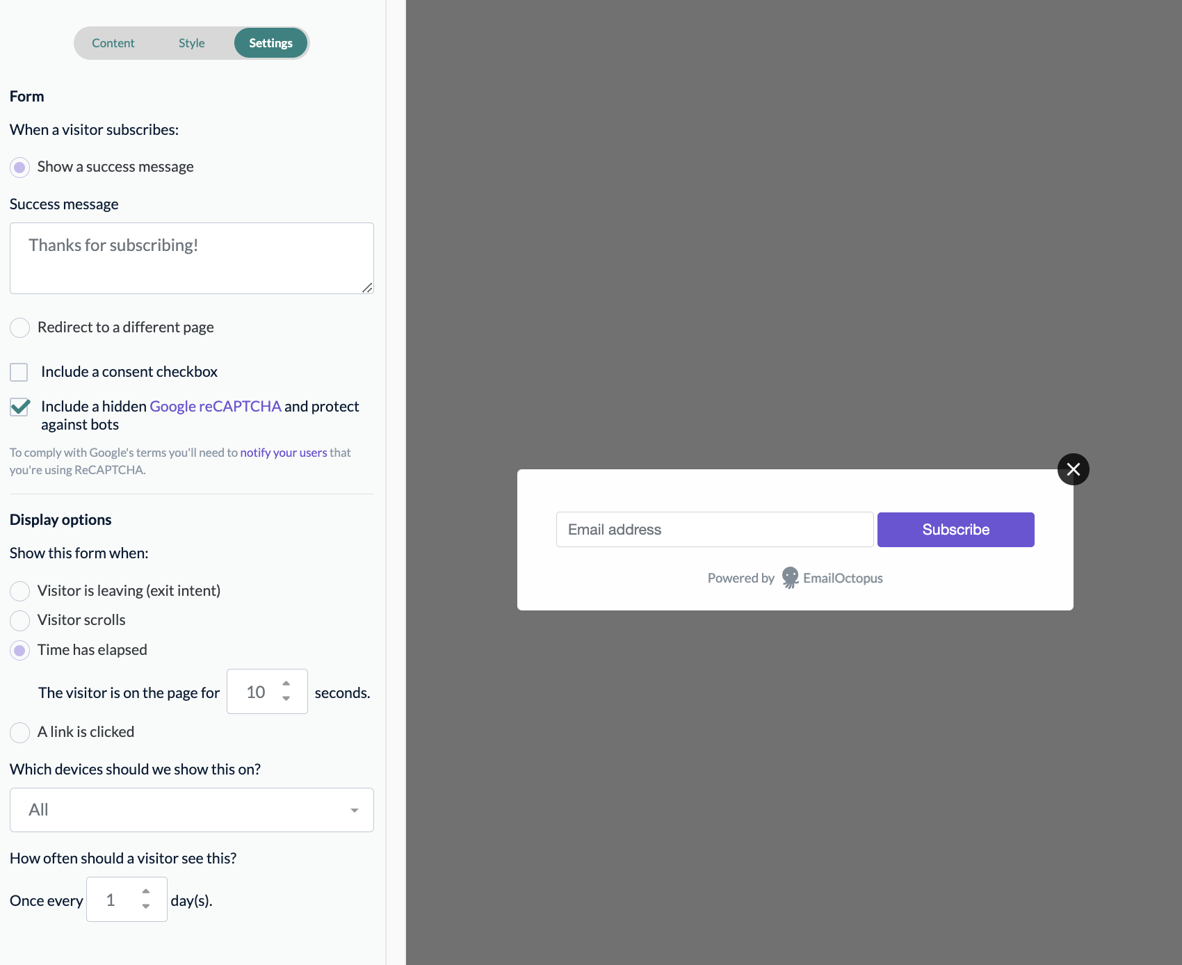
EmailOctopus also supports multiple display options, such as exit intent, scroll-based, time based and on link clicks.
Pop-up builder
If you need a dedicated tool or much more advanced pop-up triggers such as geolocation, then you’re better off using a dedicated tool.
There are many tools in the market that integrate directly with EmailOctopus, such as Poptin and Getsitecontrol. Though all these tools are great, but you’ll have to pay extra for all these tools.
Conclusion
Pop-ups are great if used in the right way; else it could also be a reason for poor user experience. Hence, follow the tips shared above and create a pop-up that works for you without affecting the user experience.
The best and easiest way to start would by building your pop-up inside EmailOctopus, if you don’t have an account, yet, then create one now – it’s free to get started.


No Comments
Leave a comment Cancel